



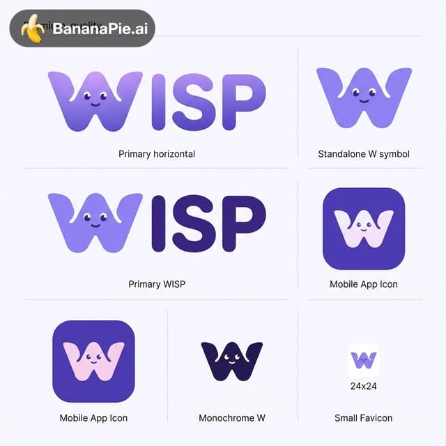
Design an exceptional, premium-quality brand identity for "WISP", a modern cooperative gaming platform. CREATIVE VISION Create a distinctive, iconic, and memorable logo that combines modern geometric minimalism with a subtle playful personality. The result should feel like a world-class digital entertainment brand — friendly, clever, modern, polished, and instantly recognizable. Think of the visual simplicity and brand recognition of Discord, Duolingo, and modern indie gaming brands, but create a completely original visual identity. CORE DESIGN CONCEPT Create a unique stylized letter "W" that subtly resembles a friendly abstract magical spirit. The W should be the actual brand symbol, not a letter placed next to a separate character. Integrate the character naturally into the geometry of the letter W. The silhouette must remain recognizable as a W even when facial features are removed. CHARACTER PERSONALITY The W symbol can have: - Two tiny expressive eyes - A subtle friendly smile - Soft organic curves - Carefully balanced rounded geometry - A slightly playful, welcoming silhouette The character should feel charming and intelligent, not childish or overly cartoonish. Avoid oversized kawaii eyes. The personality must come from the shape itself, not from excessive decorative details. GEOMETRY Use a sophisticated geometric construction. - Smooth rounded edges - Balanced proportions - Harmonious curves - Strong recognizable silhouette - Intentional negative space - Minimal visual complexity - Clean vector-style execution The logo should look carefully crafted by an experienced professional brand designer. Avoid complicated flame shapes. The top of the W may have a subtle organic movement, but the overall silhouette should remain simple. COLOR PALETTE Primary brand color: Soft Violet #8B7CF6 Secondary: Deep Violet #6857D9 Optional subtle accent: Soft Pink #EFA7E8 Background: Warm White #FAF9FF Use a predominantly violet color scheme. A subtle violet-to-lavender gradient is acceptable, but the logo must also work perfectly as a single flat color. TYPOGRAPHY Create a custom modern wordmark: WISP Use bold, rounded, contemporary sans-serif typography. The lettering should feel polished, friendly, and premium. The stylized W symbol should integrate naturally with the remaining letters "ISP". Use carefully balanced letter spacing. Avoid generic gaming fonts. APP ICON Create a matching mobile application icon. Use the exact same W symbol from the primary logo. The app icon should feature: - A clean rounded-square background - Deep violet background color - Centered W brand symbol - Strong contrast - Generous internal spacing - Minimal details - Excellent readability at small sizes The app icon should feel like a premium, modern consumer application. BRAND PRESENTATION Present the identity as a clean professional brand exploration board. Include: 1. Primary horizontal WISP logo 2. Standalone W symbol 3. Mobile app icon 4. Monochrome W symbol 5. Small favicon preview All variations must use the same underlying W geometry. STYLE Modern playful minimalism. Premium digital product branding. Friendly geometric design. Clean contemporary vector aesthetics. Soft violet color identity. Subtle character personality. Professional visual balance. STRICTLY AVOID - Separate ghost mascots - Detailed fantasy illustrations - Gaming controllers - Headphones - Chat bubbles - Stars and sparkles - Neon glow effects - Heavy shadows - 3D rendering - Excessive gradients - Complex flame shapes - Childish cartoon aesthetics - Overly detailed facial expressions - Unnecessary decorative elements FINAL ART DIRECTION The result must be simple enough to work as a 24x24 pixel icon, yet distinctive enough to become the recognizable identity of a major cooperative gaming platform. Prioritize iconic simplicity, strong silhouette, subtle personality, and timeless design. Create a beautiful, cohesive, production-oriented visual identity rather than a decorative illustration.