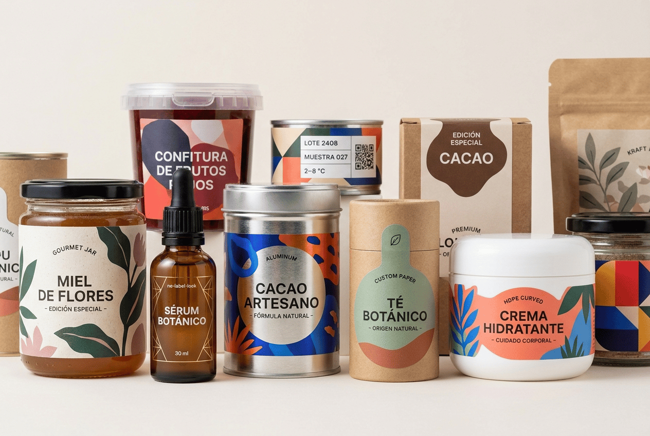
The label must look like a physical self-adhesive label applied onto the container, with visible edges and realistic material texture. It must NOT look like graphics printed directly onto the packaging. Ultra-premium editorial packaging campaign created for a professional self-adhesive label manufacturer, featuring a visually rich and sophisticated collection of DIFFERENT TYPES OF CONTAINERS made from glass, plastic, metal, kraft and cardboard. This is a LARGE WEBSITE HERO IMAGE designed to demonstrate the enormous creative and technical versatility of professional self-adhesive labels. THE LABEL DESIGN MUST BE ONE OF THE MOST IMPORTANT VISUAL ELEMENTS OF THE ENTIRE IMAGE. IMPORTANT: DO NOT create simple white rectangular labels with black typography. DO NOT create generic minimalist pharmaceutical packaging. THE LABELS MUST HAVE STRONG, CREATIVE, CONTEMPORARY GRAPHIC DESIGN. Use: • large illustrations • bold contemporary typography • expressive color • sophisticated photography integrated into selected labels • geometric compositions • abstract graphics • botanical illustrations • modern patterns • strong visual hierarchy • selective metallic details • transparent areas • textured papers • custom die-cut shapes Every label should feel professionally designed by a leading contemporary European packaging design studio. The collection must feel visually exciting, premium, contemporary and diverse. CONTAINER MATERIAL VARIETY IS ESSENTIAL. Create approximately 11–13 containers using CLEARLY DIFFERENT PACKAGING MATERIALS. GLASS PACKAGING Include: • one transparent gourmet food jar • one amber cosmetic or botanical glass bottle • one premium transparent glass jar Use sophisticated colorful and premium labels. One glass container should feature a transparent NO-LABEL-LOOK self-adhesive label. Another should feature a premium textured paper label. PLASTIC PACKAGING Include: • one contemporary white HDPE cosmetic jar • one transparent PET container • one small curved plastic container Use bold modern labels adapted perfectly to curved plastic surfaces. One plastic container should feature a vibrant colorful label with a large contemporary illustration. METAL PACKAGING VERY IMPORTANT: Include at least TWO clearly visible METAL CONTAINERS. • one cylindrical aluminum tin • one small premium metal can or metal jar The metallic packaging must be unmistakably recognizable as real brushed or coated metal. Apply REAL SELF-ADHESIVE LABELS onto the metal containers. One metal container should use a bold contemporary label with large typography and geometric graphics. Another should use a premium metallic self-adhesive label where selected areas of the metallic substrate remain exposed. The label must remain visually separate from the metal packaging itself. KRAFT PACKAGING Include at least TWO clearly visible KRAFT PACKAGING FORMATS: • one small cylindrical kraft cardboard container • one kraft pouch or kraft box Apply sophisticated self-adhesive labels onto the kraft surfaces. The labels should NOT look rustic or homemade. Create contemporary sustainable packaging design. Use modern botanical illustrations, sophisticated typography and carefully selected muted colors such as: sage green, terracotta, soft coral, deep forest green, warm cream. One kraft package should use a white recycled-paper label with visible natural fibers. Another may use a custom-shaped label. CARDBOARD PACKAGING Include at least TWO clearly recognizable CARDBOARD PACKAGES: • one premium folding carton box • one small cylindrical cardboard tube Apply professional self-adhesive labels onto both. The cardboard must remain visibly different from kraft. Use clean premium white or lightly colored cardboard. The labels can be more visually expressive. Use contemporary illustrations, bold typography and sophisticated color blocking. One cardboard box should feature a large circular or organically shaped self-adhesive label acting as a premium closure seal. The closure label must visibly cross the opening edge of the carton so its FUNCTION is immediately understandable. PRODUCT MIX The collection may represent different commercial sectors such as: • gourmet food • cosmetics • personal care • botanical products • artisan products • household products • laboratory identification • sustainable products But this is NOT a collection of one brand. Every product should have its own visual identity. The common element is EXCEPTIONAL SELF-ADHESIVE LABEL DESIGN AND PRINTING. LABEL DESIGN VARIETY Create visibly different label styles throughout the collection. COLORFUL ILLUSTRATED LABEL Use large contemporary illustrations with saturated but sophisticated colors. Coral, cobalt blue, raspberry, turquoise, orange and green. The illustration should occupy approximately 40–60% of the label. PREMIUM BOTANICAL LABEL Large sophisticated botanical illustration. Deep forest green, warm cream, burgundy and muted pink. Modern editorial typography. TRANSPARENT LABEL Crystal-clear self-adhesive film. Large transparent areas. Opaque white ink behind selected graphics. Vivid color accents. Subtle physical transparent film edges visible. METALLIC LABEL Metallic self-adhesive material. Most of the metallic substrate covered with opaque inks. Selected areas remain exposed to create real metallic reflections. NO fake digital gradients. RECYCLED PAPER LABEL Visible subtle recycled fibers. Contemporary sustainable design. Modern typography. NOT rustic. BOLD GEOMETRIC LABEL Large typography. Strong color blocks. Abstract geometric graphics. Contemporary graphic-design aesthetic. CUSTOM DIE-CUT LABEL One label must have a clearly visible custom organic or geometric contour. The shape must be sophisticated and commercially manufacturable. TECHNICAL LABEL Only ONE small container should use a technical identification label. Include: LOTE 2408 MUESTRA 027 2–8 °C QR code DataMatrix barcode This technical label should add variety but MUST NOT dominate the overall visual style. IMPORTANT: DO NOT TURN THE ENTIRE COLLECTION INTO LABORATORY OR PHARMACEUTICAL PACKAGING. Most labels must be highly visual, branded and creatively designed. SPANISH TEXT All consumer-facing label text must be written in correct Spanish. Use short realistic wording such as: MIEL DE FLORES CONFITURA DE FRUTOS ROJOS CREMA HIDRATANTE SÉRUM BOTÁNICO FÓRMULA NATURAL CACAO ARTESANO TÉ BOTÁNICO CUIDADO CORPORAL INGREDIENTES NATURALES EDICIÓN ESPECIAL ORIGEN NATURAL 250 g 50 ml 30 ml Avoid excessive small text. Prioritize LARGE BRAND NAMES, PRODUCT NAMES AND VISUAL GRAPHICS. CRITICAL SELF-ADHESIVE LABEL REQUIREMENT EVERY LABEL MUST LOOK LIKE A REAL PHYSICAL SELF-ADHESIVE LABEL APPLIED ONTO ITS CONTAINER. Clearly show: • physical label edges • paper thickness • recycled paper fibers • transparent film edges • metallic substrate • matte film • precise die-cut contours • perfect adhesion THE GRAPHICS MUST NOT LOOK PRINTED DIRECTLY ONTO THE PACKAGING. Leave visible areas of glass, plastic, metal, kraft and cardboard surrounding the labels. The viewer must immediately distinguish: PACKAGING MATERIAL + SELF-ADHESIVE LABEL MATERIAL. COMPOSITION Create a sophisticated wide horizontal editorial composition. Approximately 11–13 products. Arrange them at different heights and depths. DO NOT create a symmetrical pyramid of identical jars. DO NOT arrange everything in a straight line. Create visual rhythm using: tall containers, short jars, boxes, cylindrical tins, kraft tubes, small bottles, wide containers. Place 4–5 visually striking products prominently in the foreground. The foreground MUST include: • one glass container • one plastic container • one metallic container • one kraft/cardboard container This is essential so the material diversity is immediately visible. Additional products are positioned behind them to create depth. Some containers may partially overlap naturally. However, the most important labels must remain clearly visible. PHOTOGRAPHIC ART DIRECTION Professional premium editorial product photography. WIDE HORIZONTAL FORMAT suitable for a large website hero banner. Elegant VERY LIGHT WARM NEUTRAL BACKGROUND. Use an extremely pale ivory, soft warm white or very light limestone tone. The background should remain almost white. Clean premium studio surface. Very subtle architectural depth. Soft natural daylight combined with professional studio lighting. Controlled elegant shadows. No dramatic contrast. The lighting must reveal the physical differences between: • transparent glass • amber glass • PET • white HDPE • brushed metal • coated aluminum • kraft cardboard • premium white cardboard • textured paper labels • transparent labels • metallic labels • recycled labels The foreground labels must be RAZOR-SHARP. Extremely high print definition. Realistic commercial packaging. Sophisticated contemporary European graphic design. Visually rich but carefully controlled. Premium packaging design. 8K ultra-high definition. Designed by a Pentawards-winning packaging designer. NO collection dominated by glass bottles. NO collection dominated by white labels. NO simple white rectangular labels everywhere. NO generic pharmaceutical aesthetic. NO sterile laboratory aesthetic. NO identical typography across all products. NO identical label shapes. NO excessive minimalism. NO boring packaging. NO tiny typography as the main design. NO direct printing onto containers. NO shrink sleeves. NO fake metallic gradients. NO rustic craft-market aesthetic. NO vintage packaging. NO arabesque patterns. NO ornamental borders. NO decorative props. NO loose fruit. NO flowers around the products. NO laboratory equipment. NO kitchen scenery. NO bathroom scenery. NO wooden table. NO dark background. NO gray background. NO clutter.

@eli verges
Prompt
The label must look like a physical self-adhesive label applied onto the container, with visible edges and realistic material texture. It must NOT look like graphics printed directly onto the packaging. Ultra-premium editorial packaging campaign created for a professional self-adhesive label manufacturer, featuring a visually rich and sophisticated collection of DIFFERENT TYPES OF CONTAINERS made from glass, plastic, metal, kraft and cardboard. This is a LARGE WEBSITE HERO IMAGE designed to demonstrate the enormous creative and technical versatility of professional self-adhesive labels. THE LABEL DESIGN MUST BE ONE OF THE MOST IMPORTANT VISUAL ELEMENTS OF THE ENTIRE IMAGE. IMPORTANT: DO NOT create simple white rectangular labels with black typography. DO NOT create generic minimalist pharmaceutical packaging. THE LABELS MUST HAVE STRONG, CREATIVE, CONTEMPORARY GRAPHIC DESIGN. Use: • large illustrations • bold contemporary typography • expressive color • sophisticated photography integrated into selected labels • geometric compositions • abstract graphics • botanical illustrations • modern patterns • strong visual hierarchy • selective metallic details • transparent areas • textured papers • custom die-cut shapes Every label should feel professionally designed by a leading contemporary European packaging design studio. The collection must feel visually exciting, premium, contemporary and diverse. CONTAINER MATERIAL VARIETY IS ESSENTIAL. Create approximately 11–13 containers using CLEARLY DIFFERENT PACKAGING MATERIALS. GLASS PACKAGING Include: • one transparent gourmet food jar • one amber cosmetic or botanical glass bottle • one premium transparent glass jar Use sophisticated colorful and premium labels. One glass container should feature a transparent NO-LABEL-LOOK self-adhesive label. Another should feature a premium textured paper label. PLASTIC PACKAGING Include: • one contemporary white HDPE cosmetic jar • one transparent PET container • one small curved plastic container Use bold modern labels adapted perfectly to curved plastic surfaces. One plastic container should feature a vibrant colorful label with a large contemporary illustration. METAL PACKAGING VERY IMPORTANT: Include at least TWO clearly visible METAL CONTAINERS. • one cylindrical aluminum tin • one small premium metal can or metal jar The metallic packaging must be unmistakably recognizable as real brushed or coated metal. Apply REAL SELF-ADHESIVE LABELS onto the metal containers. One metal container should use a bold contemporary label with large typography and geometric graphics. Another should use a premium metallic self-adhesive label where selected areas of the metallic substrate remain exposed. The label must remain visually separate from the metal packaging itself. KRAFT PACKAGING Include at least TWO clearly visible KRAFT PACKAGING FORMATS: • one small cylindrical kraft cardboard container • one kraft pouch or kraft box Apply sophisticated self-adhesive labels onto the kraft surfaces. The labels should NOT look rustic or homemade. Create contemporary sustainable packaging design. Use modern botanical illustrations, sophisticated typography and carefully selected muted colors such as: sage green, terracotta, soft coral, deep forest green, warm cream. One kraft package should use a white recycled-paper label with visible natural fibers. Another may use a custom-shaped label. CARDBOARD PACKAGING Include at least TWO clearly recognizable CARDBOARD PACKAGES: • one premium folding carton box • one small cylindrical cardboard tube Apply professional self-adhesive labels onto both. The cardboard must remain visibly different from kraft. Use clean premium white or lightly colored cardboard. The labels can be more visually expressive. Use contemporary illustrations, bold typography and sophisticated color blocking. One cardboard box should feature a large circular or organically shaped self-adhesive label acting as a premium closure seal. The closure label must visibly cross the opening edge of the carton so its FUNCTION is immediately understandable. PRODUCT MIX The collection may represent different commercial sectors such as: • gourmet food • cosmetics • personal care • botanical products • artisan products • household products • laboratory identification • sustainable products But this is NOT a collection of one brand. Every product should have its own visual identity. The common element is EXCEPTIONAL SELF-ADHESIVE LABEL DESIGN AND PRINTING. LABEL DESIGN VARIETY Create visibly different label styles throughout the collection. COLORFUL ILLUSTRATED LABEL Use large contemporary illustrations with saturated but sophisticated colors. Coral, cobalt blue, raspberry, turquoise, orange and green. The illustration should occupy approximately 40–60% of the label. PREMIUM BOTANICAL LABEL Large sophisticated botanical illustration. Deep forest green, warm cream, burgundy and muted pink. Modern editorial typography. TRANSPARENT LABEL Crystal-clear self-adhesive film. Large transparent areas. Opaque white ink behind selected graphics. Vivid color accents. Subtle physical transparent film edges visible. METALLIC LABEL Metallic self-adhesive material. Most of the metallic substrate covered with opaque inks. Selected areas remain exposed to create real metallic reflections. NO fake digital gradients. RECYCLED PAPER LABEL Visible subtle recycled fibers. Contemporary sustainable design. Modern typography. NOT rustic. BOLD GEOMETRIC LABEL Large typography. Strong color blocks. Abstract geometric graphics. Contemporary graphic-design aesthetic. CUSTOM DIE-CUT LABEL One label must have a clearly visible custom organic or geometric contour. The shape must be sophisticated and commercially manufacturable. TECHNICAL LABEL Only ONE small container should use a technical identification label. Include: LOTE 2408 MUESTRA 027 2–8 °C QR code DataMatrix barcode This technical label should add variety but MUST NOT dominate the overall visual style. IMPORTANT: DO NOT TURN THE ENTIRE COLLECTION INTO LABORATORY OR PHARMACEUTICAL PACKAGING. Most labels must be highly visual, branded and creatively designed. SPANISH TEXT All consumer-facing label text must be written in correct Spanish. Use short realistic wording such as: MIEL DE FLORES CONFITURA DE FRUTOS ROJOS CREMA HIDRATANTE SÉRUM BOTÁNICO FÓRMULA NATURAL CACAO ARTESANO TÉ BOTÁNICO CUIDADO CORPORAL INGREDIENTES NATURALES EDICIÓN ESPECIAL ORIGEN NATURAL 250 g 50 ml 30 ml Avoid excessive small text. Prioritize LARGE BRAND NAMES, PRODUCT NAMES AND VISUAL GRAPHICS. CRITICAL SELF-ADHESIVE LABEL REQUIREMENT EVERY LABEL MUST LOOK LIKE A REAL PHYSICAL SELF-ADHESIVE LABEL APPLIED ONTO ITS CONTAINER. Clearly show: • physical label edges • paper thickness • recycled paper fibers • transparent film edges • metallic substrate • matte film • precise die-cut contours • perfect adhesion THE GRAPHICS MUST NOT LOOK PRINTED DIRECTLY ONTO THE PACKAGING. Leave visible areas of glass, plastic, metal, kraft and cardboard surrounding the labels. The viewer must immediately distinguish: PACKAGING MATERIAL + SELF-ADHESIVE LABEL MATERIAL. COMPOSITION Create a sophisticated wide horizontal editorial composition. Approximately 11–13 products. Arrange them at different heights and depths. DO NOT create a symmetrical pyramid of identical jars. DO NOT arrange everything in a straight line. Create visual rhythm using: tall containers, short jars, boxes, cylindrical tins, kraft tubes, small bottles, wide containers. Place 4–5 visually striking products prominently in the foreground. The foreground MUST include: • one glass container • one plastic container • one metallic container • one kraft/cardboard container This is essential so the material diversity is immediately visible. Additional products are positioned behind them to create depth. Some containers may partially overlap naturally. However, the most important labels must remain clearly visible. PHOTOGRAPHIC ART DIRECTION Professional premium editorial product photography. WIDE HORIZONTAL FORMAT suitable for a large website hero banner. Elegant VERY LIGHT WARM NEUTRAL BACKGROUND. Use an extremely pale ivory, soft warm white or very light limestone tone. The background should remain almost white. Clean premium studio surface. Very subtle architectural depth. Soft natural daylight combined with professional studio lighting. Controlled elegant shadows. No dramatic contrast. The lighting must reveal the physical differences between: • transparent glass • amber glass • PET • white HDPE • brushed metal • coated aluminum • kraft cardboard • premium white cardboard • textured paper labels • transparent labels • metallic labels • recycled labels The foreground labels must be RAZOR-SHARP. Extremely high print definition. Realistic commercial packaging. Sophisticated contemporary European graphic design. Visually rich but carefully controlled. Premium packaging design. 8K ultra-high definition. Designed by a Pentawards-winning packaging designer. NO collection dominated by glass bottles. NO collection dominated by white labels. NO simple white rectangular labels everywhere. NO generic pharmaceutical aesthetic. NO sterile laboratory aesthetic. NO identical typography across all products. NO identical label shapes. NO excessive minimalism. NO boring packaging. NO tiny typography as the main design. NO direct printing onto containers. NO shrink sleeves. NO fake metallic gradients. NO rustic craft-market aesthetic. NO vintage packaging. NO arabesque patterns. NO ornamental borders. NO decorative props. NO loose fruit. NO flowers around the products. NO laboratory equipment. NO kitchen scenery. NO bathroom scenery. NO wooden table. NO dark background. NO gray background. NO clutter.
Model
NANO-BANANA-PRO
Type
Image
Likes
0
Aspect Ratio
3/2