GPT Image 2.5 Flare vs GPT Image 2.5 Sunburst: Which Fits Your Image Task?
Choose GPT Image 2.5 Flare for product materials, human anatomy, and scene relighting; choose GPT Image 2.5 Sunburst for advertising composition, reference-heavy edits and transfers, outpainting, and product preservation through scene changes. They perform equally in multilingual typography, counting and attribute binding, structured UI graphics, and in-image text replacement.
Side-by-side facts
| Feature | GPT Image 2.5 Flare | GPT Image 2.5 Sunburst |
|---|---|---|
| Developer | OpenAI | OpenAI |
| Availability on Banana Pie | Available now | Available now |
| Credits from | 25 credits | 30 credits |
| Max resolution | 4K | 4K |
| Reference images | Up to 8 | Up to 8 |
Scenario by scenario
Same prompt. Two models. Judge the difference in the published images below.
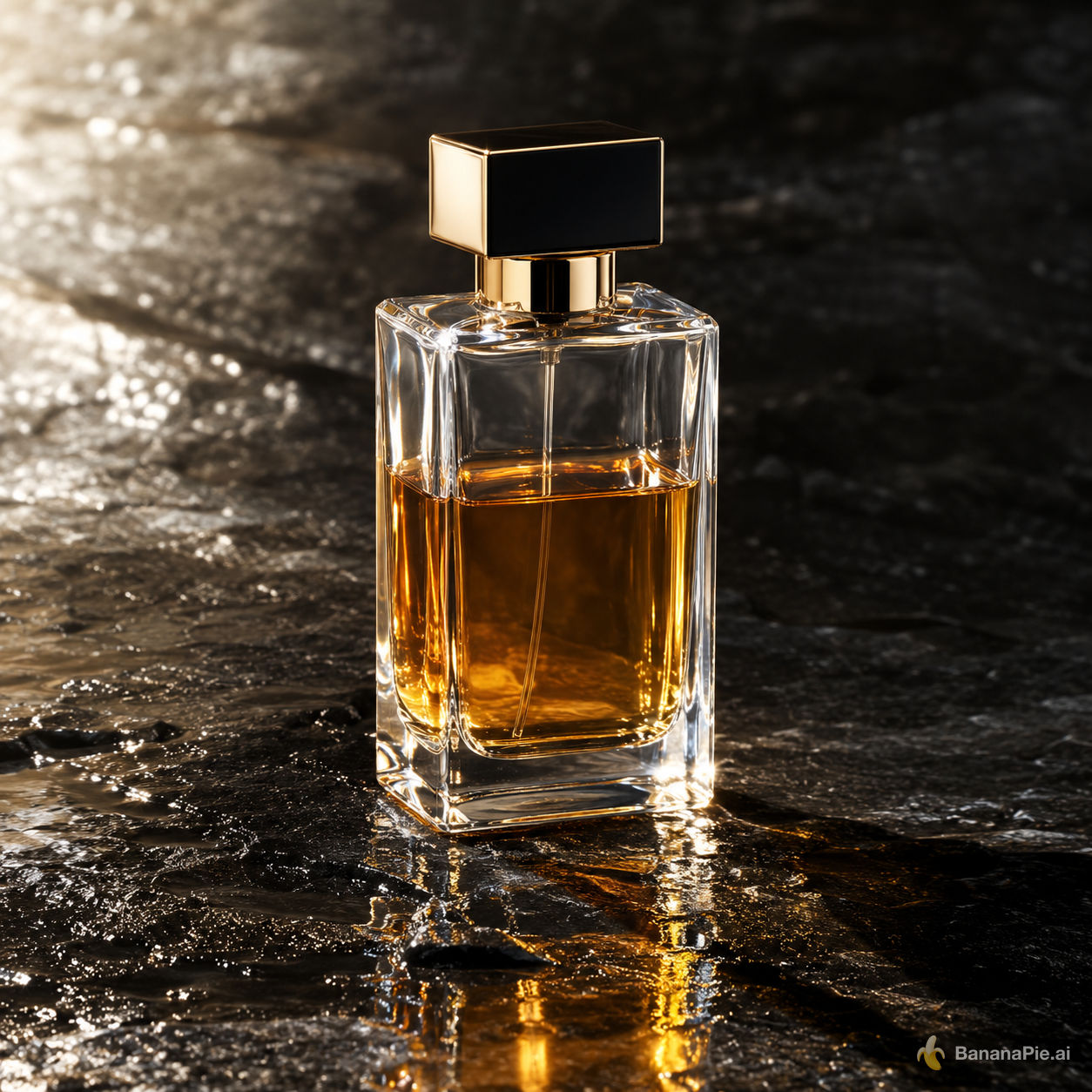
Product material and lighting
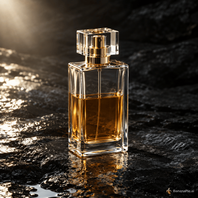
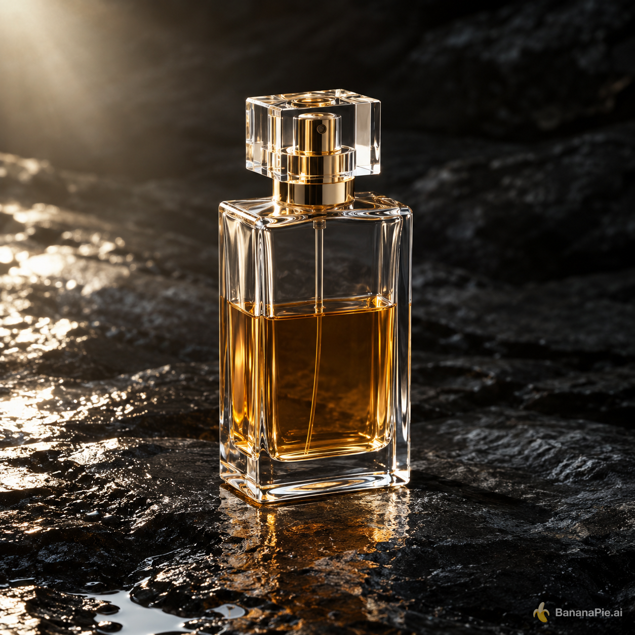
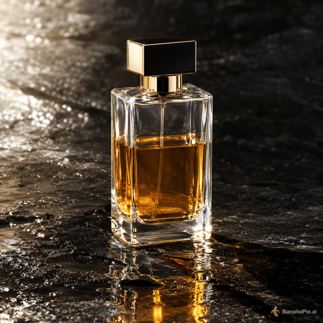
Better here: GPT Image 2.5 FlareLeft more closely satisfies the requested half fill and gives the bottle a more coherent, restrained reflection on the wet stone. Both handle the single-object composition and upper-left lighting well.
- Exactly one transparent rectangular perfume bottle is visible, with no text, logo, or extra objects: tie. Both images show one upright rectangular glass perfume bottle and no visible text, logo, plants, or separate props.
- The bottle is visibly filled halfway with amber liquid: left does better. Its liquid line sits closer to the midpoint of the main bottle body, while the right bottle appears somewhat more than half full.
- The glass refraction and the reflection on the wet black stone are physically coherent: left does better. Its thick glass edges, liquid boundary, internal tube distortion, and reflection beneath the bottle align more convincingly; the right has a broader, brighter amber reflection that looks less subtle and less directly shaped by the bottle.
- Upper-left lighting produces consistent highlights and a plausible contact shadow: tie. Both show strong upper-left illumination, bright highlights on the left-facing glass and cap edges, firm contact at the base, and shadows extending toward the right.
Prompt & settings used
Prompt
A premium product photograph of exactly one transparent rectangular perfume bottle, half filled with amber liquid, standing upright on wet black stone. Light comes from the upper left, creating coherent refraction, a contact shadow, and one subtle reflection. No text, logo, plants, or extra objects.
Multilingual typography
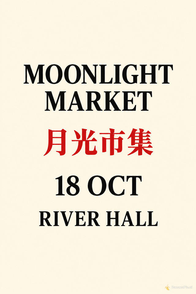
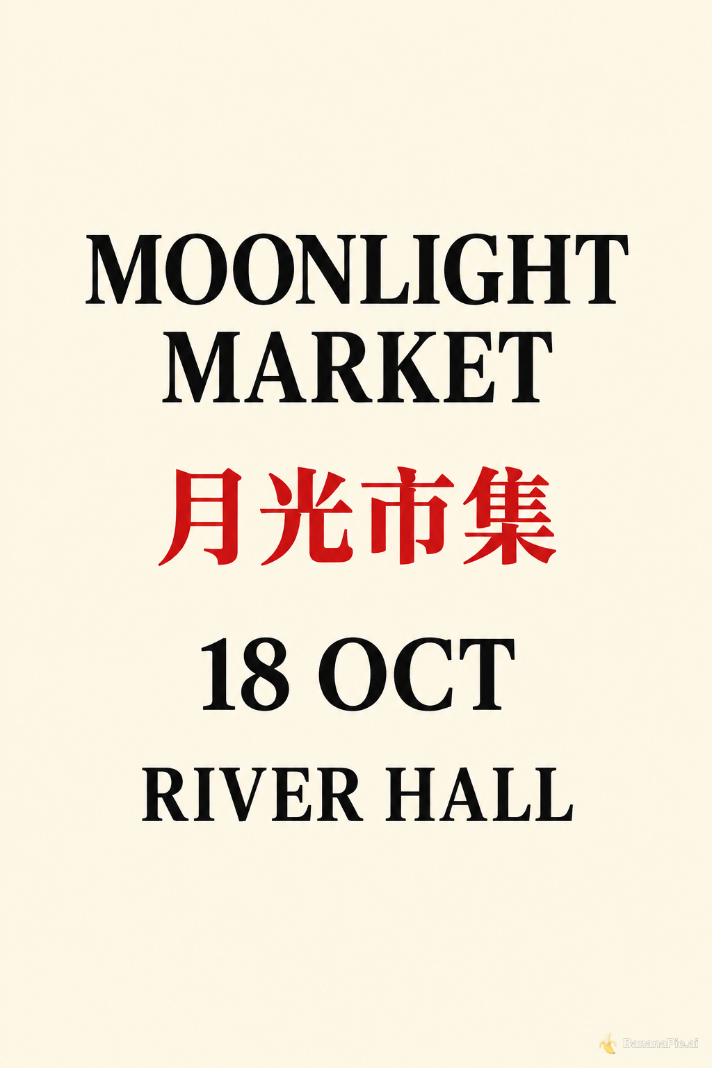
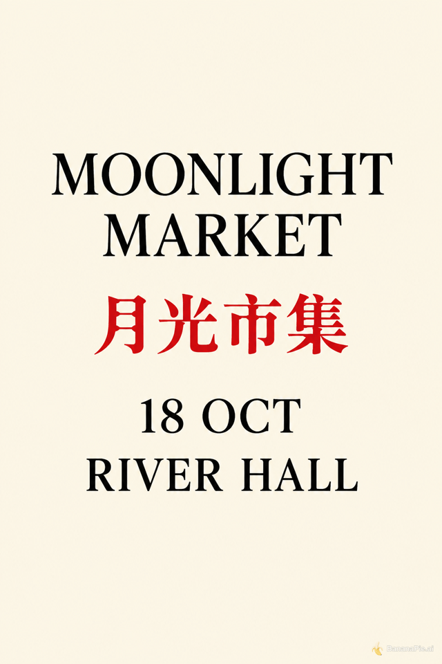
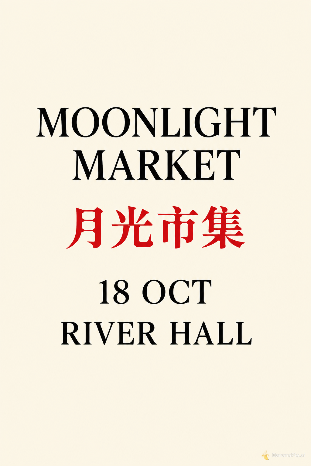
Depends on the taskBoth outputs are effectively identical in their strengths and their main failure: all wording and colors are correct, but "MOONLIGHT MARKET" wraps onto two visible lines, producing five lines instead of exactly four.
- Exactly four centered text lines: Tie. Both posters contain no additional text, but each uses five visible lines because "MOONLIGHT" and "MARKET" are rendered on separate lines, followed by "月光市集", "18 OCT", and "RIVER HALL".
- Exact wording and order: Tie. Both render "MOONLIGHT MARKET", "月光市集", "18 OCT", and "RIVER HALL" in the requested order, with "MOONLIGHT MARKET" wrapped across two lines.
- Text colors: Tie. In both posters, "月光市集" is red, while "MOONLIGHT MARKET", "18 OCT", and "RIVER HALL" are black.
- Legibility, spacing, and alignment: Tie. Both have crisp, legible text centered on the poster with similar visual alignment and broadly even spacing; neither has a clear advantage.
Prompt & settings used
Prompt
Design a clean cream-colored vertical event poster. Show exactly four centered text lines and no other text: "MOONLIGHT MARKET", "月光市集", "18 OCT", and "RIVER HALL". Render "月光市集" in red and all other lines in black.
Human anatomy and contact
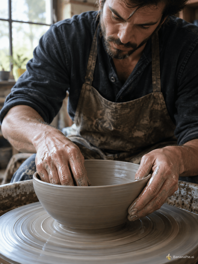
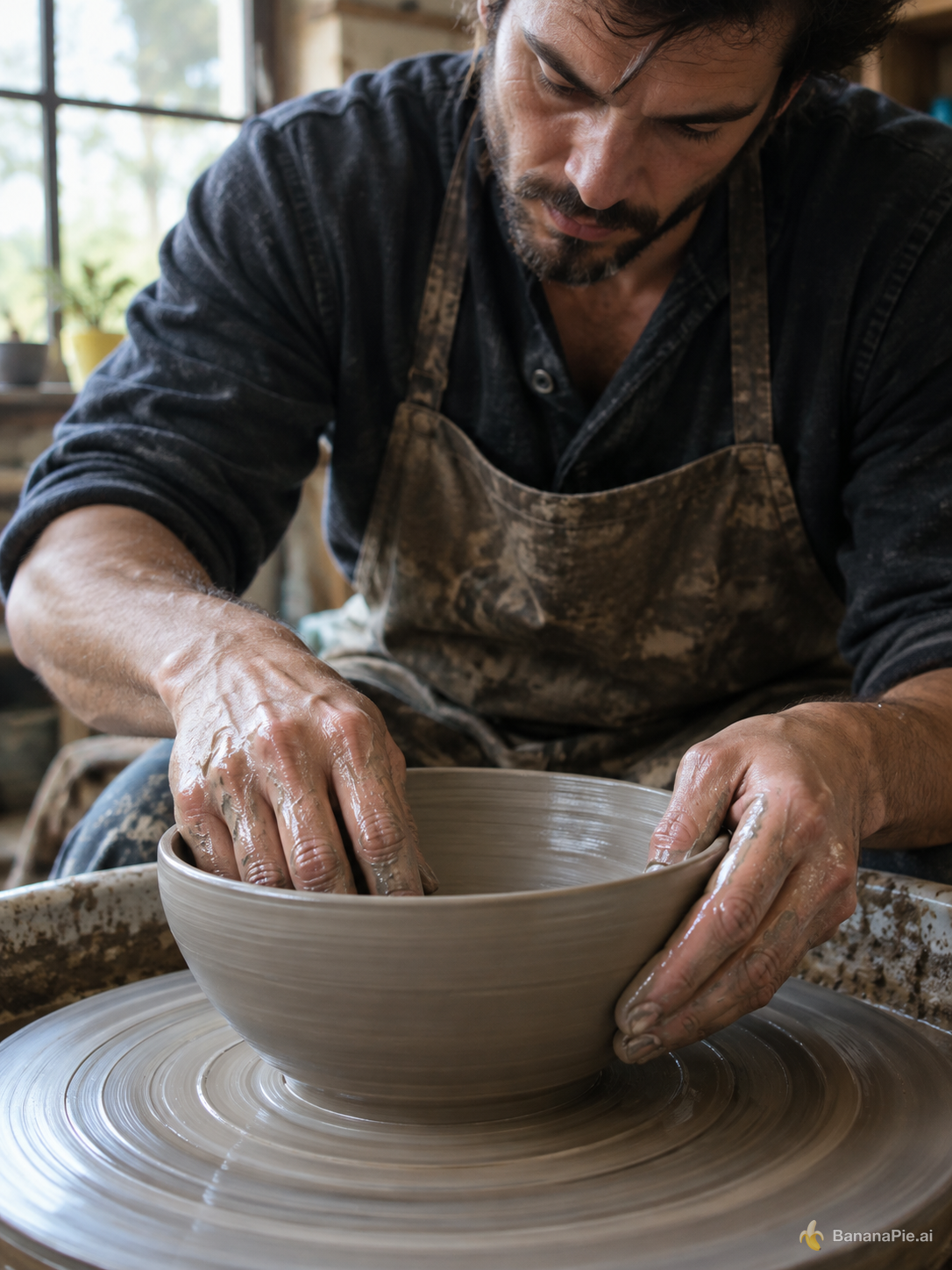
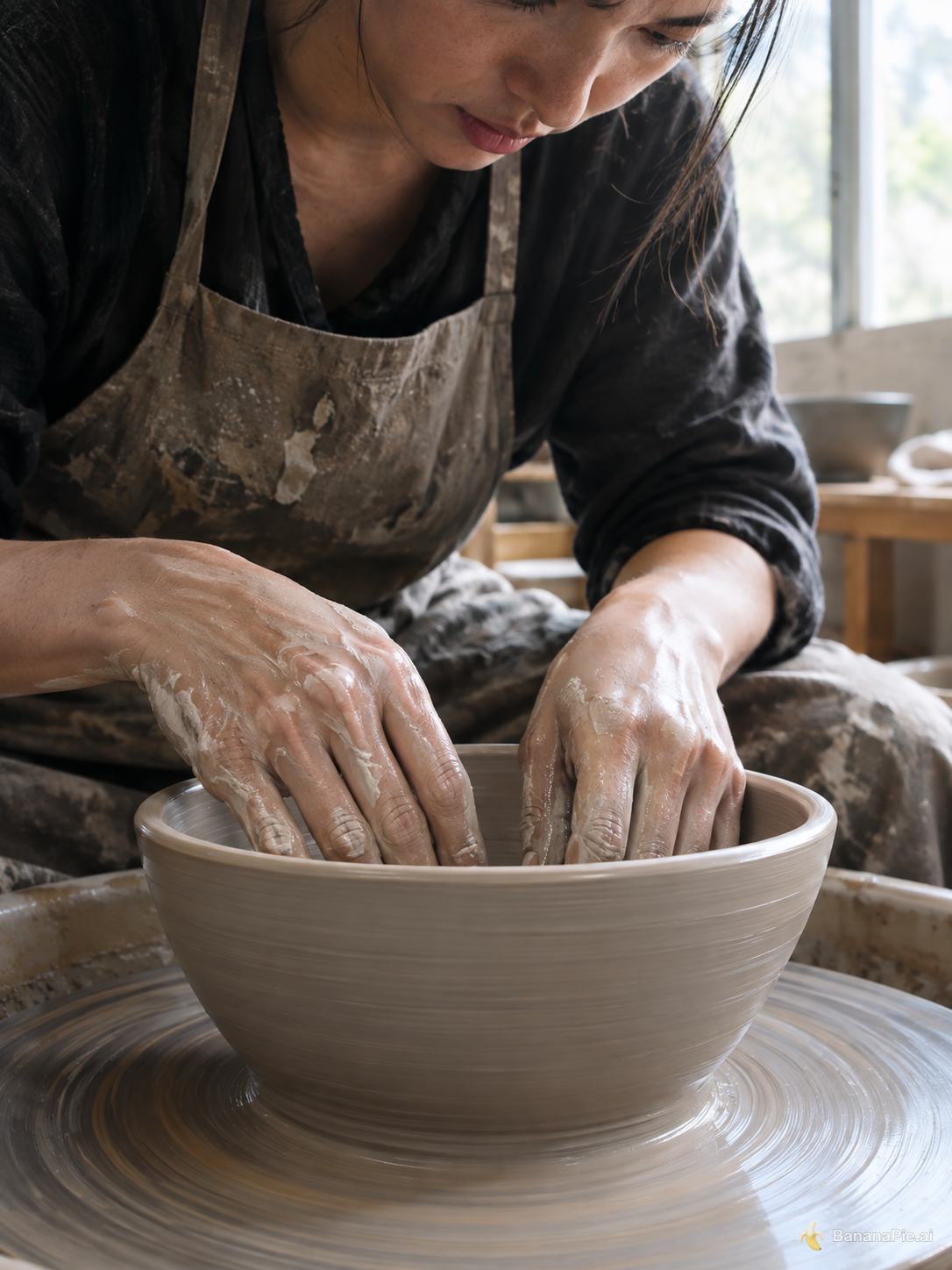
Better here: GPT Image 2.5 FlareLeft more clearly satisfies the anatomy and contact requirements. It shows a convincing two-handed shaping posture and makes the finger structure easier to inspect, although some fingers remain overlapped or partially hidden.
- Exactly two fully visible hands are present, with no extra hands or people: Left does better. Both images show one potter and exactly two hands, but Left presents the outside hand more completely; in Right, substantial portions of both hands are hidden inside the bowl.
- Each hand has exactly five distinct, naturally formed fingers: Left does better. Its outside hand shows a thumb and four overlapping fingers, while the fingers of the hand inside the bowl are still comparatively distinguishable. In Right, the thumbs are obscured and only four fingers on each hand can be clearly distinguished.
- The fingers, joints, and contact with the clay are anatomically plausible: Left does better. The inner hand shaping the interior and the opposing hand supporting the exterior form a convincing grip, with natural joint bends. Right's hands are broadly plausible, but the crowded, nearly parallel fingers inside the bowl make their contact and separation less clear.
- The clay bowl, spinning wheel, and shaping action are clearly recognizable: Left does better. The bowl and wheel are prominent in both, but Left more clearly depicts the standard shaping action with one hand inside and one supporting the outer wall; Right places both hands inside the bowl.
Prompt & settings used
Prompt
A photorealistic close-up of an adult potter shaping a clay bowl on a spinning wheel. Both hands are fully visible, each with five natural fingers touching the clay. No other people or hands. Soft window light.
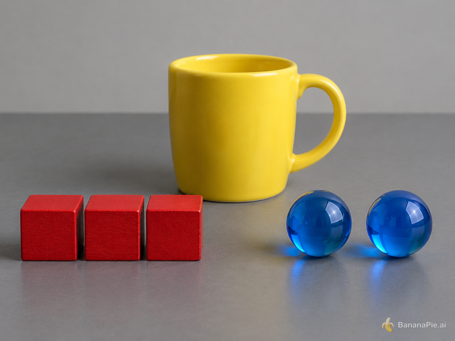
Counting and attribute binding
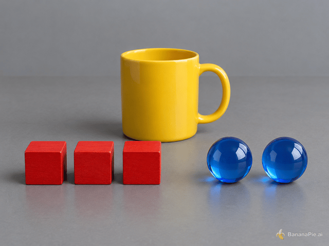
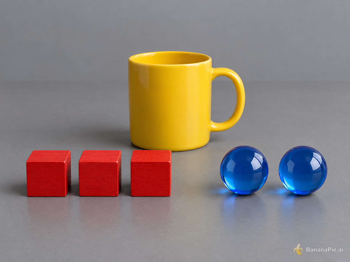
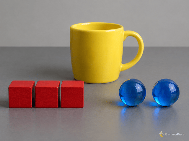
Depends on the taskBoth images satisfy all four criteria with no meaningful visible compliance difference.
- Object count and placement: Tie. Both images visibly show exactly three red cubes in a row on the left, exactly two blue spheres on the right, and one yellow mug centered behind the groups.
- Attribute binding: Tie. In both images, the cubes are red with a visible wooden texture, the spheres are blue and transparent reflective glass, and the mug is yellow with a glossy ceramic appearance.
- Mug handle direction: Tie. The mug handle is clearly visible on the right side in both images.
- No additional objects or text: Tie. Neither image contains any visible extra objects or text.
Prompt & settings used
Prompt
On a matte gray table, exactly three red wooden cubes form a row on the left, exactly two blue glass spheres sit on the right, and one yellow ceramic mug stands centered behind them. The mug handle points right. No other objects or text.
Advertising composition
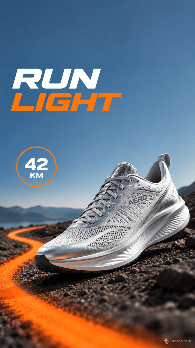
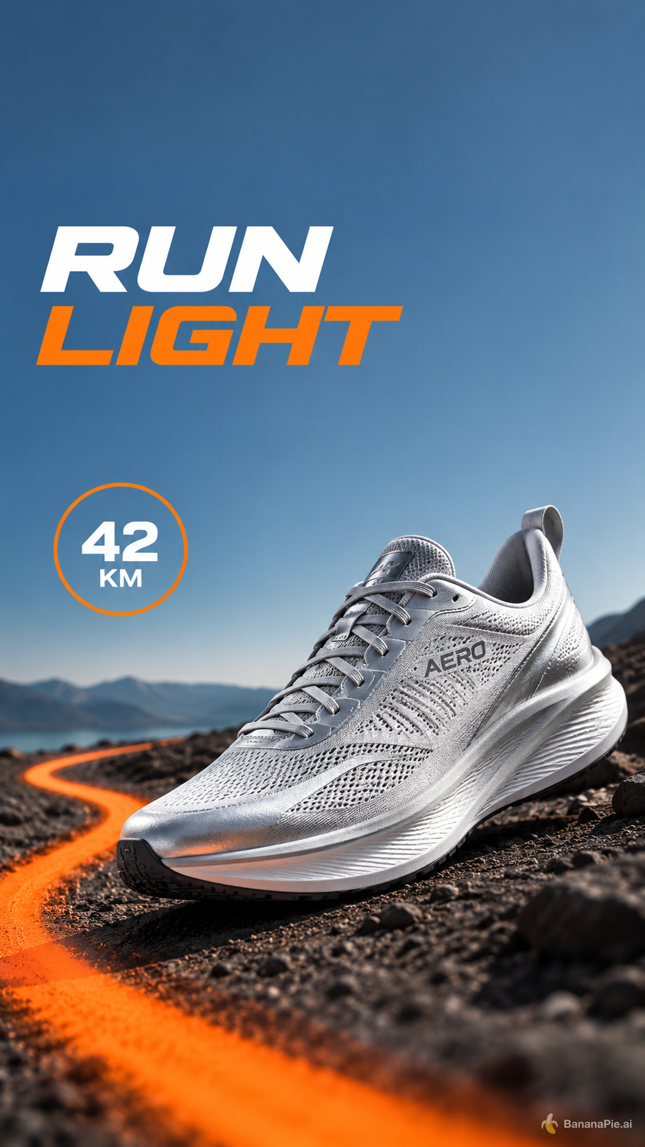
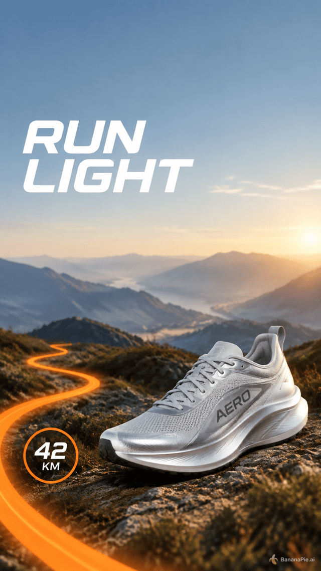
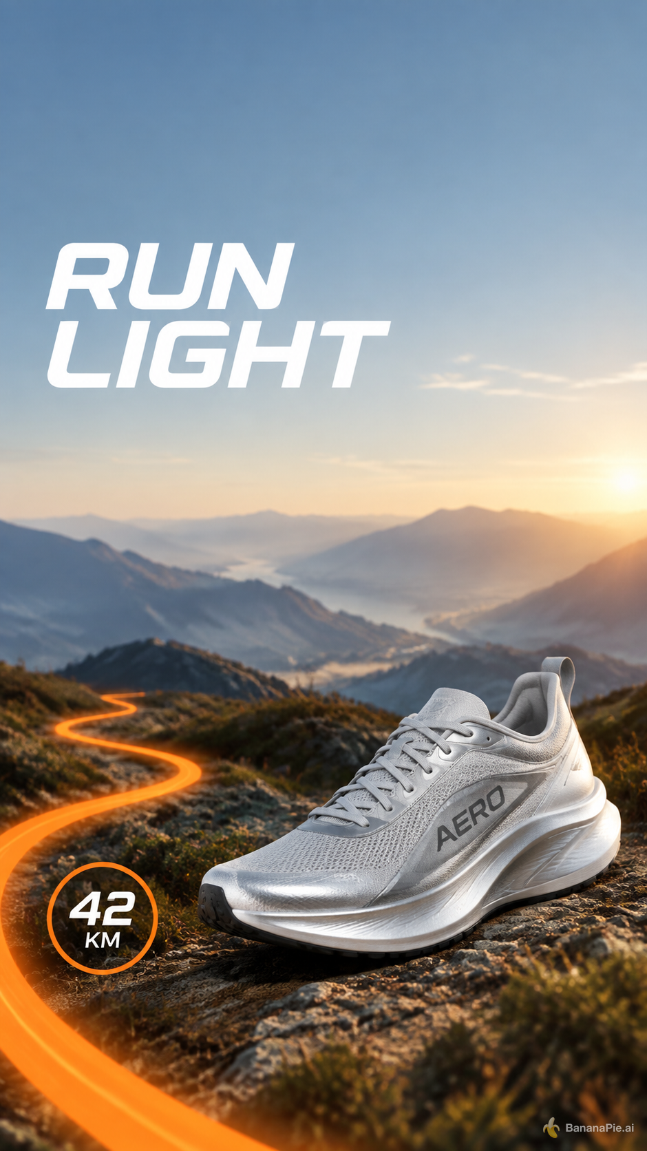
Better here: GPT Image 2.5 SunburstRight follows the requested lower-right product placement and establishes the clearer overall hierarchy, though both violate the text restriction by displaying "AERO" on the shoe.
- Exactly one silver shoe and orange trail: Right does better. Both show exactly one silver shoe and an orange trail entering from the bottom-left, but Right places the shoe more clearly within the lower-right; Left's larger shoe extends substantially toward the center.
- Visible text: Tie. Both correctly render "RUN LIGHT" and "42 KM", but both also visibly render "AERO" on the shoe, so neither satisfies the requirement that those be the only visible text.
- Top spacing and headline placement: Tie. Both leave a visibly uncluttered area at the top and position "RUN LIGHT" in the upper-left directly beneath that space.
- Visibility and hierarchy: Right does better. Its shoe, trail, badge, and headline are all clearly separated and fully visible, with a cleaner progression from headline to landscape to product; Left's oversized shoe and heavier headline compete more strongly for attention.
Prompt & settings used
Prompt
Create a vertical social ad for a fictional running shoe named AERO. Keep the top 15 percent empty. Directly below it, place the headline "RUN LIGHT" in the upper-left. Show exactly one silver shoe in the lower-right, an orange trail curving from the bottom-left, and a round badge reading "42 KM". No other shoes or text.
Structured UI graphic
Depends on the taskBoth images satisfy the title, column, row, button, and alignment requirements equally well. Both also add comparable extra plan-detail text, so neither has a clear overall advantage.
- Title and columns: Tie. Both show the exact title "CHOOSE YOUR PLAN" and exactly three columns labeled "STARTER", "PRO", and "TEAM".
- Rows: Tie. Every column in both images contains exactly three aligned rows labeled "PROJECTS", "STORAGE", and "SUPPORT".
- Buttons: Tie. Every column in both images has exactly one blue button labeled "SELECT".
- Alignment and additional text: Tie. Both have three evenly aligned columns, but both violate the no-additional-text requirement by adding plan details. Left renders "5", "10 GB", "Email", "25", "100 GB", "Priority", "Unlimited", "1 TB", and "24/7"; right renders "3", "5 GB", "Email", "10", "50 GB", "Priority", "Unlimited", "1 TB", and "24/7".
Prompt & settings used
Prompt
Create a clean horizontal pricing comparison graphic titled "CHOOSE YOUR PLAN". Use exactly three equal columns labeled "STARTER", "PRO", and "TEAM". Under each column, show exactly three aligned rows labeled "PROJECTS", "STORAGE", and "SUPPORT", followed by one blue button labeled "SELECT". White background, dark navy text, no additional columns or text.




Six-reference object binding and edit
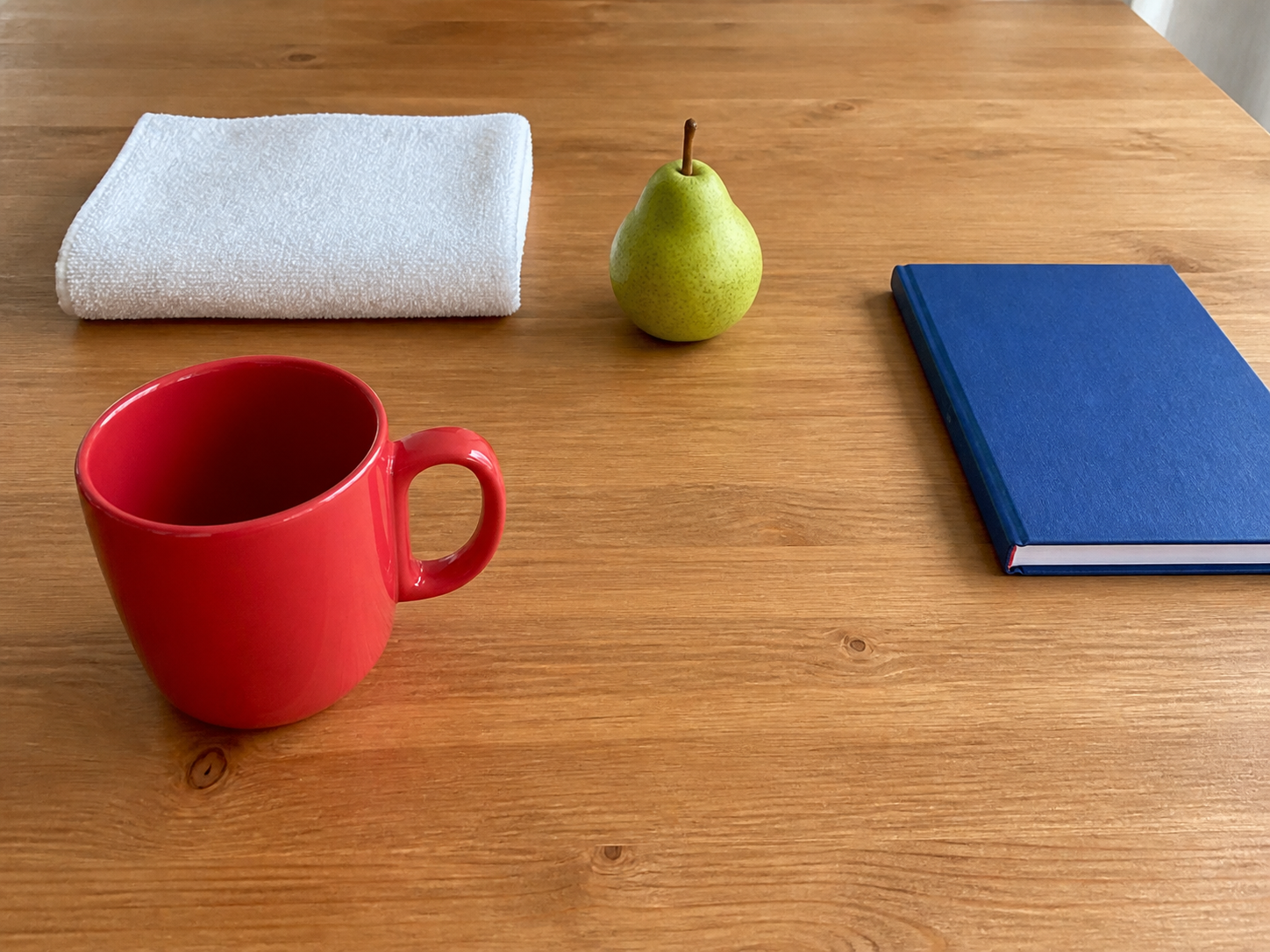
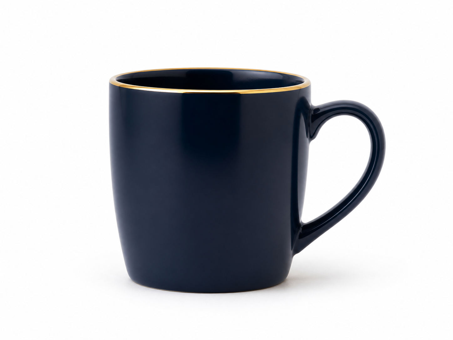
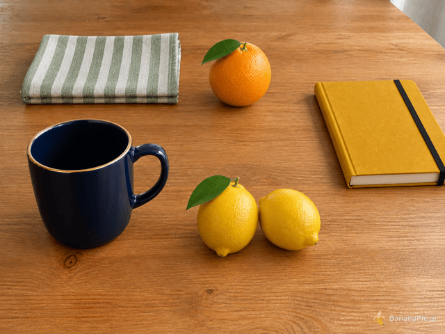
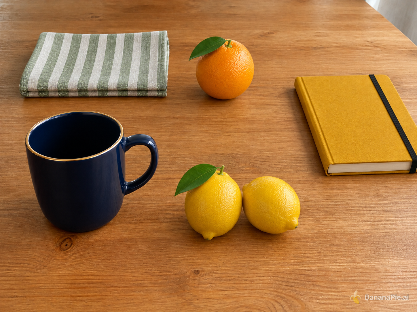
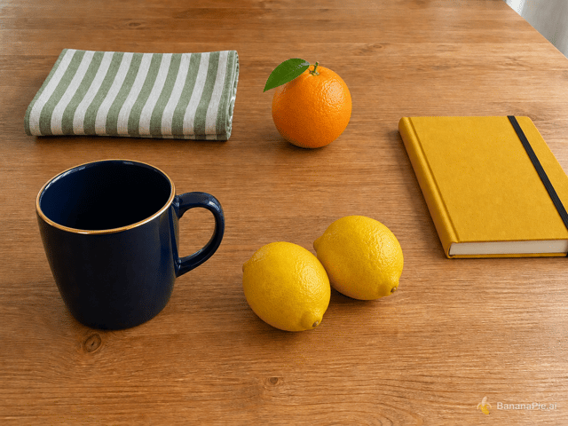
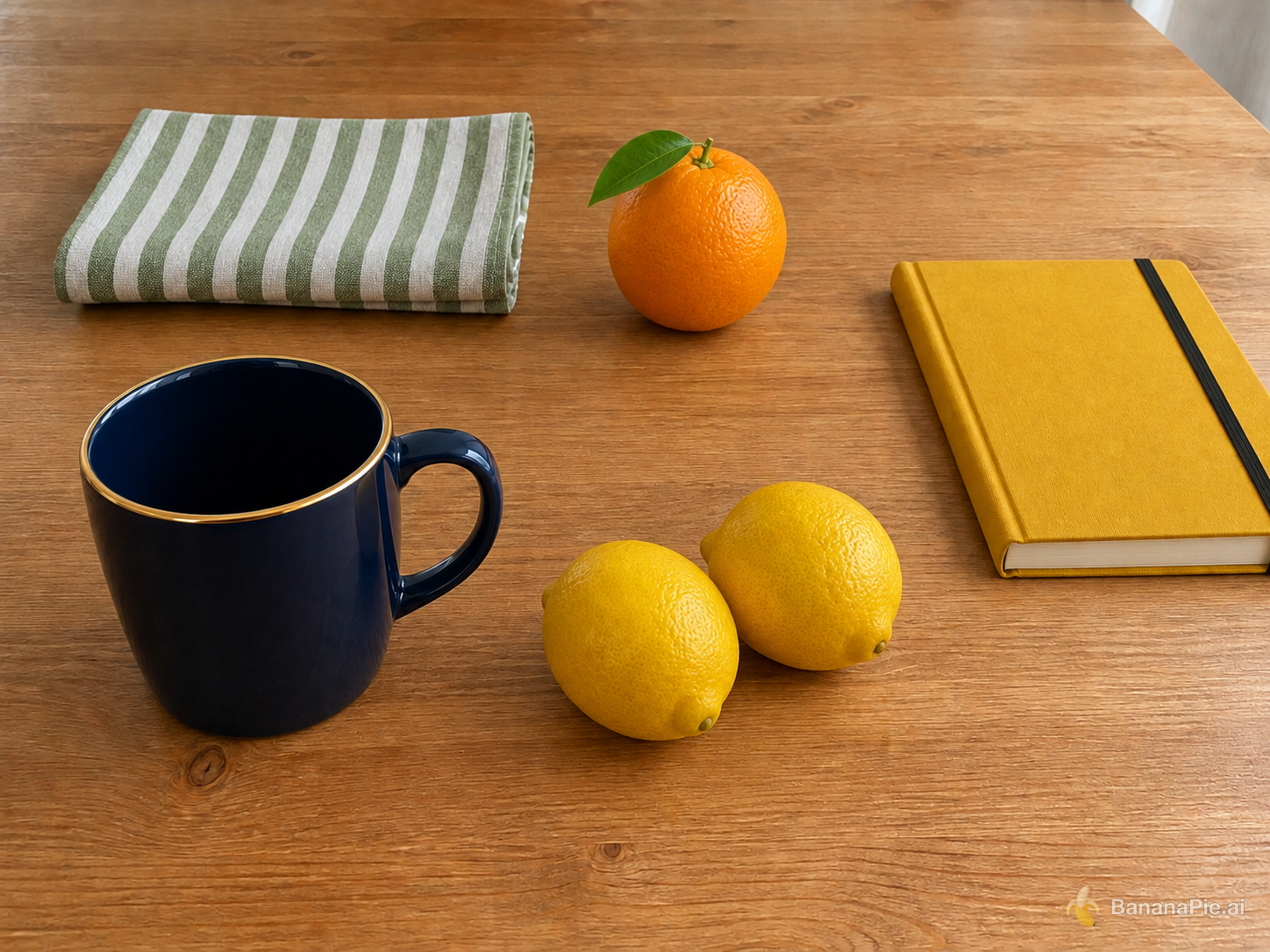
Better here: GPT Image 2.5 SunburstRIGHT is the stronger edit overall. It preserves the base composition and replacement positions more faithfully, while LEFT has the more reference-accurate lemon pair because it retains the leaf.
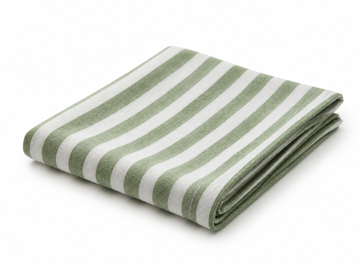
- Red mug and white towel replacement: RIGHT does better. Both replace the originals with a navy mug with gold rim and a folded green-and-white striped napkin, but RIGHT keeps the napkin and mug slightly closer to their base positions and proportions.
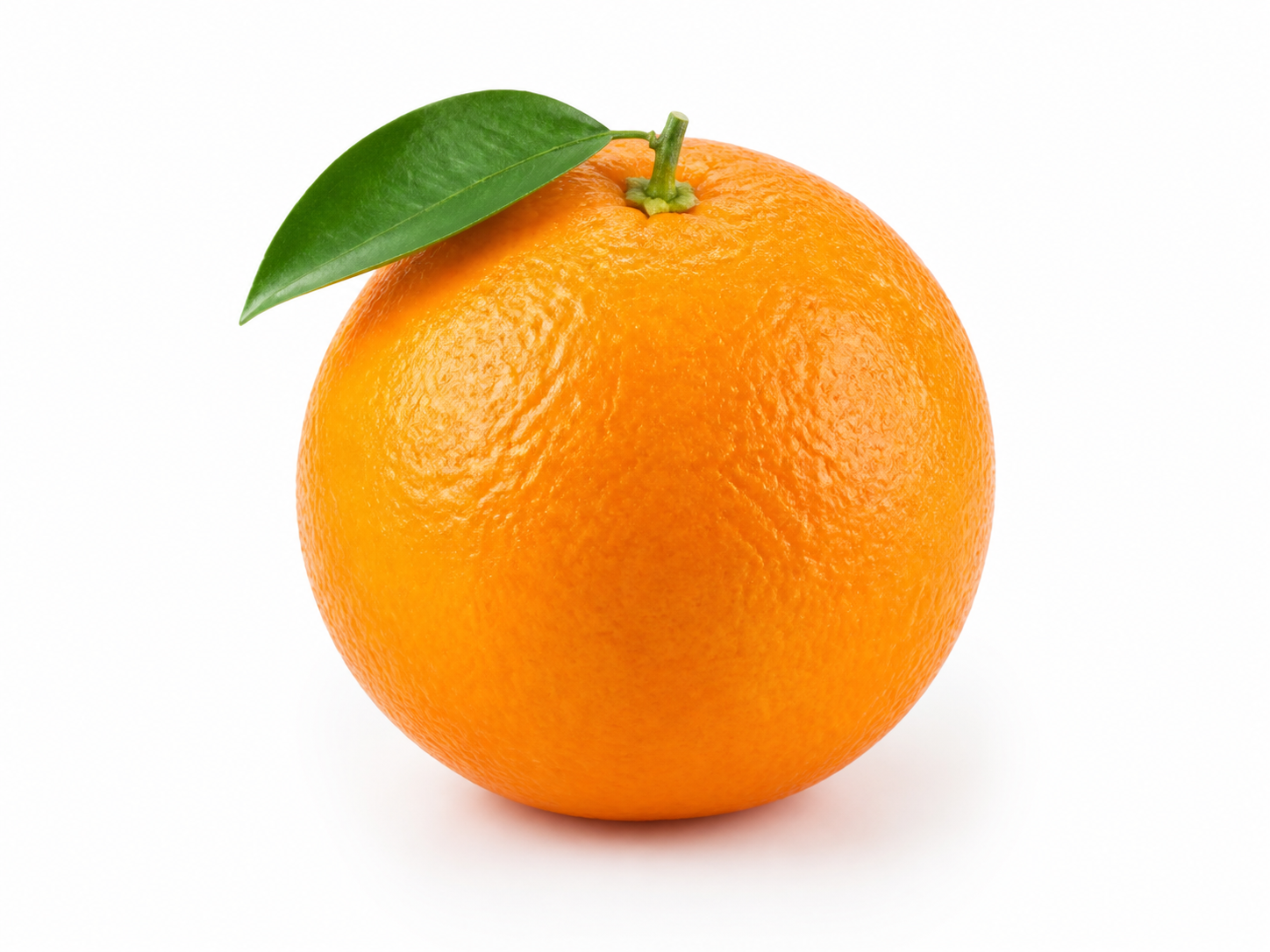
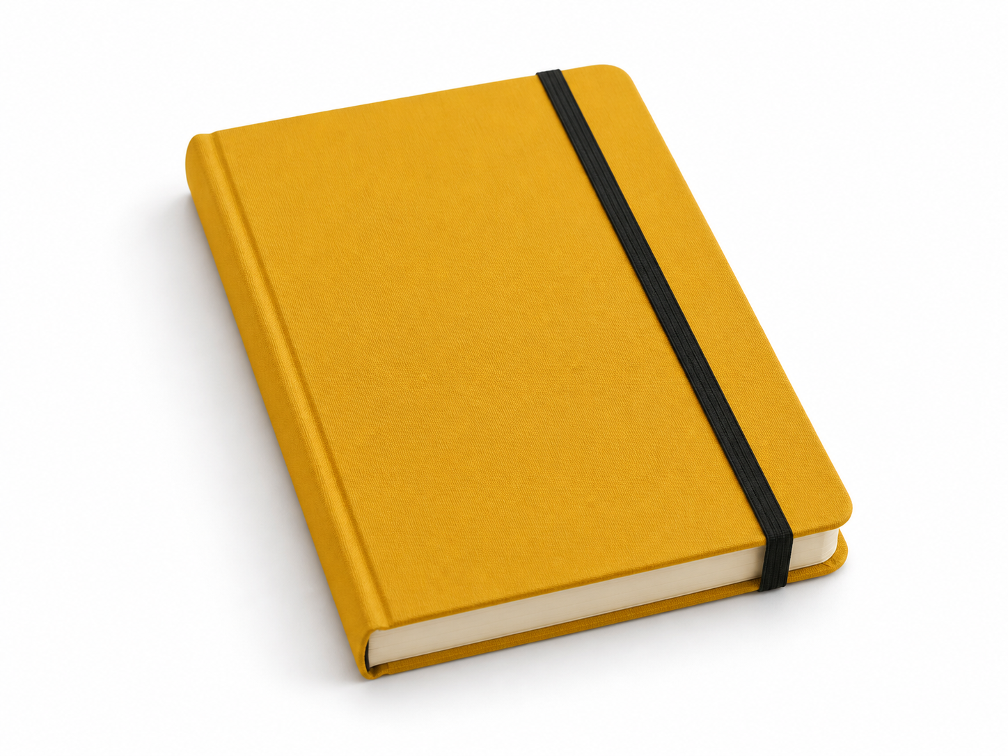
- Green pear and blue notebook replacement: RIGHT does better. Both fully remove the pear and blue notebook and show exactly one leafy orange plus a mustard-yellow hardcover notebook with a black band, but RIGHT places both replacements closer to the corresponding objects in Reference 1; LEFT shifts them noticeably upward.
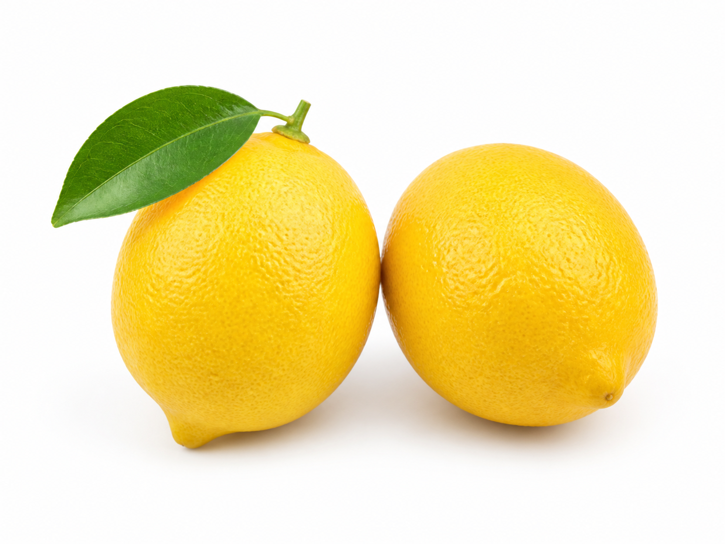
- Two lemons: LEFT does better. Both show exactly two lemons to the right of the mug with no extra objects, but LEFT retains the distinctive leaf on the left lemon from Reference 6, while RIGHT omits it.
- Base-scene preservation: RIGHT does better. Both preserve the tabletop, framing, wood grain, and general lighting, but RIGHT more closely maintains the original spacing and placement of the towel, fruit, and notebook; LEFT moves several objects farther upward.
Reference images

Prompt & settings used
Prompt
Use Reference 1 as the base tabletop scene. Replace the red mug with the exact dark navy-blue mug from Reference 2 in the same position and orientation. Replace the folded white towel with the exact green-and-white striped napkin from Reference 3 in the same folded area. Replace the green pear with exactly one orange from Reference 4 in the same position. Replace the blue notebook with the exact mustard-yellow hardcover notebook from Reference 5 in the same position. Add exactly the two lemons from Reference 6 to the right of the mug. Preserve the wooden table, camera, framing, wood grain, lighting, shadows, and all other spatial relationships from Reference 1. Do not copy the white product backgrounds from References 2–6, duplicate any asset, or add other objects.
In-image text replacement
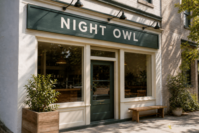
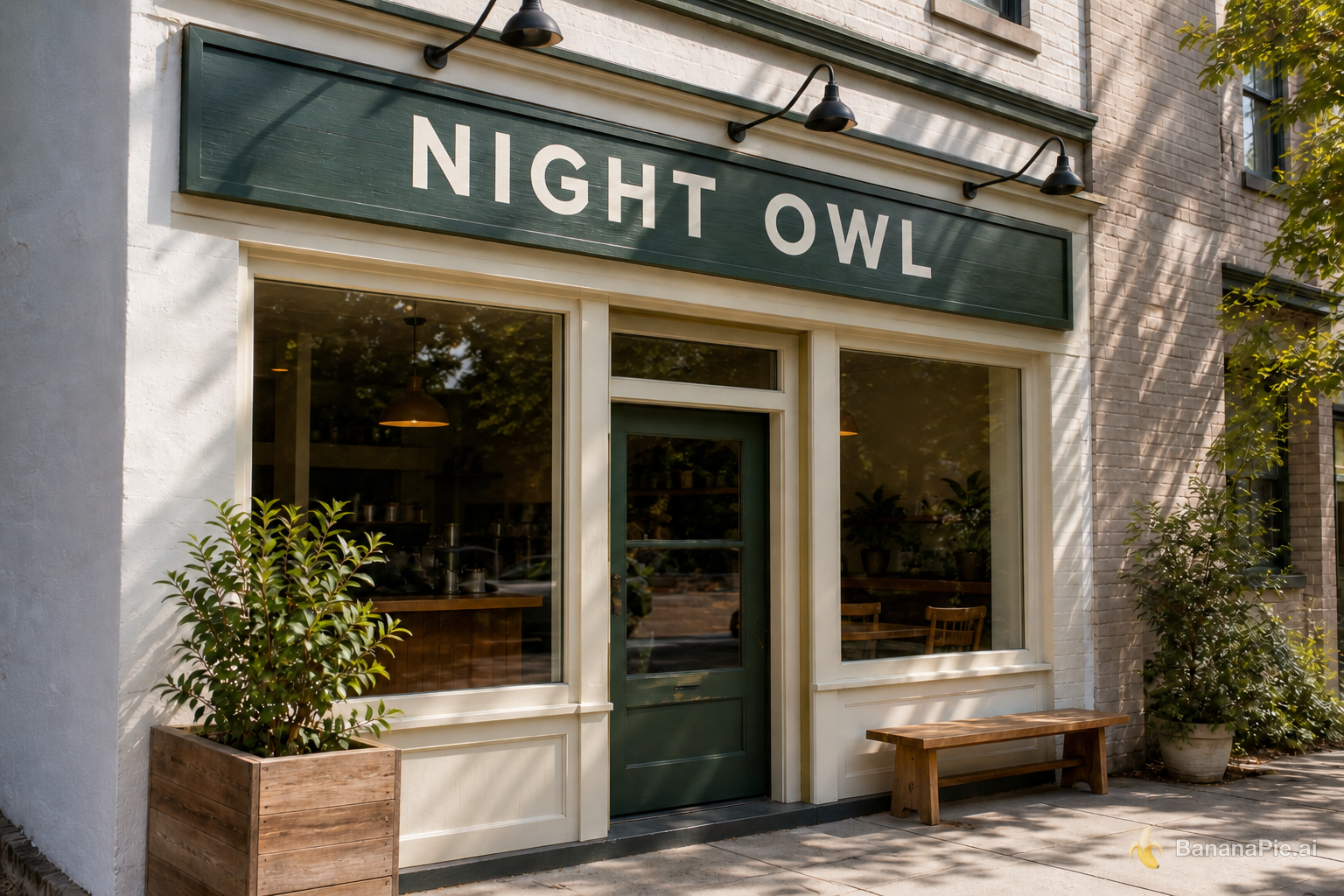
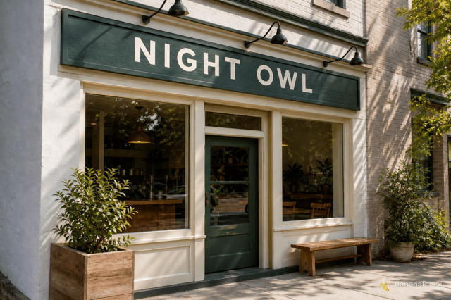
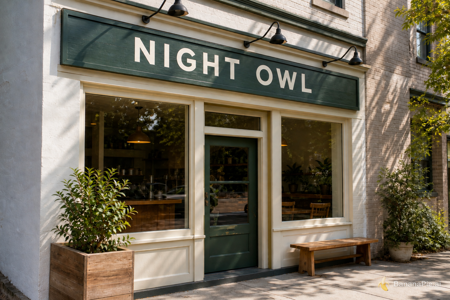
Depends on the taskBoth outputs perform the requested edit cleanly and are visually near-identical across all four criteria.
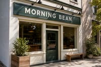
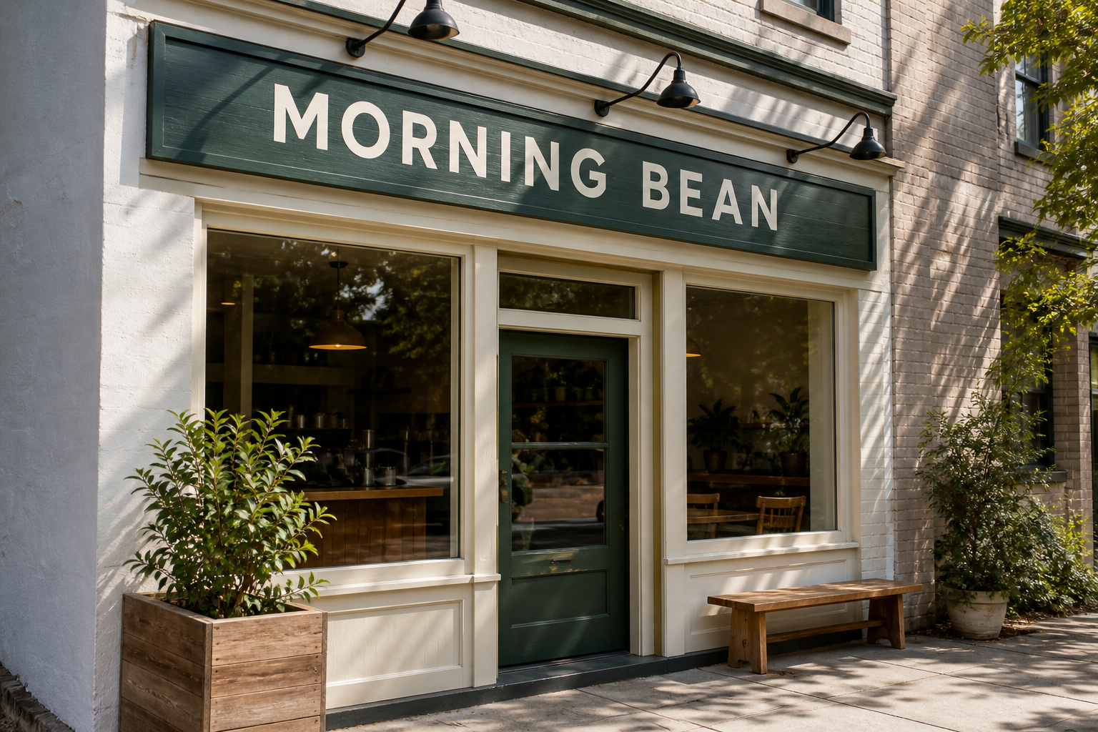
- Exact text replacement: Tie. Both signs read exactly "NIGHT OWL", and the original "MORNING BEAN" is completely gone.
- Character integrity: Tie. Neither sign contains any additional, duplicated, or malformed characters.
- Font, spacing, and perspective preservation: Tie. Both use the same clean uppercase sans-serif character, wide letter spacing, centered word gap, and sign-aligned perspective seen in the reference; any difference between them is marginal.
- Material, lighting, and scene preservation: Tie. Both retain the dark green painted wood grain, cream lettering, directional shadows, storefront, plants, windows, lamps, and surrounding architecture without a visible meaningful change.
Reference images
Prompt & settings used
Prompt
Replace only the sign text with exactly "NIGHT OWL". Preserve the original font style, spacing, perspective, sign material, lighting, and everything else.
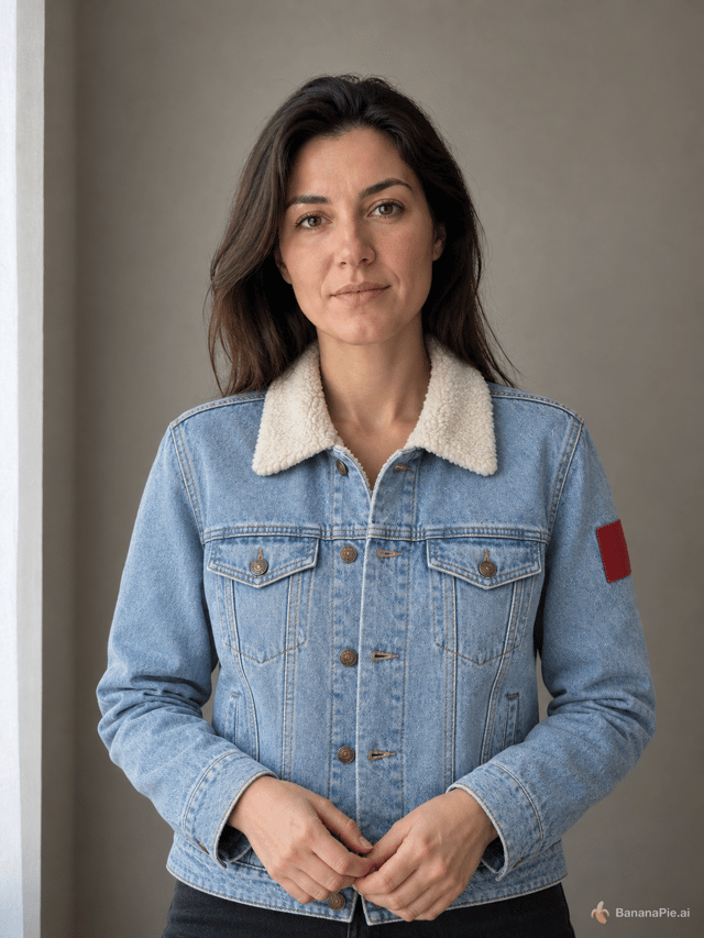
Multi-reference identity and garment transfer
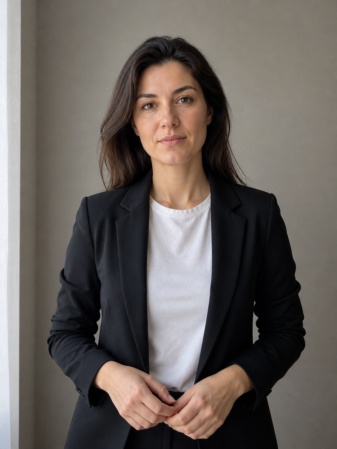
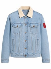
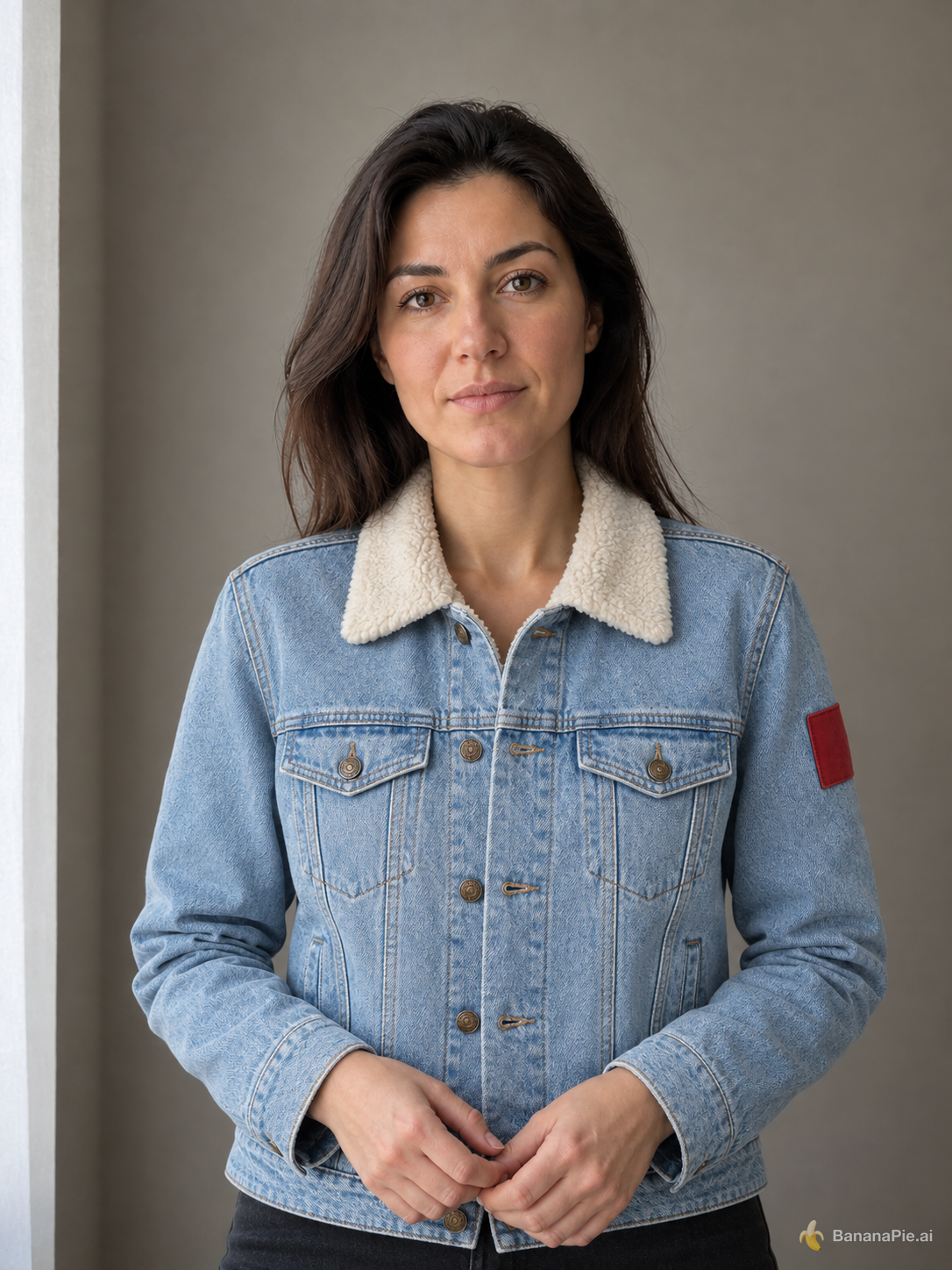
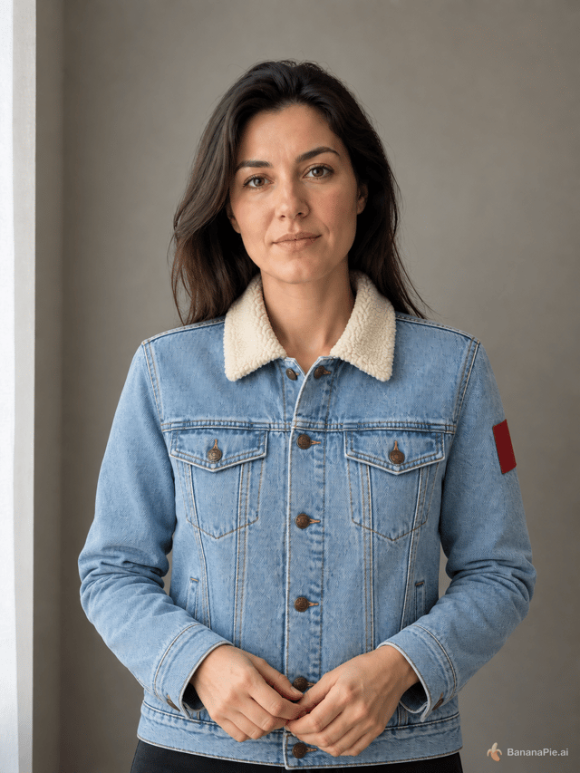
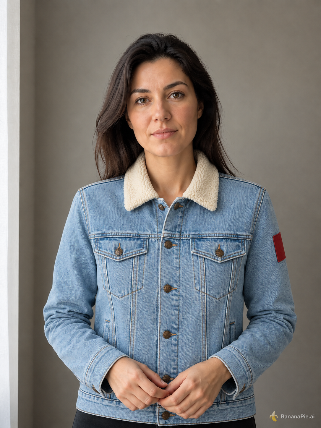
Better here: GPT Image 2.5 SunburstRight delivers the stronger transfer overall: it keeps the person and scene close to Reference 1 while reproducing the jacket's construction and wearing behavior more faithfully.
- Identity, expression, hair, pose, body proportions, and framing: Left is slightly better. Its face, subtle closed-mouth expression, hair silhouette, hand placement, and torso framing more closely preserve Reference 1; Right remains very close but shows slightly more facial smoothing and a small shift in head and shoulder proportions.
- Jacket material, color, collar, buttons, pockets, and sleeve patch: Right is better. Its light-blue denim, compact cream shearling collar, symmetrical flap pockets, central bronze-button arrangement, vertical welt pockets, seam structure, and red upper-sleeve patch are closer to Reference 2. Left enlarges the collar, alters the front closure with conspicuous offset buttonholes, and changes the jacket's proportions.
- Full replacement without mannequin or product background: Both fully replace the black suit jacket and retain the portrait's gray interior background and curtain, with no visible mannequin or white product backdrop. Right is slightly better because fewer closure details resemble an invented hybrid garment.
- Physical coherence of hands, fit, occlusion, shadows, and lighting: Right is better. The jacket fits the shoulders and torso more naturally, the sleeves meet the wrists cleanly, and the folds and shadows respond consistently to the hands and side lighting. Left has bulkier cuffs, more gathered sleeves, and a less convincing split and closure around the hands.
Reference images

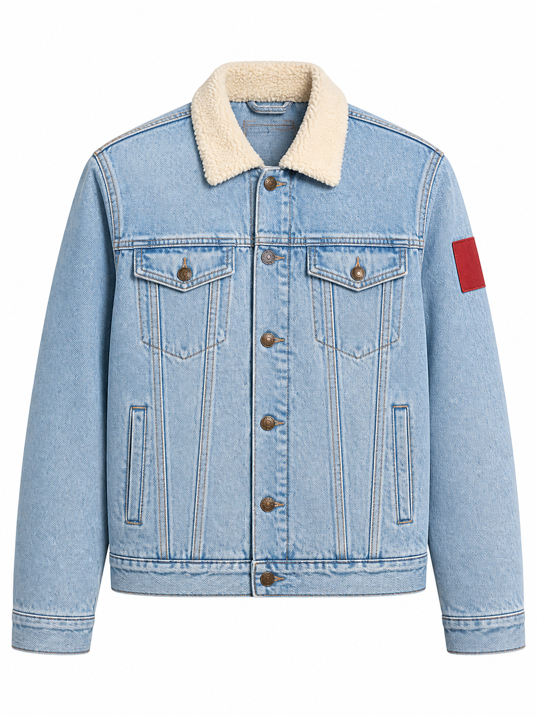
Prompt & settings used
Prompt
Use the portrait in Reference 1 for the person and the isolated jacket in Reference 2 for the garment. Dress the person from Reference 1 in the exact jacket shown in Reference 2. Preserve the person's identity, face, expression, skin, hair, hands, pose, body proportions, background, framing, and lighting from Reference 1. Preserve the jacket's material, color, collar, buttons, pockets, and sleeve patch from Reference 2. Do not copy the ghost mannequin or white product background.
Coherent scene relighting
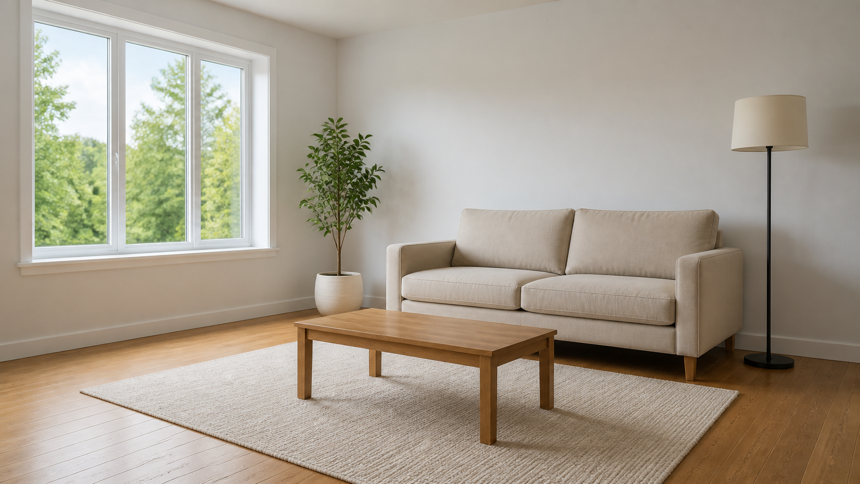
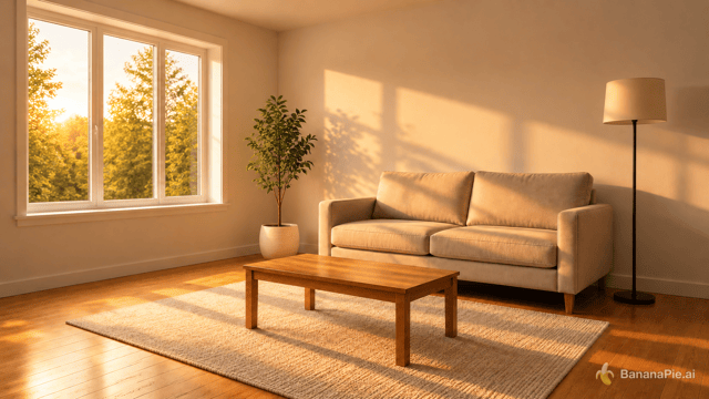
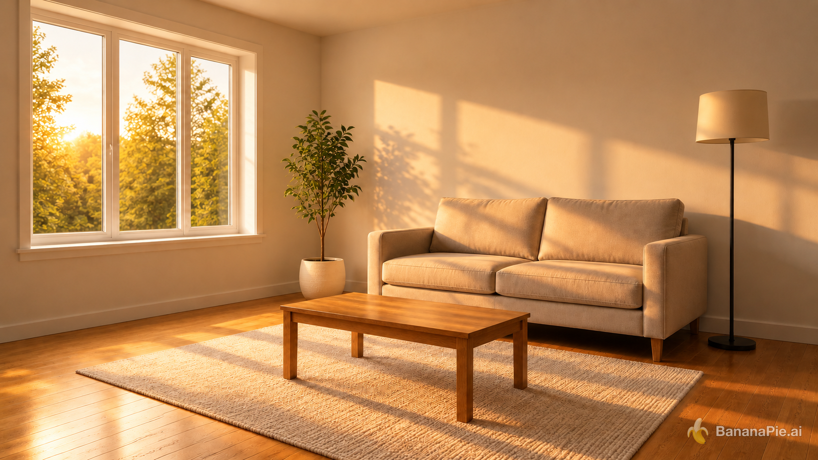
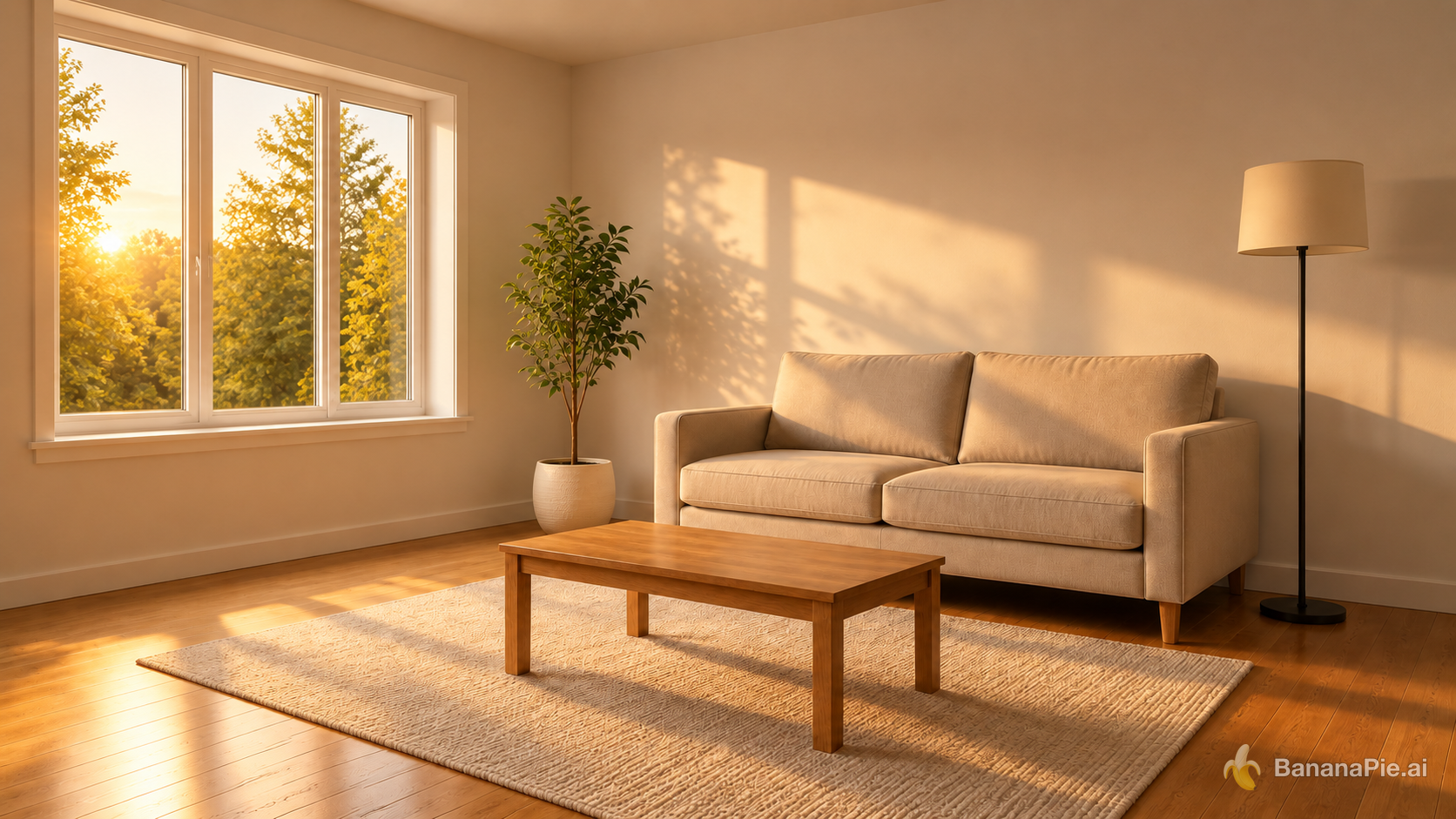
Better here: GPT Image 2.5 FlareLeft has a narrow overall edge because its directional golden-hour illumination and corresponding highlights and shadows are more clearly expressed. Right remains very close and looks somewhat more restrained.
- Warm golden-hour light clearly enters from the left window: Left does slightly better; the bright low sun visible at the left and the stronger golden illumination spreading across the floor, sofa, and wall make the incoming light especially clear.
- Highlights and shadow directions respond coherently to the new light source: Left does slightly better; it shows stronger directional highlights and consistent shadows extending rightward from the table, plant, window frames, and sofa, while Right's corresponding effects are softer but still coherent.
- The result is more than a uniform yellow color filter: Left does slightly better; distinct sunlit patches, projected window-frame and foliage shadows, bright highlights, and retained dark occlusion areas demonstrate a spatial relighting rather than only a global tint. Right also achieves this, but less emphatically.
- No furniture or decor is moved, added, removed, or redesigned: The two are even; both preserve the reference arrangement and appearance of the sofa, coffee table, rug, potted plant, floor lamp, window, and room structure.
Reference images
Prompt & settings used
Prompt
Change the lighting to warm golden-hour sunlight entering from the left window. Do not move, add, remove, or redesign any object. Update highlights and shadows coherently.
Cross-ratio outpainting
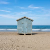
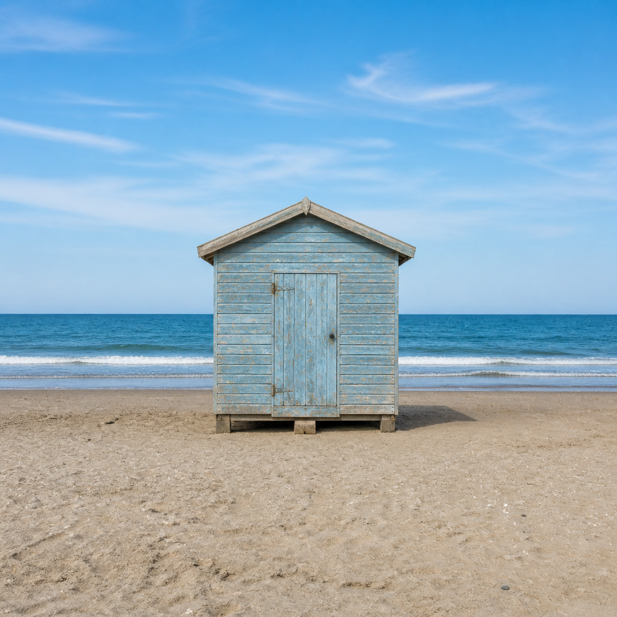
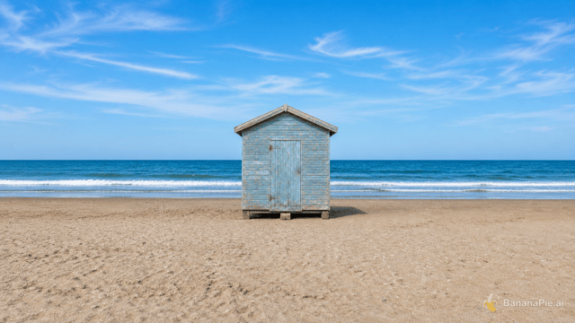
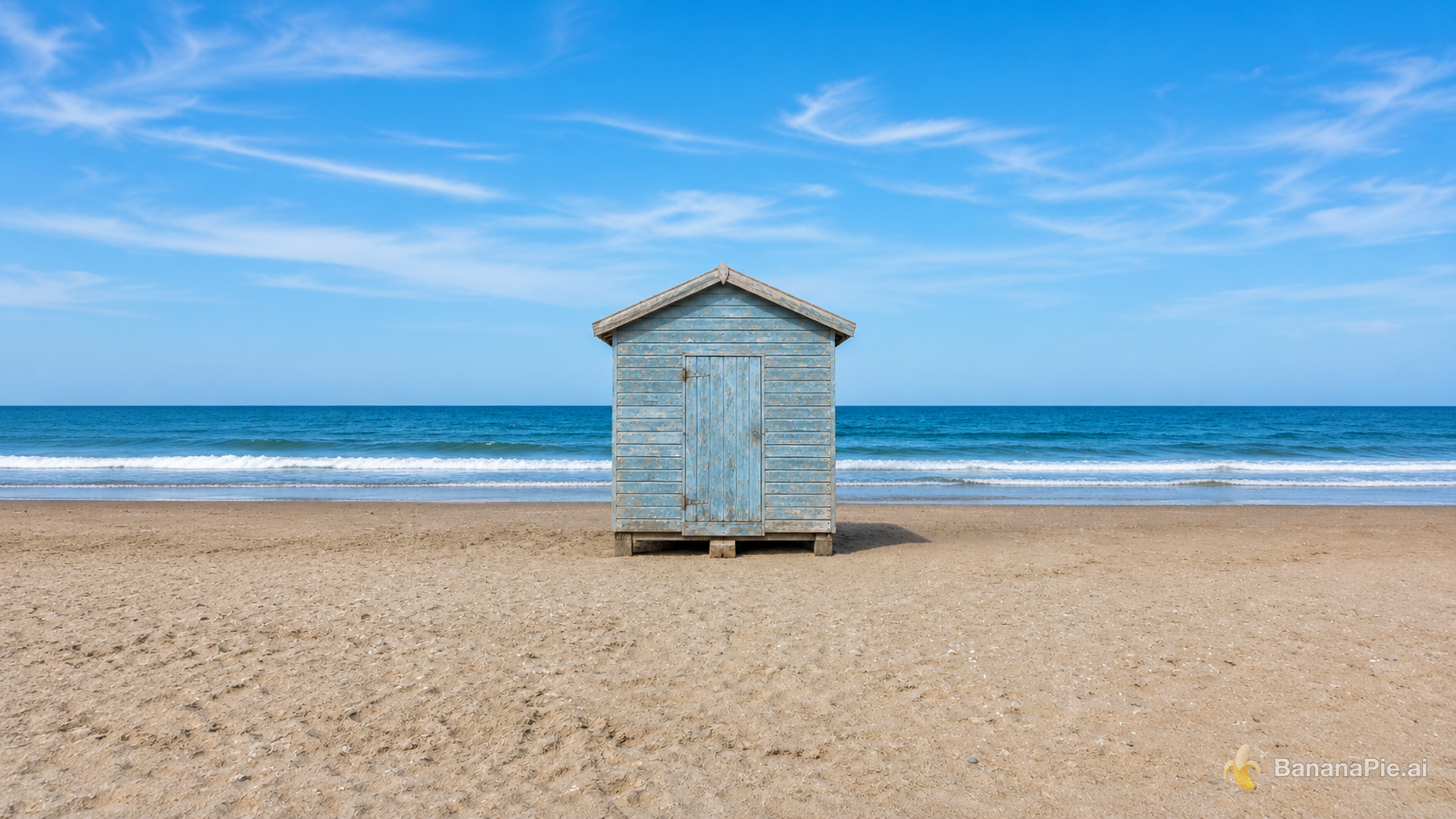
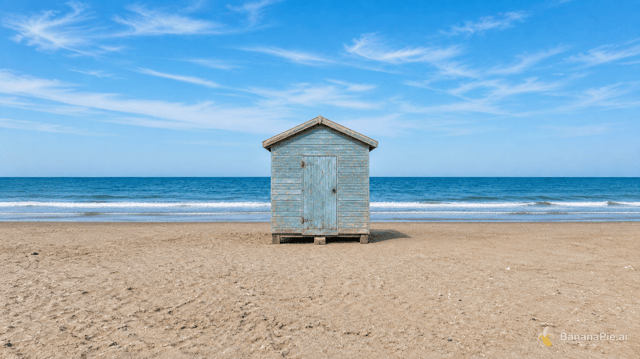
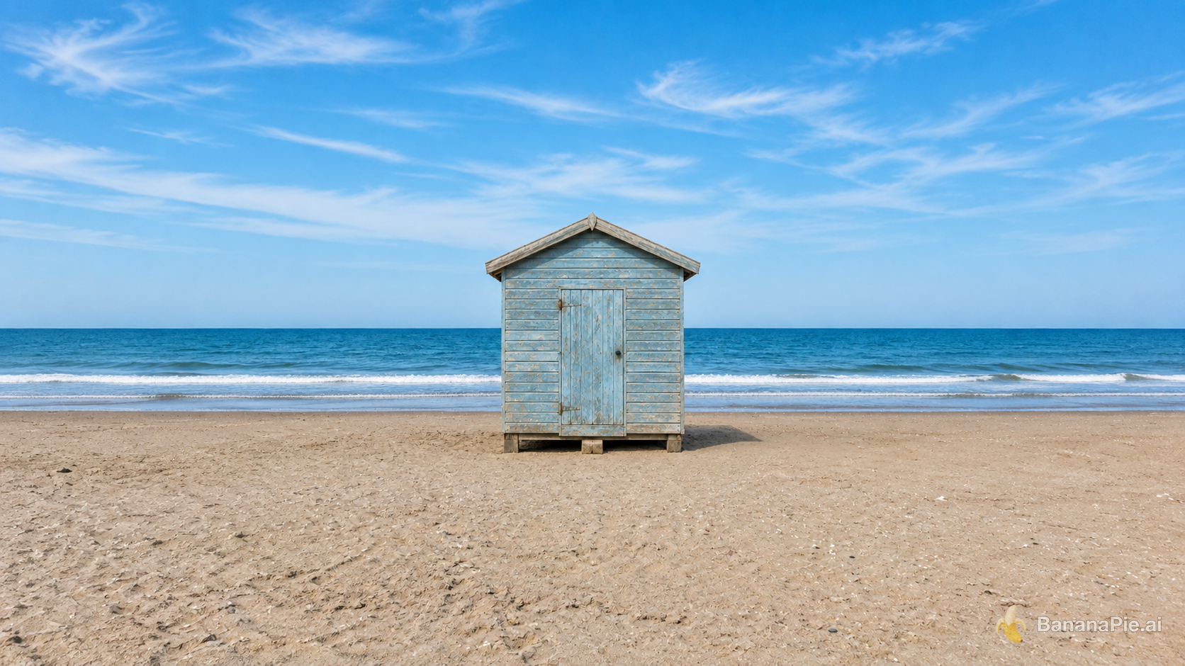
Better here: GPT Image 2.5 SunburstRIGHT wins by a narrow margin. Both create strong landscape extensions, but RIGHT centers the original composition more accurately and produces slightly more natural, consistent side content.
- 16:9 landscape with natural new content on both sides: Both outputs present convincing 16:9 beach extensions across the sky, ocean, and sand; RIGHT is slightly more balanced and natural in the cloud continuation.
- Complete original image centered without cropping or stretching: RIGHT does slightly better because the cabin is more precisely centered, while LEFT places it subtly left of center. Neither shows obvious cropping or stretching.
- Original cabin, shoreline, and internal composition unchanged: RIGHT is slightly closer to the reference, retaining the cabin proportions and visible door hardware more faithfully; LEFT's cabin appears a little narrower and some small door details are less distinct.
- No visible seams, mirrored filler, or repeated objects: RIGHT does slightly better, with consistently varied clouds, waves, and sand. LEFT has a conspicuous swirling cloud formation in the upper-left extension, though neither output shows a hard seam or obvious mirrored repetition.
Reference images
Prompt & settings used
Prompt
Expand the canvas to a 16:9 landscape by naturally continuing the beach, ocean, and sky on both sides. Keep the complete original image centered without cropping, stretching, letterboxing, or modifying it.
Product preservation across scene change
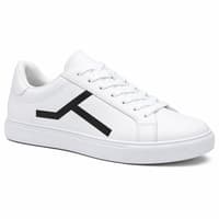
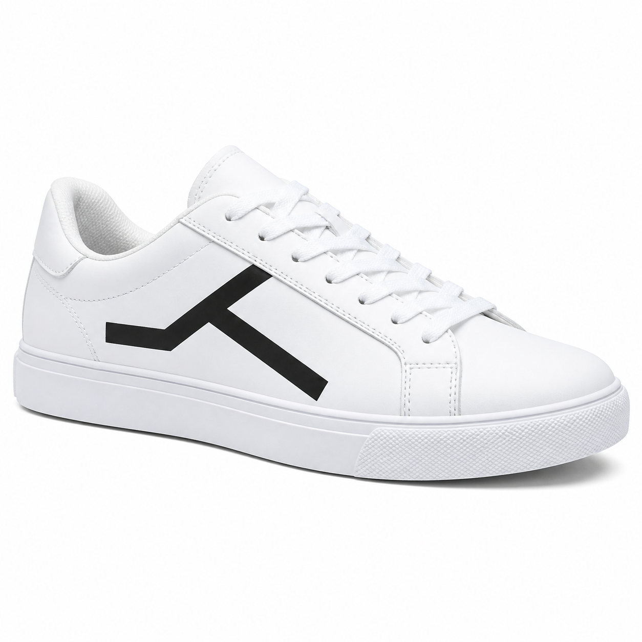
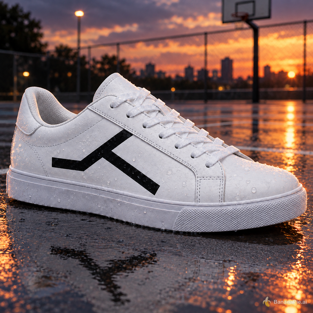
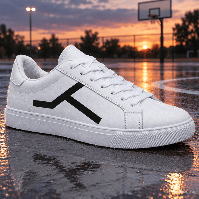
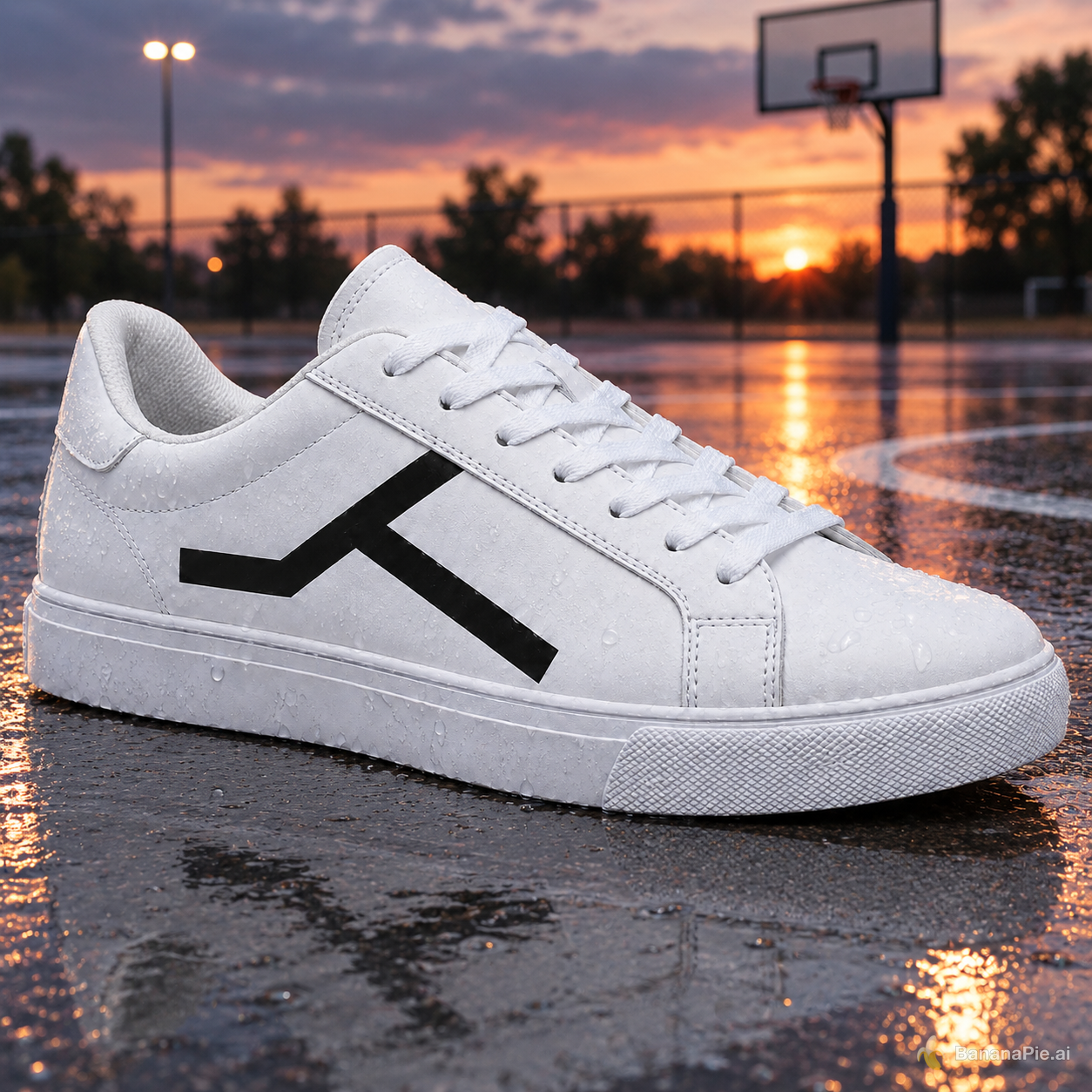
Better here: GPT Image 2.5 SunburstBoth outputs preserve the sneaker closely and create credible dusk court scenes. Right has a narrow overall advantage from clearer court context and slightly more coherent surface contact and reflections.
- Convincing wet outdoor basketball court at dusk: Right does slightly better; its hoop, fence, painted court lines, puddled surface, and sunset read more clearly as one coherent outdoor basketball-court scene. Left is also convincing, though the court markings are less distinct.
- Silhouette, sole geometry, stitching, materials, and camera angle consistency: The two are nearly even, but Right is slightly closer to the reference in the overall silhouette and side-on camera angle. Both retain the white leather-like upper, stitched panel layout, layered sole, textured toe bumper, and lace arrangement.
- Black geometric side mark preservation: The two are even; both retain the same readable angular mark with the left horizontal arm, rising branch, and descending diagonal branch in essentially the same placement and proportions as the reference.
- Physically coherent contact shadow, wet-surface reflection, and dusk lighting: Right does slightly better; the dark contact beneath the sole, restrained reflected shoe shape, and sunset reflections align consistently with the visible light source. Left has strong wet reflections and rim light, but the dark reflected mark in the foreground looks somewhat detached and distorted.
Reference images
Prompt & settings used
Prompt
Place the sneaker on a wet outdoor basketball court at dusk. Preserve the exact sneaker shape, black geometric side mark, materials, stitching, sole geometry, and camera angle. Add physically coherent contact, reflections, and dusk lighting.

Cost & latency
GPT Image 2.5 Flare starts at 25 credits and GPT Image 2.5 Sunburst at 30, giving Flare the lower minimum cost per generation. Latency varied by scenario, with neither model quicker every time; these are small-sample observations from this run, not benchmark figures.
How we compared & disclosure
This comparison used one fixed prompt per scenario and one run per model per scenario, with outputs published as generated. Banana Pie sells paid access to both models.
Banana Pie sells paid access to this model alongside other models in one studio. Our verdicts come from tests run through the same pipeline our users get.