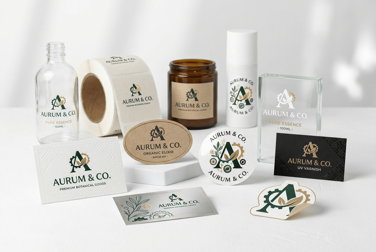
Premium professional commercial photography for a European label printing and graphic design company, showing ONE BRAND IDENTITY professionally adapted across DIFFERENT SELF-ADHESIVE LABEL MATERIALS AND FINISHES. The image must communicate: LOGO DESIGN BRAND CONSISTENCY LABEL DESIGN MATERIAL ADAPTATION PREMIUM PRINTING PROFESSIONAL BRANDING. MAIN CONCEPT: Create one ORIGINAL fictional premium brand with a distinctive modern logo and strong visual identity. The SAME recognizable logo and graphic language must appear consistently across all label designs. Do NOT create different brands. MAIN SCENE: On a clean white studio surface, arrange a sophisticated collection of professionally printed self-adhesive labels using the same brand identity. Show different label materials: • premium textured white paper • natural kraft paper • glossy white synthetic PP • transparent film • matte black label • silver metallic label • premium paper label with subtle gold foil detail Use different shapes: • rectangular • vertical • circular • oval • small die-cut label DESIGN: Create a contemporary and memorable visual identity with elegant typography, a distinctive graphic symbol and a sophisticated coordinated color palette. The labels should NOT look generic or overly minimalist. Use richer professional graphic design: • bold typography • subtle patterns • color blocks • fine illustration • elegant geometric elements • selective metallic details Keep the overall identity coherent across every version. PRINTING DETAILS: Labels must be the absolute visual protagonists. Show exceptional definition and realistic materials: • visible paper fibers • matte versus gloss surfaces • transparent areas • metallic reflections • gold foil detail • precise die-cut edges • perfect typography • rich printed colors APPLICATION EXAMPLES: Include THREE simple unbranded containers in the background carrying the same identity: • clear glass bottle with transparent label • amber glass jar with textured paper label • white cosmetic bottle with glossy synthetic label Containers remain secondary. FOREGROUND: Several loose label samples and a partially unwound roll of printed labels should be closest to camera. One premium label can be slightly lifted at one corner to clearly reveal that it is SELF-ADHESIVE. COMPOSITION: Wide horizontal website image. Label samples dominate the foreground. Containers create depth behind them. Arrange everything naturally at different heights rather than in a rigid straight line. Leave generous clean negative space. BACKGROUND: Pure white and extremely light neutral studio environment. Bright, sophisticated and contemporary. LIGHTING: Premium soft studio photography emphasizing label textures, print quality, metallic details and transparent materials. Foreground labels razor-sharp. Containers slightly softer but clearly recognizable. STYLE: Contemporary European premium branding and packaging photography, creative, tactile, sophisticated, colorful but elegant, hyper-realistic, 8K. CRITICAL: The viewer must immediately understand that ONE PROFESSIONAL LOGO has been designed to work consistently across MANY DIFFERENT LABEL MATERIALS, SHAPES AND FINISHES. The LABEL DESIGN AND PRINTED LABELS are more important than the containers. NO generic blank labels. NO simplistic black text only. NO multiple unrelated brands. NO real brands. NO recognizable logos. NO giant packaging products. NO dark background. NO excessive props. NO hands. NO people. NO CGI. NO floating graphics.

@eli verges
Prompt
Premium professional commercial photography for a European label printing and graphic design company, showing ONE BRAND IDENTITY professionally adapted across DIFFERENT SELF-ADHESIVE LABEL MATERIALS AND FINISHES. The image must communicate: LOGO DESIGN BRAND CONSISTENCY LABEL DESIGN MATERIAL ADAPTATION PREMIUM PRINTING PROFESSIONAL BRANDING. MAIN CONCEPT: Create one ORIGINAL fictional premium brand with a distinctive modern logo and strong visual identity. The SAME recognizable logo and graphic language must appear consistently across all label designs. Do NOT create different brands. MAIN SCENE: On a clean white studio surface, arrange a sophisticated collection of professionally printed self-adhesive labels using the same brand identity. Show different label materials: • premium textured white paper • natural kraft paper • glossy white synthetic PP • transparent film • matte black label • silver metallic label • premium paper label with subtle gold foil detail Use different shapes: • rectangular • vertical • circular • oval • small die-cut label DESIGN: Create a contemporary and memorable visual identity with elegant typography, a distinctive graphic symbol and a sophisticated coordinated color palette. The labels should NOT look generic or overly minimalist. Use richer professional graphic design: • bold typography • subtle patterns • color blocks • fine illustration • elegant geometric elements • selective metallic details Keep the overall identity coherent across every version. PRINTING DETAILS: Labels must be the absolute visual protagonists. Show exceptional definition and realistic materials: • visible paper fibers • matte versus gloss surfaces • transparent areas • metallic reflections • gold foil detail • precise die-cut edges • perfect typography • rich printed colors APPLICATION EXAMPLES: Include THREE simple unbranded containers in the background carrying the same identity: • clear glass bottle with transparent label • amber glass jar with textured paper label • white cosmetic bottle with glossy synthetic label Containers remain secondary. FOREGROUND: Several loose label samples and a partially unwound roll of printed labels should be closest to camera. One premium label can be slightly lifted at one corner to clearly reveal that it is SELF-ADHESIVE. COMPOSITION: Wide horizontal website image. Label samples dominate the foreground. Containers create depth behind them. Arrange everything naturally at different heights rather than in a rigid straight line. Leave generous clean negative space. BACKGROUND: Pure white and extremely light neutral studio environment. Bright, sophisticated and contemporary. LIGHTING: Premium soft studio photography emphasizing label textures, print quality, metallic details and transparent materials. Foreground labels razor-sharp. Containers slightly softer but clearly recognizable. STYLE: Contemporary European premium branding and packaging photography, creative, tactile, sophisticated, colorful but elegant, hyper-realistic, 8K. CRITICAL: The viewer must immediately understand that ONE PROFESSIONAL LOGO has been designed to work consistently across MANY DIFFERENT LABEL MATERIALS, SHAPES AND FINISHES. The LABEL DESIGN AND PRINTED LABELS are more important than the containers. NO generic blank labels. NO simplistic black text only. NO multiple unrelated brands. NO real brands. NO recognizable logos. NO giant packaging products. NO dark background. NO excessive props. NO hands. NO people. NO CGI. NO floating graphics.
Modell
NANO-BANANA-PRO
Typ
Bild
Likes
0
Seitenverhältnis
3/2