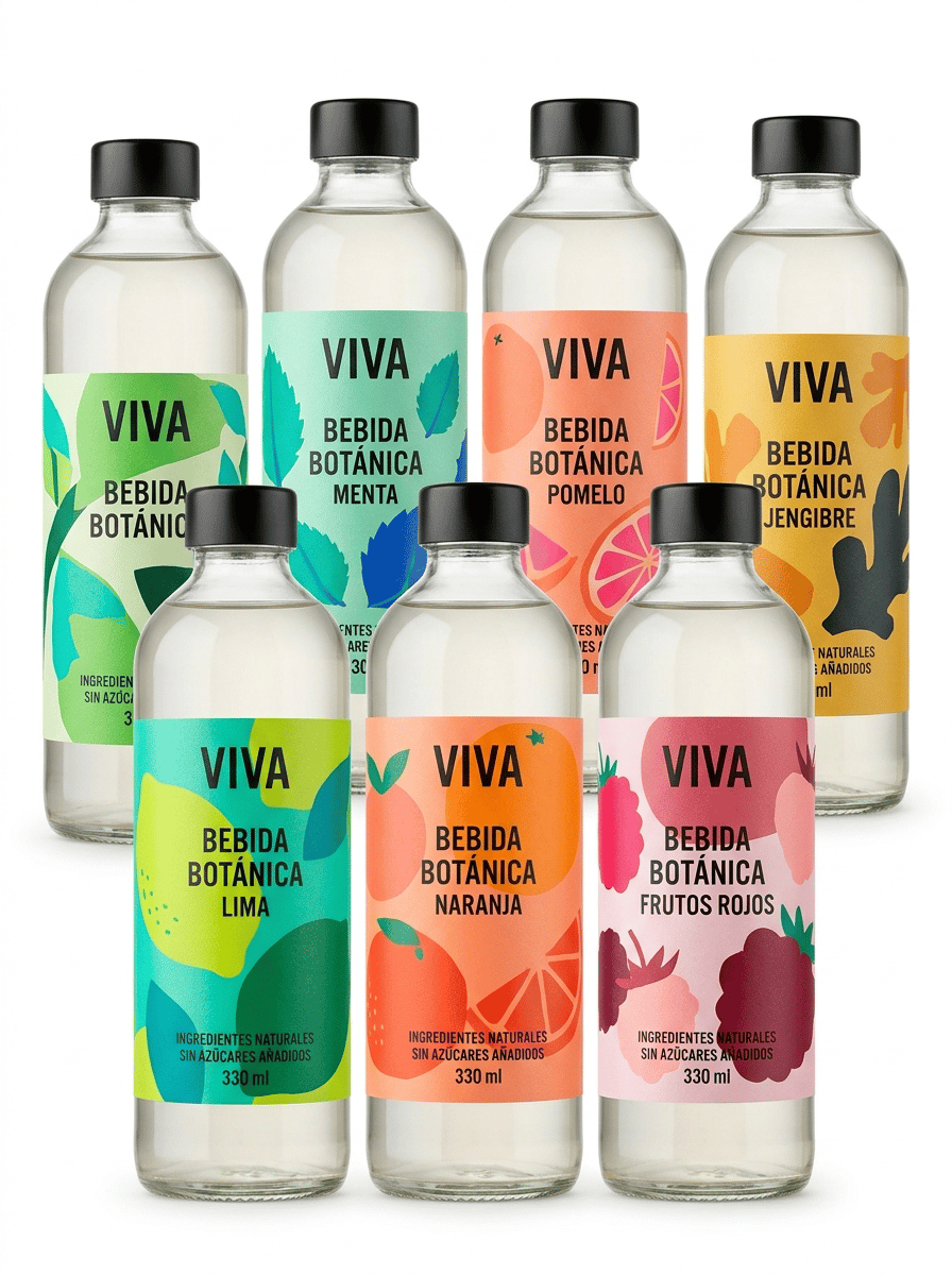
The label must look like a physical self-adhesive label applied onto the container, with visible edges and realistic material texture. It must NOT look like graphics printed directly onto the packaging. Ultra-premium commercial packaging photography created for a premium self-adhesive label manufacturer, featuring a coordinated collection of premium beverage bottles showcasing the creative possibilities of DIGITAL LABEL PRINTING, MULTIPLE DESIGNS and PRODUCT PERSONALIZATION. The purpose of the image is to demonstrate how the same bottle and the same brand can use multiple different self-adhesive label designs while maintaining a perfectly coherent visual identity. THE SELF-ADHESIVE LABELS MUST BE THE ABSOLUTE VISUAL PROTAGONISTS OF THE IMAGE. Create a sophisticated collection of SIX IDENTICAL transparent glass bottles containing the same premium botanical beverage. IMPORTANT: ALL SIX BOTTLES MUST HAVE: • exactly the same bottle shape • exactly the same transparent glass • exactly the same cap • exactly the same product • exactly the same brand name BUT EACH BOTTLE MUST HAVE A DIFFERENT SELF-ADHESIVE LABEL DESIGN. The six bottles represent six different graphic versions of the same product collection. Arrange three bottles prominently in the foreground and three additional bottles slightly behind them, creating an elegant staggered composition with depth. Do NOT place the bottles in a rigid straight line. Every front label must remain clearly visible. BRAND CONCEPT: Create a contemporary premium botanical beverage brand called: VIVA The collection uses bold contemporary European graphic design. Each label has a DIFFERENT LARGE ARTISTIC ILLUSTRATION while maintaining the same typography, logo position and overall brand architecture. The six label variations are inspired by different botanical ingredients: VERSION 01 LIMA VERSION 02 NARANJA VERSION 03 FRUTOS ROJOS VERSION 04 MENTA VERSION 05 POMELO VERSION 06 JENGIBRE COLOR SYSTEM: Each bottle has its own distinctive contemporary color palette. LIMA: lime green, turquoise and deep green. NARANJA: vivid orange, coral and warm red. FRUTOS ROJOS: raspberry, burgundy and soft pink. MENTA: mint green, turquoise and cobalt blue. POMELO: coral, peach and vivid pink. JENGIBRE: mustard yellow, warm orange and deep charcoal. The labels must look bold, sophisticated, contemporary and highly visual. Use large artistic illustrations of the ingredients. The illustrations should occupy a significant portion of each label. Combine expressive contemporary graphics with clean modern typography. The six labels must look DIFFERENT but clearly belong to the SAME BRAND FAMILY. This visual relationship is essential. ALL VISIBLE TEXT MUST BE WRITTEN IN CORRECT SPANISH. Use realistic wording such as: VIVA BEBIDA BOTÁNICA LIMA NARANJA FRUTOS ROJOS MENTA POMELO JENGIBRE INGREDIENTES NATURALES SIN AZÚCARES AÑADIDOS 330 ml IMPORTANT LABEL CONSTRUCTION: Every design must look like a REAL PHYSICAL SELF-ADHESIVE LABEL applied onto the bottle. Clearly visible physical label edges. Realistic premium label material. Perfect adhesion following the curved glass surface. Perfect die-cutting. No bubbles. No wrinkles. No lifting edges. THE GRAPHICS MUST NOT LOOK PRINTED DIRECTLY ONTO THE GLASS. Leave visible transparent glass surrounding every label. The viewer must immediately understand that each bottle carries a separate professionally printed self-adhesive label. DIGITAL PRINTING CONCEPT: The image must visually communicate the ability of DIGITAL LABEL PRINTING to produce multiple different designs within the same product range. The six labels must demonstrate: • multiple designs • multiple references • coordinated product families • short-run flexibility • visual personalization • exceptional color reproduction • consistent brand identity DO NOT write these concepts as text on the labels. Communicate them visually through the six coordinated label variations. LABEL DESIGN QUALITY: Exceptional commercial graphic design. Bold contemporary illustrations. Large visual elements. Excellent hierarchy. Premium typography. Vivid but sophisticated colors. Extremely sharp printing. Perfect color registration. The labels must look professionally designed for real commercial production, not like conceptual artwork. BOTTLE DESIGN: Use an elegant contemporary transparent glass beverage bottle. Clean cylindrical shape with slightly rounded shoulders. Premium proportions. Minimal black or brushed aluminum cap. The beverage inside should be almost transparent with only a very subtle natural tint. The glass must remain clearly visible around the labels. PHOTOGRAPHIC COMPOSITION: Professional editorial product photography. PURE WHITE seamless background (#FFFFFF). The background must be genuinely pure white, not gray, beige or cream. Clean white studio surface. Wide horizontal composition suitable for a website image carousel. The six bottles occupy most of the horizontal composition while maintaining generous clean white space around them. Three bottles in the foreground. Three bottles slightly behind. Subtle natural depth of field. The foreground labels must be RAZOR-SHARP. The labels on the rear bottles must still be recognizable as different designs. LIGHTING: Controlled high-key professional studio lighting. Soft natural contact shadows only. Lighting must emphasize: • transparent glass • physical label edges • vivid printed colors • different graphic versions • exceptional print sharpness • perfect adhesion to the bottle Hyper-realistic transparent glass. Hyper-realistic self-adhesive label material. Exceptional digital printing quality. Contemporary European packaging design. Premium commercial photography. 8K ultra-high definition. Designed by a Pentawards-winning packaging designer. NO six different bottle shapes. NO different brands. NO different caps. NO different product categories. NO random unrelated designs. NO identical labels on every bottle. NO generic supermarket design. NO childish fruit illustrations. NO vintage design. NO rustic aesthetic. NO ornamental borders. NO arabesque patterns. NO direct printing onto glass. NO shrink sleeves. NO floating labels. NO peeling labels. NO decorative props. NO loose fruit. NO glasses. NO ice. NO wooden table. NO colored background. NO beige background. NO gray background. NO clutter.

@eli verges
Prompt
The label must look like a physical self-adhesive label applied onto the container, with visible edges and realistic material texture. It must NOT look like graphics printed directly onto the packaging. Ultra-premium commercial packaging photography created for a premium self-adhesive label manufacturer, featuring a coordinated collection of premium beverage bottles showcasing the creative possibilities of DIGITAL LABEL PRINTING, MULTIPLE DESIGNS and PRODUCT PERSONALIZATION. The purpose of the image is to demonstrate how the same bottle and the same brand can use multiple different self-adhesive label designs while maintaining a perfectly coherent visual identity. THE SELF-ADHESIVE LABELS MUST BE THE ABSOLUTE VISUAL PROTAGONISTS OF THE IMAGE. Create a sophisticated collection of SIX IDENTICAL transparent glass bottles containing the same premium botanical beverage. IMPORTANT: ALL SIX BOTTLES MUST HAVE: • exactly the same bottle shape • exactly the same transparent glass • exactly the same cap • exactly the same product • exactly the same brand name BUT EACH BOTTLE MUST HAVE A DIFFERENT SELF-ADHESIVE LABEL DESIGN. The six bottles represent six different graphic versions of the same product collection. Arrange three bottles prominently in the foreground and three additional bottles slightly behind them, creating an elegant staggered composition with depth. Do NOT place the bottles in a rigid straight line. Every front label must remain clearly visible. BRAND CONCEPT: Create a contemporary premium botanical beverage brand called: VIVA The collection uses bold contemporary European graphic design. Each label has a DIFFERENT LARGE ARTISTIC ILLUSTRATION while maintaining the same typography, logo position and overall brand architecture. The six label variations are inspired by different botanical ingredients: VERSION 01 LIMA VERSION 02 NARANJA VERSION 03 FRUTOS ROJOS VERSION 04 MENTA VERSION 05 POMELO VERSION 06 JENGIBRE COLOR SYSTEM: Each bottle has its own distinctive contemporary color palette. LIMA: lime green, turquoise and deep green. NARANJA: vivid orange, coral and warm red. FRUTOS ROJOS: raspberry, burgundy and soft pink. MENTA: mint green, turquoise and cobalt blue. POMELO: coral, peach and vivid pink. JENGIBRE: mustard yellow, warm orange and deep charcoal. The labels must look bold, sophisticated, contemporary and highly visual. Use large artistic illustrations of the ingredients. The illustrations should occupy a significant portion of each label. Combine expressive contemporary graphics with clean modern typography. The six labels must look DIFFERENT but clearly belong to the SAME BRAND FAMILY. This visual relationship is essential. ALL VISIBLE TEXT MUST BE WRITTEN IN CORRECT SPANISH. Use realistic wording such as: VIVA BEBIDA BOTÁNICA LIMA NARANJA FRUTOS ROJOS MENTA POMELO JENGIBRE INGREDIENTES NATURALES SIN AZÚCARES AÑADIDOS 330 ml IMPORTANT LABEL CONSTRUCTION: Every design must look like a REAL PHYSICAL SELF-ADHESIVE LABEL applied onto the bottle. Clearly visible physical label edges. Realistic premium label material. Perfect adhesion following the curved glass surface. Perfect die-cutting. No bubbles. No wrinkles. No lifting edges. THE GRAPHICS MUST NOT LOOK PRINTED DIRECTLY ONTO THE GLASS. Leave visible transparent glass surrounding every label. The viewer must immediately understand that each bottle carries a separate professionally printed self-adhesive label. DIGITAL PRINTING CONCEPT: The image must visually communicate the ability of DIGITAL LABEL PRINTING to produce multiple different designs within the same product range. The six labels must demonstrate: • multiple designs • multiple references • coordinated product families • short-run flexibility • visual personalization • exceptional color reproduction • consistent brand identity DO NOT write these concepts as text on the labels. Communicate them visually through the six coordinated label variations. LABEL DESIGN QUALITY: Exceptional commercial graphic design. Bold contemporary illustrations. Large visual elements. Excellent hierarchy. Premium typography. Vivid but sophisticated colors. Extremely sharp printing. Perfect color registration. The labels must look professionally designed for real commercial production, not like conceptual artwork. BOTTLE DESIGN: Use an elegant contemporary transparent glass beverage bottle. Clean cylindrical shape with slightly rounded shoulders. Premium proportions. Minimal black or brushed aluminum cap. The beverage inside should be almost transparent with only a very subtle natural tint. The glass must remain clearly visible around the labels. PHOTOGRAPHIC COMPOSITION: Professional editorial product photography. PURE WHITE seamless background (#FFFFFF). The background must be genuinely pure white, not gray, beige or cream. Clean white studio surface. Wide horizontal composition suitable for a website image carousel. The six bottles occupy most of the horizontal composition while maintaining generous clean white space around them. Three bottles in the foreground. Three bottles slightly behind. Subtle natural depth of field. The foreground labels must be RAZOR-SHARP. The labels on the rear bottles must still be recognizable as different designs. LIGHTING: Controlled high-key professional studio lighting. Soft natural contact shadows only. Lighting must emphasize: • transparent glass • physical label edges • vivid printed colors • different graphic versions • exceptional print sharpness • perfect adhesion to the bottle Hyper-realistic transparent glass. Hyper-realistic self-adhesive label material. Exceptional digital printing quality. Contemporary European packaging design. Premium commercial photography. 8K ultra-high definition. Designed by a Pentawards-winning packaging designer. NO six different bottle shapes. NO different brands. NO different caps. NO different product categories. NO random unrelated designs. NO identical labels on every bottle. NO generic supermarket design. NO childish fruit illustrations. NO vintage design. NO rustic aesthetic. NO ornamental borders. NO arabesque patterns. NO direct printing onto glass. NO shrink sleeves. NO floating labels. NO peeling labels. NO decorative props. NO loose fruit. NO glasses. NO ice. NO wooden table. NO colored background. NO beige background. NO gray background. NO clutter.
Modell
NANO-BANANA-PRO
Typ
Bild
Likes
0
Seitenverhältnis
3/4