
Banana Pie
ホームモデル料金プランギャラリーブログ
無料ツール
背景リムーバー被写体を切り抜いて透過PNGに画像圧縮画質または指定KBまでファイルを圧縮画像サイズ変更自由なサイズやSNS用プリセットに変更画像形式変換HEIC、WebP、PNG、JPGを相互変換AI画像高画質化AIで写真を4倍に拡大画像からテキストを抽出(OCR)スクリーンショットやスキャン画像から文字を抽出
すべてのツール
ホームモデル料金プランギャラリーブログ
無料ツール背景リムーバー画像圧縮画像サイズ変更画像形式変換AI画像高画質化画像からテキストを抽出(OCR)すべてのツール
始める
始める

みんなのギャラリー

コミュニティの最新作品をチェック。

今のトレンド

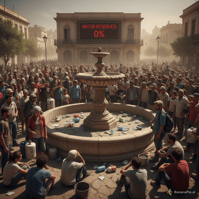
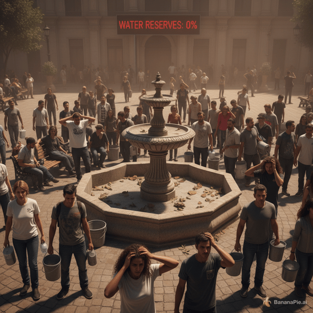
A wide shot of a VERY crowded community square. People look worried, frustrated, and stressed because there is no water left. In the background, there is an empty fountain showing how serious the water shortage has become. A caption reads: “Water Reserves: 0%”. The overall mood is tense, desperate, and hopeless.
トレンド #1nano-banana

A wide shot of a VERY crowded community square. People look worried, frustrated, and stressed because there is no water left. In the background, there is an empty fountain showing how serious the water shortage has become. A caption reads: “Water Reserves: 0%”. The overall mood is tense, desperate, and hopeless.

@lizzie murphy
A wide shot of a crowded community square. People look worried, frustrated, and stressed because there is no water left. In the background, there is an empty fountain showing how serious the water shortage has become. A caption reads: “Water Reserves: 0%”. The overall mood is tense, desperate, and hopeless.
トレンド #2nano-banana

A wide shot of a crowded community square. People look worried, frustrated, and stressed because there is no water left. In the background, there is an empty fountain showing how serious the water shortage has become. A caption reads: “Water Reserves: 0%”. The overall mood is tense, desperate, and hopeless.

@lizzie murphy
make it better quality, for a wallpaper
トレンド #3nano-banana

make it better quality, for a wallpaper

@X_ E D A _X
each room in each A3 sheet, dont put all together on 1 sheet
トレンド #4nano-banana

each room in each A3 sheet, dont put all together on 1 sheet

@Cara Yang
The label must look like a physical self-adhesive label applied onto the container, with visible edges and realistic material texture. It must NOT look like graphics printed directly onto the packaging.


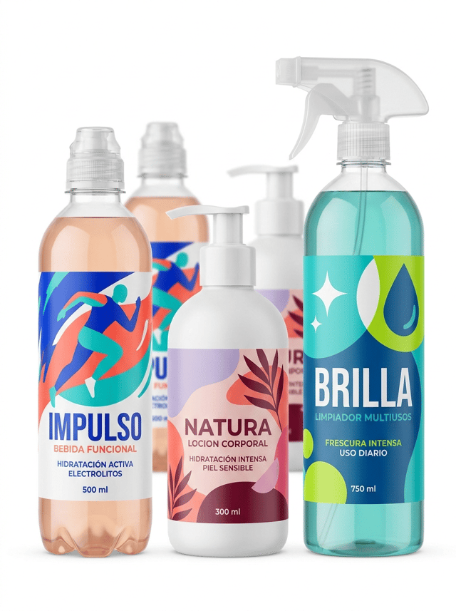
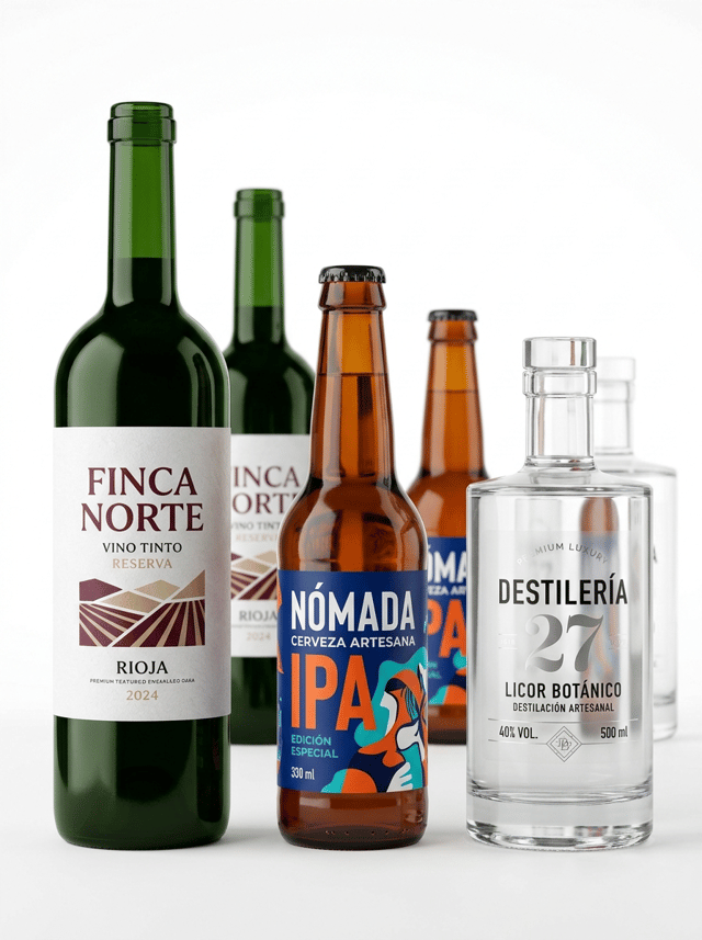
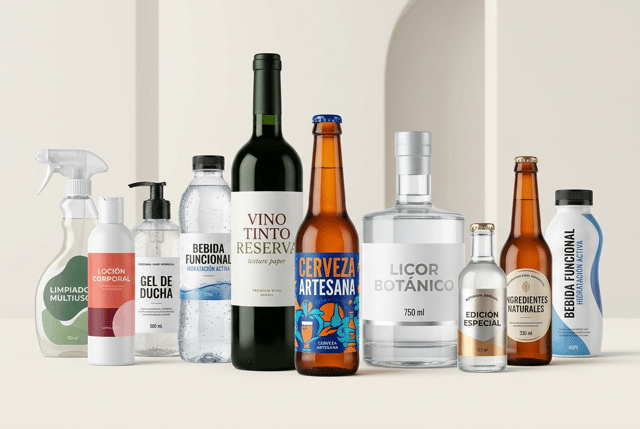
Ultra-premium editorial packaging campaign created for a premium self-adhesive label manufacturer, featuring a sophisticated and visually striking collection of DIFFERENT TYPES OF BOTTLES with professional self-adhesive labels.

The image must immediately communicate:

PREMIUM CUSTOM SELF-ADHESIVE LABELS FOR ALL TYPES OF BOTTLES.

This is NOT an advertisement for beverages or consumer products.

THE SELF-ADHESIVE LABELS ARE THE ABSOLUTE VISUAL PROTAGONISTS OF THE IMAGE.

Create a wide horizontal editorial composition featuring approximately 9–11 bottles with clearly different shapes, sizes, materials and applications.

The collection includes:

• a tall dark green glass premium wine bottle
• an amber glass craft beer bottle
• a thick transparent glass premium spirits bottle
• a transparent PET functional beverage bottle
• a modern white plastic cosmetic bottle
• a transparent personal-care pump bottle
• a contemporary household cleaning spray bottle
• a small transparent glass botanical beverage bottle
• an elegant amber glass bottle
• a modern curved HDPE bottle

The bottles must have noticeably DIFFERENT silhouettes.

Include tall and slender bottles, short bottles, cylindrical bottles, bottles with pronounced shoulders, ergonomic PET bottles, pump bottles and trigger bottles.

The purpose is to visually demonstrate the versatility of professional self-adhesive labels for many different bottle formats.

COMPOSITION

Create a sophisticated editorial arrangement rather than a simple straight product lineup.

Place the tallest bottles toward the central and rear areas.

Position medium-height bottles around them.

Place several smaller bottles toward the foreground.

Some bottles partially overlap others naturally, but EVERY IMPORTANT LABEL must remain clearly visible.

Create visual rhythm through different heights, bottle shapes and subtle changes in depth.

The composition should feel abundant and impressive without becoming cluttered.

The foreground products must be razor-sharp.

Products positioned further behind can have a subtle natural depth of field while remaining recognizable.

Leave generous negative space around the overall collection.

The result should resemble an international premium packaging campaign photographed by a leading commercial product photographer.

SHOWCASE DIFFERENT SELF-ADHESIVE LABEL SOLUTIONS

The collection must visibly demonstrate a wide range of label materials, designs and finishes.

TEXTURED PAPER LABEL

Apply a premium textured white paper label to the dark green wine bottle.

Visible natural paper texture.

Sophisticated contemporary wine design.

Warm ivory, burgundy and muted olive.

Elegant typography.

Clearly visible physical label edges.

COLORFUL PREMIUM LABEL

Apply a bold contemporary label to the amber beer bottle.

Cobalt blue, vivid orange, turquoise and white.

Large artistic illustration.

Modern expressive typography.

Premium craft branding.

TRANSPARENT NO-LABEL-LOOK LABEL

Apply a transparent self-adhesive film label to the thick transparent glass spirits bottle.

Large areas remain transparent.

Selected typography and graphics use opaque white ink and subtle metallic silver.

The physical transparent film edge must remain subtly visible.

It must NOT look printed directly onto the glass.

METALLIC SELF-ADHESIVE LABEL

Apply a premium metallic self-adhesive label to one elegant glass bottle.

Large areas of metallic substrate are covered with opaque inks.

Only selected areas remain exposed to create controlled silver and warm gold metallic reflections.

The metallic effect must come from the LABEL MATERIAL itself.

NO fake digital metallic gradients.

HIGH-RESISTANCE SYNTHETIC LABEL

Apply a premium synthetic self-adhesive label to the personal-care bottle.

Show a few realistic water droplets and subtle condensation directly on the bottle and label.

Despite the moisture, the label remains perfectly adhered, flat and completely readable.

MATTE PREMIUM LABEL

Apply an ultra-matte self-adhesive label to the white cosmetic bottle.

Sophisticated contemporary design using coral, burgundy, soft pink and warm ivory.

The matte surface must look tactile and non-reflective.

CUSTOM DIE-CUT LABEL

Apply a custom-shaped self-adhesive label to another bottle.

The label has a sophisticated asymmetric or organic die-cut contour.

The shape must be clearly visible against the bottle surface.

The die-cut must look commercially manufacturable and refined, NOT decorative or whimsical.

HIGH-ADHESION LABEL FOR CURVED PLASTIC

Apply a premium synthetic label to the curved PET or HDPE bottle.

The label follows the curved geometry perfectly.

No wrinkles.

No bubbles.

No lifting edges.

Perfect adhesion.

GRAPHIC DESIGN

Every bottle may belong to a different product category and brand, but the entire collection must feel visually harmonious.

Use a sophisticated contemporary European packaging aesthetic.

Combine:

• bold modern typography
• large illustrations
• geometric compositions
• carefully controlled color
• generous negative space
• premium printing finishes

Some labels can be colorful and expressive.

Others can be minimalist and sophisticated.

Others can emphasize material and finishing.

Avoid making every label look identical.

The purpose is to demonstrate CREATIVE AND TECHNICAL VERSATILITY.

ALL VISIBLE TEXT MUST BE WRITTEN IN CORRECT SPANISH.

Use realistic wording distributed naturally across the different bottles, such as:

VINO TINTO

RESERVA

CERVEZA ARTESANA

LICOR BOTÁNICO

BEBIDA FUNCIONAL

HIDRATACIÓN ACTIVA

LOCION CORPORAL

GEL DE DUCHA

LIMPIADOR MULTIUSOS

EDICIÓN ESPECIAL

INGREDIENTES NATURALES

500 ml

330 ml

750 ml

CRITICAL LABEL REQUIREMENT

EVERY LABEL MUST LOOK LIKE A REAL PHYSICAL SELF-ADHESIVE LABEL APPLIED ONTO THE BOTTLE.

This is essential.

Show clearly:

• physical label edges
• realistic material thickness
• paper texture
• transparent film
• metallic substrate
• matte film
• synthetic film
• custom die-cut contours
• perfect adhesion to curved surfaces

The graphics must NOT look printed directly onto the bottles.

Leave visible bottle material surrounding the labels wherever possible.

The viewer must immediately understand the visual relationship between:

BOTTLE + SELF-ADHESIVE LABEL.

BOTTLE MATERIALS

Clearly differentiate the physical materials of the bottles:

• dark green glass
• amber glass
• thick transparent glass
• transparent PET
• white HDPE
• matte plastic
• transparent plastic

Show realistic transparency, thickness, refraction, surface texture and reflections.

The different bottle materials must remain immediately recognizable.

BACKGROUND AND ART DIRECTION

Professional premium editorial product photography.

WIDE HORIZONTAL COMPOSITION suitable for a large website hero banner.

Background in VERY LIGHT WARM NEUTRAL TONES.

Use an elegant pale ivory, warm off-white or extremely light limestone tone.

The background should have an almost imperceptible architectural texture.

It must remain extremely clean and minimal.

The neutral background should create more depth than pure white while remaining significantly lighter than the products.

NO strong beige.

NO gray industrial background.

NO colored background.

Use a subtle premium studio surface in the same neutral tone.

Soft architectural daylight entering naturally from one side combined with controlled professional studio lighting.

Elegant natural shadows beneath and behind the bottles.

No dramatic shadows.

No excessive reflections.

The lighting must reveal the physical differences between the label materials:

directional light reveals textured paper,

controlled highlights reveal metallic material,

soft reflections reveal transparent film,

diffuse light reveals matte surfaces,

small water droplets reveal high-resistance synthetic labels.

PHOTOGRAPHIC QUALITY

The foreground labels must be extremely sharp.

Ultra-sharp typography.

Exceptional print definition.

Perfect registration.

Perfect die-cutting.

Hyper-realistic glass.

Hyper-realistic PET and HDPE.

Hyper-realistic self-adhesive materials.

Premium contemporary European packaging.

Sophisticated editorial art direction.

High-end commercial photography.

Clean, modern and timeless aesthetic.

8K ultra-high definition.

Designed by a Pentawards-winning packaging designer.

NO simple straight lineup of bottles.
NO identical bottle shapes.
NO identical label designs.
NO shrink sleeves.
NO graphics printed directly onto bottles.
NO labels floating away from bottles.
NO peeling labels.
NO wrinkled labels.
NO bubbles.
NO excessive condensation.
NO dramatic water splashes.
NO fake metallic gradients.
NO rustic aesthetic.
NO vintage overload.
NO ornamental borders.
NO arabesque patterns.
NO wine glasses.
NO beer glasses.
NO cocktail glasses.
NO loose fruit.
NO flowers.
NO plants.
NO ice.
NO wooden table.
NO bar.
NO kitchen.
NO bathroom.
NO cleaning accessories.
NO decorative props.
NO clutter.
NO dark background.
NO strong colored background.
nano-banana-pro

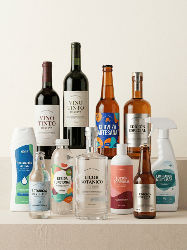
The label must look like a physical self-adhesive label applied onto the container, with visible edges and realistic material texture. It must NOT look like graphics printed directly onto the packaging. Ultra-premium editorial packaging campaign created for a premium self-adhesive label manufacturer, featuring a sophisticated and visually striking collection of DIFFERENT TYPES OF BOTTLES with professional self-adhesive labels. The image must immediately communicate: PREMIUM CUSTOM SELF-ADHESIVE LABELS FOR ALL TYPES OF BOTTLES. This is NOT an advertisement for beverages or consumer products. THE SELF-ADHESIVE LABELS ARE THE ABSOLUTE VISUAL PROTAGONISTS OF THE IMAGE. Create a wide horizontal editorial composition featuring approximately 9–11 bottles with clearly different shapes, sizes, materials and applications. The collection includes: • a tall dark green glass premium wine bottle • an amber glass craft beer bottle • a thick transparent glass premium spirits bottle • a transparent PET functional beverage bottle • a modern white plastic cosmetic bottle • a transparent personal-care pump bottle • a contemporary household cleaning spray bottle • a small transparent glass botanical beverage bottle • an elegant amber glass bottle • a modern curved HDPE bottle The bottles must have noticeably DIFFERENT silhouettes. Include tall and slender bottles, short bottles, cylindrical bottles, bottles with pronounced shoulders, ergonomic PET bottles, pump bottles and trigger bottles. The purpose is to visually demonstrate the versatility of professional self-adhesive labels for many different bottle formats. COMPOSITION Create a sophisticated editorial arrangement rather than a simple straight product lineup. Place the tallest bottles toward the central and rear areas. Position medium-height bottles around them. Place several smaller bottles toward the foreground. Some bottles partially overlap others naturally, but EVERY IMPORTANT LABEL must remain clearly visible. Create visual rhythm through different heights, bottle shapes and subtle changes in depth. The composition should feel abundant and impressive without becoming cluttered. The foreground products must be razor-sharp. Products positioned further behind can have a subtle natural depth of field while remaining recognizable. Leave generous negative space around the overall collection. The result should resemble an international premium packaging campaign photographed by a leading commercial product photographer. SHOWCASE DIFFERENT SELF-ADHESIVE LABEL SOLUTIONS The collection must visibly demonstrate a wide range of label materials, designs and finishes. TEXTURED PAPER LABEL Apply a premium textured white paper label to the dark green wine bottle. Visible natural paper texture. Sophisticated contemporary wine design. Warm ivory, burgundy and muted olive. Elegant typography. Clearly visible physical label edges. COLORFUL PREMIUM LABEL Apply a bold contemporary label to the amber beer bottle. Cobalt blue, vivid orange, turquoise and white. Large artistic illustration. Modern expressive typography. Premium craft branding. TRANSPARENT NO-LABEL-LOOK LABEL Apply a transparent self-adhesive film label to the thick transparent glass spirits bottle. Large areas remain transparent. Selected typography and graphics use opaque white ink and subtle metallic silver. The physical transparent film edge must remain subtly visible. It must NOT look printed directly onto the glass. METALLIC SELF-ADHESIVE LABEL Apply a premium metallic self-adhesive label to one elegant glass bottle. Large areas of metallic substrate are covered with opaque inks. Only selected areas remain exposed to create controlled silver and warm gold metallic reflections. The metallic effect must come from the LABEL MATERIAL itself. NO fake digital metallic gradients. HIGH-RESISTANCE SYNTHETIC LABEL Apply a premium synthetic self-adhesive label to the personal-care bottle. Show a few realistic water droplets and subtle condensation directly on the bottle and label. Despite the moisture, the label remains perfectly adhered, flat and completely readable. MATTE PREMIUM LABEL Apply an ultra-matte self-adhesive label to the white cosmetic bottle. Sophisticated contemporary design using coral, burgundy, soft pink and warm ivory. The matte surface must look tactile and non-reflective. CUSTOM DIE-CUT LABEL Apply a custom-shaped self-adhesive label to another bottle. The label has a sophisticated asymmetric or organic die-cut contour. The shape must be clearly visible against the bottle surface. The die-cut must look commercially manufacturable and refined, NOT decorative or whimsical. HIGH-ADHESION LABEL FOR CURVED PLASTIC Apply a premium synthetic label to the curved PET or HDPE bottle. The label follows the curved geometry perfectly. No wrinkles. No bubbles. No lifting edges. Perfect adhesion. GRAPHIC DESIGN Every bottle may belong to a different product category and brand, but the entire collection must feel visually harmonious. Use a sophisticated contemporary European packaging aesthetic. Combine: • bold modern typography • large illustrations • geometric compositions • carefully controlled color • generous negative space • premium printing finishes Some labels can be colorful and expressive. Others can be minimalist and sophisticated. Others can emphasize material and finishing. Avoid making every label look identical. The purpose is to demonstrate CREATIVE AND TECHNICAL VERSATILITY. ALL VISIBLE TEXT MUST BE WRITTEN IN CORRECT SPANISH. Use realistic wording distributed naturally across the different bottles, such as: VINO TINTO RESERVA CERVEZA ARTESANA LICOR BOTÁNICO BEBIDA FUNCIONAL HIDRATACIÓN ACTIVA LOCION CORPORAL GEL DE DUCHA LIMPIADOR MULTIUSOS EDICIÓN ESPECIAL INGREDIENTES NATURALES 500 ml 330 ml 750 ml CRITICAL LABEL REQUIREMENT EVERY LABEL MUST LOOK LIKE A REAL PHYSICAL SELF-ADHESIVE LABEL APPLIED ONTO THE BOTTLE. This is essential. Show clearly: • physical label edges • realistic material thickness • paper texture • transparent film • metallic substrate • matte film • synthetic film • custom die-cut contours • perfect adhesion to curved surfaces The graphics must NOT look printed directly onto the bottles. Leave visible bottle material surrounding the labels wherever possible. The viewer must immediately understand the visual relationship between: BOTTLE + SELF-ADHESIVE LABEL. BOTTLE MATERIALS Clearly differentiate the physical materials of the bottles: • dark green glass • amber glass • thick transparent glass • transparent PET • white HDPE • matte plastic • transparent plastic Show realistic transparency, thickness, refraction, surface texture and reflections. The different bottle materials must remain immediately recognizable. BACKGROUND AND ART DIRECTION Professional premium editorial product photography. WIDE HORIZONTAL COMPOSITION suitable for a large website hero banner. Background in VERY LIGHT WARM NEUTRAL TONES. Use an elegant pale ivory, warm off-white or extremely light limestone tone. The background should have an almost imperceptible architectural texture. It must remain extremely clean and minimal. The neutral background should create more depth than pure white while remaining significantly lighter than the products. NO strong beige. NO gray industrial background. NO colored background. Use a subtle premium studio surface in the same neutral tone. Soft architectural daylight entering naturally from one side combined with controlled professional studio lighting. Elegant natural shadows beneath and behind the bottles. No dramatic shadows. No excessive reflections. The lighting must reveal the physical differences between the label materials: directional light reveals textured paper, controlled highlights reveal metallic material, soft reflections reveal transparent film, diffuse light reveals matte surfaces, small water droplets reveal high-resistance synthetic labels. PHOTOGRAPHIC QUALITY The foreground labels must be extremely sharp. Ultra-sharp typography. Exceptional print definition. Perfect registration. Perfect die-cutting. Hyper-realistic glass. Hyper-realistic PET and HDPE. Hyper-realistic self-adhesive materials. Premium contemporary European packaging. Sophisticated editorial art direction. High-end commercial photography. Clean, modern and timeless aesthetic. 8K ultra-high definition. Designed by a Pentawards-winning packaging designer. NO simple straight lineup of bottles. NO identical bottle shapes. NO identical label designs. NO shrink sleeves. NO graphics printed directly onto bottles. NO labels floating away from bottles. NO peeling labels. NO wrinkled labels. NO bubbles. NO excessive condensation. NO dramatic water splashes. NO fake metallic gradients. NO rustic aesthetic. NO vintage overload. NO ornamental borders. NO arabesque patterns. NO wine glasses. NO beer glasses. NO cocktail glasses. NO loose fruit. NO flowers. NO plants. NO ice. NO wooden table. NO bar. NO kitchen. NO bathroom. NO cleaning accessories. NO decorative props. NO clutter. NO dark background. NO strong colored background.
ev@eli verges
The label must look like a physical self-adhesive label applied onto the container, with visible edges and realistic material texture. It must NOT look like graphics printed directly onto the packaging.


Ultra-premium editorial packaging campaign created for a premium self-adhesive label manufacturer, featuring a sophisticated and visually striking collection of DIFFERENT TYPES OF BOTTLES with professional self-adhesive labels.

The image must immediately communicate:

PREMIUM CUSTOM SELF-ADHESIVE LABELS FOR ALL TYPES OF BOTTLES.

This is NOT an advertisement for beverages or consumer products.

THE SELF-ADHESIVE LABELS ARE THE ABSOLUTE VISUAL PROTAGONISTS OF THE IMAGE.

Create a wide horizontal editorial composition featuring approximately 9–11 bottles with clearly different shapes, sizes, materials and applications.

The collection includes:

• a tall dark green glass premium wine bottle
• an amber glass craft beer bottle
• a thick transparent glass premium spirits bottle
• a transparent PET functional beverage bottle
• a modern white plastic cosmetic bottle
• a transparent personal-care pump bottle
• a contemporary household cleaning spray bottle
• a small transparent glass botanical beverage bottle
• an elegant amber glass bottle
• a modern curved HDPE bottle

The bottles must have noticeably DIFFERENT silhouettes.

Include tall and slender bottles, short bottles, cylindrical bottles, bottles with pronounced shoulders, ergonomic PET bottles, pump bottles and trigger bottles.

The purpose is to visually demonstrate the versatility of professional self-adhesive labels for many different bottle formats.

COMPOSITION

Create a sophisticated editorial arrangement rather than a simple straight product lineup.

Place the tallest bottles toward the central and rear areas.

Position medium-height bottles around them.

Place several smaller bottles toward the foreground.

Some bottles partially overlap others naturally, but EVERY IMPORTANT LABEL must remain clearly visible.

Create visual rhythm through different heights, bottle shapes and subtle changes in depth.

The composition should feel abundant and impressive without becoming cluttered.

The foreground products must be razor-sharp.

Products positioned further behind can have a subtle natural depth of field while remaining recognizable.

Leave generous negative space around the overall collection.

The result should resemble an international premium packaging campaign photographed by a leading commercial product photographer.

SHOWCASE DIFFERENT SELF-ADHESIVE LABEL SOLUTIONS

The collection must visibly demonstrate a wide range of label materials, designs and finishes.

TEXTURED PAPER LABEL

Apply a premium textured white paper label to the dark green wine bottle.

Visible natural paper texture.

Sophisticated contemporary wine design.

Warm ivory, burgundy and muted olive.

Elegant typography.

Clearly visible physical label edges.

COLORFUL PREMIUM LABEL

Apply a bold contemporary label to the amber beer bottle.

Cobalt blue, vivid orange, turquoise and white.

Large artistic illustration.

Modern expressive typography.

Premium craft branding.

TRANSPARENT NO-LABEL-LOOK LABEL

Apply a transparent self-adhesive film label to the thick transparent glass spirits bottle.

Large areas remain transparent.

Selected typography and graphics use opaque white ink and subtle metallic silver.

The physical transparent film edge must remain subtly visible.

It must NOT look printed directly onto the glass.

METALLIC SELF-ADHESIVE LABEL

Apply a premium metallic self-adhesive label to one elegant glass bottle.

Large areas of metallic substrate are covered with opaque inks.

Only selected areas remain exposed to create controlled silver and warm gold metallic reflections.

The metallic effect must come from the LABEL MATERIAL itself.

NO fake digital metallic gradients.

HIGH-RESISTANCE SYNTHETIC LABEL

Apply a premium synthetic self-adhesive label to the personal-care bottle.

Show a few realistic water droplets and subtle condensation directly on the bottle and label.

Despite the moisture, the label remains perfectly adhered, flat and completely readable.

MATTE PREMIUM LABEL

Apply an ultra-matte self-adhesive label to the white cosmetic bottle.

Sophisticated contemporary design using coral, burgundy, soft pink and warm ivory.

The matte surface must look tactile and non-reflective.

CUSTOM DIE-CUT LABEL

Apply a custom-shaped self-adhesive label to another bottle.

The label has a sophisticated asymmetric or organic die-cut contour.

The shape must be clearly visible against the bottle surface.

The die-cut must look commercially manufacturable and refined, NOT decorative or whimsical.

HIGH-ADHESION LABEL FOR CURVED PLASTIC

Apply a premium synthetic label to the curved PET or HDPE bottle.

The label follows the curved geometry perfectly.

No wrinkles.

No bubbles.

No lifting edges.

Perfect adhesion.

GRAPHIC DESIGN

Every bottle may belong to a different product category and brand, but the entire collection must feel visually harmonious.

Use a sophisticated contemporary European packaging aesthetic.

Combine:

• bold modern typography
• large illustrations
• geometric compositions
• carefully controlled color
• generous negative space
• premium printing finishes

Some labels can be colorful and expressive.

Others can be minimalist and sophisticated.

Others can emphasize material and finishing.

Avoid making every label look identical.

The purpose is to demonstrate CREATIVE AND TECHNICAL VERSATILITY.

ALL VISIBLE TEXT MUST BE WRITTEN IN CORRECT SPANISH.

Use realistic wording distributed naturally across the different bottles, such as:

VINO TINTO

RESERVA

CERVEZA ARTESANA

LICOR BOTÁNICO

BEBIDA FUNCIONAL

HIDRATACIÓN ACTIVA

LOCION CORPORAL

GEL DE DUCHA

LIMPIADOR MULTIUSOS

EDICIÓN ESPECIAL

INGREDIENTES NATURALES

500 ml

330 ml

750 ml

CRITICAL LABEL REQUIREMENT

EVERY LABEL MUST LOOK LIKE A REAL PHYSICAL SELF-ADHESIVE LABEL APPLIED ONTO THE BOTTLE.

This is essential.

Show clearly:

• physical label edges
• realistic material thickness
• paper texture
• transparent film
• metallic substrate
• matte film
• synthetic film
• custom die-cut contours
• perfect adhesion to curved surfaces

The graphics must NOT look printed directly onto the bottles.

Leave visible bottle material surrounding the labels wherever possible.

The viewer must immediately understand the visual relationship between:

BOTTLE + SELF-ADHESIVE LABEL.

BOTTLE MATERIALS

Clearly differentiate the physical materials of the bottles:

• dark green glass
• amber glass
• thick transparent glass
• transparent PET
• white HDPE
• matte plastic
• transparent plastic

Show realistic transparency, thickness, refraction, surface texture and reflections.

The different bottle materials must remain immediately recognizable.

BACKGROUND AND ART DIRECTION

Professional premium editorial product photography.

WIDE HORIZONTAL COMPOSITION suitable for a large website hero banner.

Background in VERY LIGHT WARM NEUTRAL TONES.

Use an elegant pale ivory, warm off-white or extremely light limestone tone.

The background should have an almost imperceptible architectural texture.

It must remain extremely clean and minimal.

The neutral background should create more depth than pure white while remaining significantly lighter than the products.

NO strong beige.

NO gray industrial background.

NO colored background.

Use a subtle premium studio surface in the same neutral tone.

Soft architectural daylight entering naturally from one side combined with controlled professional studio lighting.

Elegant natural shadows beneath and behind the bottles.

No dramatic shadows.

No excessive reflections.

The lighting must reveal the physical differences between the label materials:

directional light reveals textured paper,

controlled highlights reveal metallic material,

soft reflections reveal transparent film,

diffuse light reveals matte surfaces,

small water droplets reveal high-resistance synthetic labels.

PHOTOGRAPHIC QUALITY

The foreground labels must be extremely sharp.

Ultra-sharp typography.

Exceptional print definition.

Perfect registration.

Perfect die-cutting.

Hyper-realistic glass.

Hyper-realistic PET and HDPE.

Hyper-realistic self-adhesive materials.

Premium contemporary European packaging.

Sophisticated editorial art direction.

High-end commercial photography.

Clean, modern and timeless aesthetic.

8K ultra-high definition.

Designed by a Pentawards-winning packaging designer.

NO simple straight lineup of bottles.
NO identical bottle shapes.
NO identical label designs.
NO shrink sleeves.
NO graphics printed directly onto bottles.
NO labels floating away from bottles.
NO peeling labels.
NO wrinkled labels.
NO bubbles.
NO excessive condensation.
NO dramatic water splashes.
NO fake metallic gradients.
NO rustic aesthetic.
NO vintage overload.
NO ornamental borders.
NO arabesque patterns.
NO wine glasses.
NO beer glasses.
NO cocktail glasses.
NO loose fruit.
NO flowers.
NO plants.
NO ice.
NO wooden table.
NO bar.
NO kitchen.
NO bathroom.
NO cleaning accessories.
NO decorative props.
NO clutter.
NO dark background.
NO strong colored background.
nano-banana-pro

The label must look like a physical self-adhesive label applied onto the container, with visible edges and realistic material texture. It must NOT look like graphics printed directly onto the packaging. Ultra-premium editorial packaging campaign created for a premium self-adhesive label manufacturer, featuring a sophisticated and visually striking collection of DIFFERENT TYPES OF BOTTLES with professional self-adhesive labels. The image must immediately communicate: PREMIUM CUSTOM SELF-ADHESIVE LABELS FOR ALL TYPES OF BOTTLES. This is NOT an advertisement for beverages or consumer products. THE SELF-ADHESIVE LABELS ARE THE ABSOLUTE VISUAL PROTAGONISTS OF THE IMAGE. Create a wide horizontal editorial composition featuring approximately 9–11 bottles with clearly different shapes, sizes, materials and applications. The collection includes: • a tall dark green glass premium wine bottle • an amber glass craft beer bottle • a thick transparent glass premium spirits bottle • a transparent PET functional beverage bottle • a modern white plastic cosmetic bottle • a transparent personal-care pump bottle • a contemporary household cleaning spray bottle • a small transparent glass botanical beverage bottle • an elegant amber glass bottle • a modern curved HDPE bottle The bottles must have noticeably DIFFERENT silhouettes. Include tall and slender bottles, short bottles, cylindrical bottles, bottles with pronounced shoulders, ergonomic PET bottles, pump bottles and trigger bottles. The purpose is to visually demonstrate the versatility of professional self-adhesive labels for many different bottle formats. COMPOSITION Create a sophisticated editorial arrangement rather than a simple straight product lineup. Place the tallest bottles toward the central and rear areas. Position medium-height bottles around them. Place several smaller bottles toward the foreground. Some bottles partially overlap others naturally, but EVERY IMPORTANT LABEL must remain clearly visible. Create visual rhythm through different heights, bottle shapes and subtle changes in depth. The composition should feel abundant and impressive without becoming cluttered. The foreground products must be razor-sharp. Products positioned further behind can have a subtle natural depth of field while remaining recognizable. Leave generous negative space around the overall collection. The result should resemble an international premium packaging campaign photographed by a leading commercial product photographer. SHOWCASE DIFFERENT SELF-ADHESIVE LABEL SOLUTIONS The collection must visibly demonstrate a wide range of label materials, designs and finishes. TEXTURED PAPER LABEL Apply a premium textured white paper label to the dark green wine bottle. Visible natural paper texture. Sophisticated contemporary wine design. Warm ivory, burgundy and muted olive. Elegant typography. Clearly visible physical label edges. COLORFUL PREMIUM LABEL Apply a bold contemporary label to the amber beer bottle. Cobalt blue, vivid orange, turquoise and white. Large artistic illustration. Modern expressive typography. Premium craft branding. TRANSPARENT NO-LABEL-LOOK LABEL Apply a transparent self-adhesive film label to the thick transparent glass spirits bottle. Large areas remain transparent. Selected typography and graphics use opaque white ink and subtle metallic silver. The physical transparent film edge must remain subtly visible. It must NOT look printed directly onto the glass. METALLIC SELF-ADHESIVE LABEL Apply a premium metallic self-adhesive label to one elegant glass bottle. Large areas of metallic substrate are covered with opaque inks. Only selected areas remain exposed to create controlled silver and warm gold metallic reflections. The metallic effect must come from the LABEL MATERIAL itself. NO fake digital metallic gradients. HIGH-RESISTANCE SYNTHETIC LABEL Apply a premium synthetic self-adhesive label to the personal-care bottle. Show a few realistic water droplets and subtle condensation directly on the bottle and label. Despite the moisture, the label remains perfectly adhered, flat and completely readable. MATTE PREMIUM LABEL Apply an ultra-matte self-adhesive label to the white cosmetic bottle. Sophisticated contemporary design using coral, burgundy, soft pink and warm ivory. The matte surface must look tactile and non-reflective. CUSTOM DIE-CUT LABEL Apply a custom-shaped self-adhesive label to another bottle. The label has a sophisticated asymmetric or organic die-cut contour. The shape must be clearly visible against the bottle surface. The die-cut must look commercially manufacturable and refined, NOT decorative or whimsical. HIGH-ADHESION LABEL FOR CURVED PLASTIC Apply a premium synthetic label to the curved PET or HDPE bottle. The label follows the curved geometry perfectly. No wrinkles. No bubbles. No lifting edges. Perfect adhesion. GRAPHIC DESIGN Every bottle may belong to a different product category and brand, but the entire collection must feel visually harmonious. Use a sophisticated contemporary European packaging aesthetic. Combine: • bold modern typography • large illustrations • geometric compositions • carefully controlled color • generous negative space • premium printing finishes Some labels can be colorful and expressive. Others can be minimalist and sophisticated. Others can emphasize material and finishing. Avoid making every label look identical. The purpose is to demonstrate CREATIVE AND TECHNICAL VERSATILITY. ALL VISIBLE TEXT MUST BE WRITTEN IN CORRECT SPANISH. Use realistic wording distributed naturally across the different bottles, such as: VINO TINTO RESERVA CERVEZA ARTESANA LICOR BOTÁNICO BEBIDA FUNCIONAL HIDRATACIÓN ACTIVA LOCION CORPORAL GEL DE DUCHA LIMPIADOR MULTIUSOS EDICIÓN ESPECIAL INGREDIENTES NATURALES 500 ml 330 ml 750 ml CRITICAL LABEL REQUIREMENT EVERY LABEL MUST LOOK LIKE A REAL PHYSICAL SELF-ADHESIVE LABEL APPLIED ONTO THE BOTTLE. This is essential. Show clearly: • physical label edges • realistic material thickness • paper texture • transparent film • metallic substrate • matte film • synthetic film • custom die-cut contours • perfect adhesion to curved surfaces The graphics must NOT look printed directly onto the bottles. Leave visible bottle material surrounding the labels wherever possible. The viewer must immediately understand the visual relationship between: BOTTLE + SELF-ADHESIVE LABEL. BOTTLE MATERIALS Clearly differentiate the physical materials of the bottles: • dark green glass • amber glass • thick transparent glass • transparent PET • white HDPE • matte plastic • transparent plastic Show realistic transparency, thickness, refraction, surface texture and reflections. The different bottle materials must remain immediately recognizable. BACKGROUND AND ART DIRECTION Professional premium editorial product photography. WIDE HORIZONTAL COMPOSITION suitable for a large website hero banner. Background in VERY LIGHT WARM NEUTRAL TONES. Use an elegant pale ivory, warm off-white or extremely light limestone tone. The background should have an almost imperceptible architectural texture. It must remain extremely clean and minimal. The neutral background should create more depth than pure white while remaining significantly lighter than the products. NO strong beige. NO gray industrial background. NO colored background. Use a subtle premium studio surface in the same neutral tone. Soft architectural daylight entering naturally from one side combined with controlled professional studio lighting. Elegant natural shadows beneath and behind the bottles. No dramatic shadows. No excessive reflections. The lighting must reveal the physical differences between the label materials: directional light reveals textured paper, controlled highlights reveal metallic material, soft reflections reveal transparent film, diffuse light reveals matte surfaces, small water droplets reveal high-resistance synthetic labels. PHOTOGRAPHIC QUALITY The foreground labels must be extremely sharp. Ultra-sharp typography. Exceptional print definition. Perfect registration. Perfect die-cutting. Hyper-realistic glass. Hyper-realistic PET and HDPE. Hyper-realistic self-adhesive materials. Premium contemporary European packaging. Sophisticated editorial art direction. High-end commercial photography. Clean, modern and timeless aesthetic. 8K ultra-high definition. Designed by a Pentawards-winning packaging designer. NO simple straight lineup of bottles. NO identical bottle shapes. NO identical label designs. NO shrink sleeves. NO graphics printed directly onto bottles. NO labels floating away from bottles. NO peeling labels. NO wrinkled labels. NO bubbles. NO excessive condensation. NO dramatic water splashes. NO fake metallic gradients. NO rustic aesthetic. NO vintage overload. NO ornamental borders. NO arabesque patterns. NO wine glasses. NO beer glasses. NO cocktail glasses. NO loose fruit. NO flowers. NO plants. NO ice. NO wooden table. NO bar. NO kitchen. NO bathroom. NO cleaning accessories. NO decorative props. NO clutter. NO dark background. NO strong colored background.
ev@eli verges
The label must look like a physical self-adhesive label applied onto the container, with visible edges and realistic material texture. It must NOT look like graphics printed directly onto the packaging.


Ultra-premium commercial packaging photography created for a premium self-adhesive label manufacturer, featuring a coordinated collection of premium beverage bottles showcasing the creative possibilities of DIGITAL LABEL PRINTING, MULTIPLE DESIGNS and PRODUCT PERSONALIZATION.

The purpose of the image is to demonstrate how the same bottle and the same brand can use multiple different self-adhesive label designs while maintaining a perfectly coherent visual identity.

THE SELF-ADHESIVE LABELS MUST BE THE ABSOLUTE VISUAL PROTAGONISTS OF THE IMAGE.

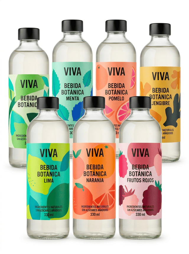
Create a sophisticated collection of SIX IDENTICAL transparent glass bottles containing the same premium botanical beverage.

IMPORTANT:

ALL SIX BOTTLES MUST HAVE:

• exactly the same bottle shape
• exactly the same transparent glass
• exactly the same cap
• exactly the same product
• exactly the same brand name

BUT EACH BOTTLE MUST HAVE A DIFFERENT SELF-ADHESIVE LABEL DESIGN.

The six bottles represent six different graphic versions of the same product collection.

Arrange three bottles prominently in the foreground and three additional bottles slightly behind them, creating an elegant staggered composition with depth.

Do NOT place the bottles in a rigid straight line.

Every front label must remain clearly visible.


BRAND CONCEPT:

Create a contemporary premium botanical beverage brand called:

VIVA

The collection uses bold contemporary European graphic design.

Each label has a DIFFERENT LARGE ARTISTIC ILLUSTRATION while maintaining the same typography, logo position and overall brand architecture.

The six label variations are inspired by different botanical ingredients:

VERSION 01
LIMA

VERSION 02
NARANJA

VERSION 03
FRUTOS ROJOS

VERSION 04
MENTA

VERSION 05
POMELO

VERSION 06
JENGIBRE


COLOR SYSTEM:

Each bottle has its own distinctive contemporary color palette.

LIMA:
lime green, turquoise and deep green.

NARANJA:
vivid orange, coral and warm red.

FRUTOS ROJOS:
raspberry, burgundy and soft pink.

MENTA:
mint green, turquoise and cobalt blue.

POMELO:
coral, peach and vivid pink.

JENGIBRE:
mustard yellow, warm orange and deep charcoal.

The labels must look bold, sophisticated, contemporary and highly visual.

Use large artistic illustrations of the ingredients.

The illustrations should occupy a significant portion of each label.

Combine expressive contemporary graphics with clean modern typography.

The six labels must look DIFFERENT but clearly belong to the SAME BRAND FAMILY.

This visual relationship is essential.


ALL VISIBLE TEXT MUST BE WRITTEN IN CORRECT SPANISH.

Use realistic wording such as:

VIVA

BEBIDA BOTÁNICA

LIMA

NARANJA

FRUTOS ROJOS

MENTA

POMELO

JENGIBRE

INGREDIENTES NATURALES

SIN AZÚCARES AÑADIDOS

330 ml


IMPORTANT LABEL CONSTRUCTION:

Every design must look like a REAL PHYSICAL SELF-ADHESIVE LABEL applied onto the bottle.

Clearly visible physical label edges.

Realistic premium label material.

Perfect adhesion following the curved glass surface.

Perfect die-cutting.

No bubbles.

No wrinkles.

No lifting edges.

THE GRAPHICS MUST NOT LOOK PRINTED DIRECTLY ONTO THE GLASS.

Leave visible transparent glass surrounding every label.

The viewer must immediately understand that each bottle carries a separate professionally printed self-adhesive label.


DIGITAL PRINTING CONCEPT:

The image must visually communicate the ability of DIGITAL LABEL PRINTING to produce multiple different designs within the same product range.

The six labels must demonstrate:

• multiple designs
• multiple references
• coordinated product families
• short-run flexibility
• visual personalization
• exceptional color reproduction
• consistent brand identity

DO NOT write these concepts as text on the labels.

Communicate them visually through the six coordinated label variations.


LABEL DESIGN QUALITY:

Exceptional commercial graphic design.

Bold contemporary illustrations.

Large visual elements.

Excellent hierarchy.

Premium typography.

Vivid but sophisticated colors.

Extremely sharp printing.

Perfect color registration.

The labels must look professionally designed for real commercial production, not like conceptual artwork.


BOTTLE DESIGN:

Use an elegant contemporary transparent glass beverage bottle.

Clean cylindrical shape with slightly rounded shoulders.

Premium proportions.

Minimal black or brushed aluminum cap.

The beverage inside should be almost transparent with only a very subtle natural tint.

The glass must remain clearly visible around the labels.


PHOTOGRAPHIC COMPOSITION:

Professional editorial product photography.

PURE WHITE seamless background (#FFFFFF).

The background must be genuinely pure white, not gray, beige or cream.

Clean white studio surface.

Wide horizontal composition suitable for a website image carousel.

The six bottles occupy most of the horizontal composition while maintaining generous clean white space around them.

Three bottles in the foreground.

Three bottles slightly behind.

Subtle natural depth of field.

The foreground labels must be RAZOR-SHARP.

The labels on the rear bottles must still be recognizable as different designs.


LIGHTING:

Controlled high-key professional studio lighting.

Soft natural contact shadows only.

Lighting must emphasize:

• transparent glass
• physical label edges
• vivid printed colors
• different graphic versions
• exceptional print sharpness
• perfect adhesion to the bottle


Hyper-realistic transparent glass.

Hyper-realistic self-adhesive label material.

Exceptional digital printing quality.

Contemporary European packaging design.

Premium commercial photography.

8K ultra-high definition.

Designed by a Pentawards-winning packaging designer.


NO six different bottle shapes.
NO different brands.
NO different caps.
NO different product categories.
NO random unrelated designs.
NO identical labels on every bottle.
NO generic supermarket design.
NO childish fruit illustrations.
NO vintage design.
NO rustic aesthetic.
NO ornamental borders.
NO arabesque patterns.
NO direct printing onto glass.
NO shrink sleeves.
NO floating labels.
NO peeling labels.
NO decorative props.
NO loose fruit.
NO glasses.
NO ice.
NO wooden table.
NO colored background.
NO beige background.
NO gray background.
NO clutter.
nano-banana-pro

The label must look like a physical self-adhesive label applied onto the container, with visible edges and realistic material texture. It must NOT look like graphics printed directly onto the packaging. Ultra-premium commercial packaging photography created for a premium self-adhesive label manufacturer, featuring a coordinated collection of premium beverage bottles showcasing the creative possibilities of DIGITAL LABEL PRINTING, MULTIPLE DESIGNS and PRODUCT PERSONALIZATION. The purpose of the image is to demonstrate how the same bottle and the same brand can use multiple different self-adhesive label designs while maintaining a perfectly coherent visual identity. THE SELF-ADHESIVE LABELS MUST BE THE ABSOLUTE VISUAL PROTAGONISTS OF THE IMAGE. Create a sophisticated collection of SIX IDENTICAL transparent glass bottles containing the same premium botanical beverage. IMPORTANT: ALL SIX BOTTLES MUST HAVE: • exactly the same bottle shape • exactly the same transparent glass • exactly the same cap • exactly the same product • exactly the same brand name BUT EACH BOTTLE MUST HAVE A DIFFERENT SELF-ADHESIVE LABEL DESIGN. The six bottles represent six different graphic versions of the same product collection. Arrange three bottles prominently in the foreground and three additional bottles slightly behind them, creating an elegant staggered composition with depth. Do NOT place the bottles in a rigid straight line. Every front label must remain clearly visible. BRAND CONCEPT: Create a contemporary premium botanical beverage brand called: VIVA The collection uses bold contemporary European graphic design. Each label has a DIFFERENT LARGE ARTISTIC ILLUSTRATION while maintaining the same typography, logo position and overall brand architecture. The six label variations are inspired by different botanical ingredients: VERSION 01 LIMA VERSION 02 NARANJA VERSION 03 FRUTOS ROJOS VERSION 04 MENTA VERSION 05 POMELO VERSION 06 JENGIBRE COLOR SYSTEM: Each bottle has its own distinctive contemporary color palette. LIMA: lime green, turquoise and deep green. NARANJA: vivid orange, coral and warm red. FRUTOS ROJOS: raspberry, burgundy and soft pink. MENTA: mint green, turquoise and cobalt blue. POMELO: coral, peach and vivid pink. JENGIBRE: mustard yellow, warm orange and deep charcoal. The labels must look bold, sophisticated, contemporary and highly visual. Use large artistic illustrations of the ingredients. The illustrations should occupy a significant portion of each label. Combine expressive contemporary graphics with clean modern typography. The six labels must look DIFFERENT but clearly belong to the SAME BRAND FAMILY. This visual relationship is essential. ALL VISIBLE TEXT MUST BE WRITTEN IN CORRECT SPANISH. Use realistic wording such as: VIVA BEBIDA BOTÁNICA LIMA NARANJA FRUTOS ROJOS MENTA POMELO JENGIBRE INGREDIENTES NATURALES SIN AZÚCARES AÑADIDOS 330 ml IMPORTANT LABEL CONSTRUCTION: Every design must look like a REAL PHYSICAL SELF-ADHESIVE LABEL applied onto the bottle. Clearly visible physical label edges. Realistic premium label material. Perfect adhesion following the curved glass surface. Perfect die-cutting. No bubbles. No wrinkles. No lifting edges. THE GRAPHICS MUST NOT LOOK PRINTED DIRECTLY ONTO THE GLASS. Leave visible transparent glass surrounding every label. The viewer must immediately understand that each bottle carries a separate professionally printed self-adhesive label. DIGITAL PRINTING CONCEPT: The image must visually communicate the ability of DIGITAL LABEL PRINTING to produce multiple different designs within the same product range. The six labels must demonstrate: • multiple designs • multiple references • coordinated product families • short-run flexibility • visual personalization • exceptional color reproduction • consistent brand identity DO NOT write these concepts as text on the labels. Communicate them visually through the six coordinated label variations. LABEL DESIGN QUALITY: Exceptional commercial graphic design. Bold contemporary illustrations. Large visual elements. Excellent hierarchy. Premium typography. Vivid but sophisticated colors. Extremely sharp printing. Perfect color registration. The labels must look professionally designed for real commercial production, not like conceptual artwork. BOTTLE DESIGN: Use an elegant contemporary transparent glass beverage bottle. Clean cylindrical shape with slightly rounded shoulders. Premium proportions. Minimal black or brushed aluminum cap. The beverage inside should be almost transparent with only a very subtle natural tint. The glass must remain clearly visible around the labels. PHOTOGRAPHIC COMPOSITION: Professional editorial product photography. PURE WHITE seamless background (#FFFFFF). The background must be genuinely pure white, not gray, beige or cream. Clean white studio surface. Wide horizontal composition suitable for a website image carousel. The six bottles occupy most of the horizontal composition while maintaining generous clean white space around them. Three bottles in the foreground. Three bottles slightly behind. Subtle natural depth of field. The foreground labels must be RAZOR-SHARP. The labels on the rear bottles must still be recognizable as different designs. LIGHTING: Controlled high-key professional studio lighting. Soft natural contact shadows only. Lighting must emphasize: • transparent glass • physical label edges • vivid printed colors • different graphic versions • exceptional print sharpness • perfect adhesion to the bottle Hyper-realistic transparent glass. Hyper-realistic self-adhesive label material. Exceptional digital printing quality. Contemporary European packaging design. Premium commercial photography. 8K ultra-high definition. Designed by a Pentawards-winning packaging designer. NO six different bottle shapes. NO different brands. NO different caps. NO different product categories. NO random unrelated designs. NO identical labels on every bottle. NO generic supermarket design. NO childish fruit illustrations. NO vintage design. NO rustic aesthetic. NO ornamental borders. NO arabesque patterns. NO direct printing onto glass. NO shrink sleeves. NO floating labels. NO peeling labels. NO decorative props. NO loose fruit. NO glasses. NO ice. NO wooden table. NO colored background. NO beige background. NO gray background. NO clutter.

ev@eli verges
spoglia
nano-banana

spoglia

MZ@Maurizio Zuccaro
The label must look like a physical self-adhesive label applied onto the container, with visible edges and realistic material texture. It must NOT look like graphics printed directly onto the packaging.


Ultra-premium commercial packaging photography created for a premium self-adhesive label manufacturer, featuring a sophisticated collection of premium bottles showcasing custom die-cut self-adhesive labels and special neck-label applications.

The purpose of the image is to demonstrate that professional bottle labels can be manufactured in CUSTOM SHAPES, SPECIAL DIE-CUT FORMATS and CREATIVE NECK APPLICATIONS rather than conventional rectangular formats.

THE LABELS MUST BE THE ABSOLUTE VISUAL PROTAGONISTS OF THE IMAGE.

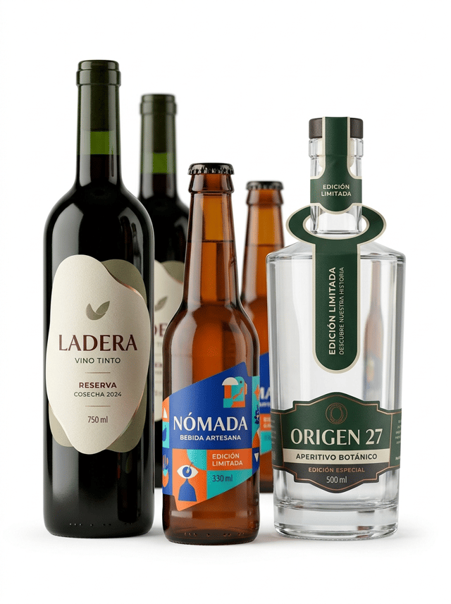
Create an elegant contemporary composition featuring THREE clearly different premium bottles:

• a dark green glass wine bottle with a large custom die-cut self-adhesive label
• an amber glass craft beverage bottle with an asymmetric shaped self-adhesive label
• a thick transparent glass premium beverage bottle with a sophisticated neck-hanging label combined with a front self-adhesive label

The three main bottles are positioned in the foreground at slightly different heights.

Three additional bottles may appear aligned behind them, softly out of focus, creating depth while keeping the front labels completely dominant.

The different bottle silhouettes and label shapes must be immediately recognizable.

1. WINE BOTTLE — ORGANIC DIE-CUT LABEL

Use an elegant dark green glass wine bottle.

Apply a premium textured paper self-adhesive label with a sophisticated CUSTOM ORGANIC DIE-CUT SHAPE.

The label must NOT be rectangular, square or oval.

Create an elegant irregular silhouette inspired by the geometry of a vineyard landscape: subtle curved edges combined with clean architectural angles.

The custom contour must be clearly visible against the dark green glass.

The die-cut shape should look sophisticated and commercially manufacturable, not whimsical or decorative.

Contemporary premium Spanish wine branding.

Warm ivory textured paper.

Deep burgundy typography.

Muted olive details.

Small selective metallic accent.

Visible text in Spanish:

LADERA

VINO TINTO

RESERVA

COSECHA 2024

750 ml

2. AMBER BOTTLE — ASYMMETRIC DIE-CUT LABEL

Use a contemporary amber glass bottle with a modern crown cap.

Apply a bold self-adhesive label with an asymmetric geometric die-cut shape.

The label contour incorporates diagonal cuts, subtle curves and a distinctive modern silhouette.

The shape itself becomes part of the graphic identity.

Use a contemporary color palette combining cobalt blue, vivid orange, turquoise and warm white.

Integrate a large modern illustration that follows and interacts with the custom die-cut contour.

The design must feel current, bold and premium.

Visible text in Spanish:

NÓMADA

BEBIDA ARTESANA

EDICIÓN LIMITADA

330 ml

3. PREMIUM TRANSPARENT BOTTLE — NECK HANGER + FRONT LABEL

Use an elegant thick transparent glass bottle with sophisticated architectural proportions.

Apply a premium front self-adhesive label combined with an elegant printed NECK-HANGING LABEL placed around the bottle neck.

The neck hanger must be clearly visible and physically separate from the front adhesive label.

The hanging label should have a sophisticated custom die-cut shape with a circular opening around the bottle neck and an elongated printed section hanging naturally down the front.

The neck hanger must look like a REAL PRINTED AND DIE-CUT PIECE OF MATERIAL, not part of the bottle.

Use a refined contemporary graphic identity combining deep forest green, warm ivory, charcoal and selective metallic details.

Visible front-label text in Spanish:

ORIGEN 27

APERITIVO BOTÁNICO

EDICIÓN ESPECIAL

500 ml

Visible neck-hanger text:

EDICIÓN LIMITADA

DESCUBRE NUESTRA HISTORIA

IMPORTANT FOR ALL THREE PRODUCTS:

The custom label shapes must be CLEARLY VISIBLE.

Do not hide the die-cut contours with dark graphics or reflections.

Leave visible bottle surface surrounding every label so the viewer can clearly appreciate the shape of the adhesive material.

Every self-adhesive label must look like a REAL PHYSICAL LABEL applied onto the bottle.

Clearly visible physical edges.

Realistic paper or film thickness.

Perfect die-cut contours.

Perfect adhesion following the curved bottle surfaces.

The neck hanger must behave naturally according to gravity and must remain visibly separate from the self-adhesive front label.

The graphics must NOT look printed directly onto the glass.

The image must immediately communicate:

CUSTOM LABEL SHAPES

SPECIAL DIE-CUTTING

CREATIVE BOTTLE LABEL SOLUTIONS

PREMIUM NECK LABELS

Exceptional commercial printing quality.

Ultra-sharp typography.

Perfect registration.

Extremely precise die-cut edges.

Professional editorial product photography.

PURE WHITE seamless background (#FFFFFF).

The background must be genuinely pure white, not beige, cream or gray.

Clean white studio surface.

Front three-quarter view, almost frontal.

The camera angle must clearly reveal the custom contours of every label.

Balanced horizontal composition.

Generous clean white space surrounding the bottles.

Soft natural contact shadows only.

Controlled high-key studio lighting designed to reveal:

• the physical contour of each die-cut label
• the texture and thickness of the label materials
• the separation between label and bottle
• the construction of the neck hanger
• the different glass colors
• exceptional print definition

The three foreground labels must be razor-sharp.

Hyper-realistic glass.

Hyper-realistic paper and self-adhesive materials.

Exceptional commercial printing.

Contemporary European packaging design.

Premium editorial photography.

8K ultra-high definition.

Designed by a Pentawards-winning packaging designer.

NO conventional rectangular labels on all bottles.
NO simple oval labels.
NO excessive ornamental shapes.
NO baroque contours.
NO arabesque patterns.
NO heart-shaped labels.
NO star-shaped labels.
NO childish die-cut shapes.
NO oversized neck hanger hiding the bottle.
NO ribbon tied around the neck.
NO string tags.
NO fabric tags.
NO direct printing onto glass.
NO shrink sleeves.
NO floating labels.
NO peeling edges.
NO decorative props.
NO glasses.
NO fruit.
NO flowers.
NO wooden surfaces.
NO colored background.
NO beige background.
NO gray background.
NO clutter.
nano-banana-pro

The label must look like a physical self-adhesive label applied onto the container, with visible edges and realistic material texture. It must NOT look like graphics printed directly onto the packaging. Ultra-premium commercial packaging photography created for a premium self-adhesive label manufacturer, featuring a sophisticated collection of premium bottles showcasing custom die-cut self-adhesive labels and special neck-label applications. The purpose of the image is to demonstrate that professional bottle labels can be manufactured in CUSTOM SHAPES, SPECIAL DIE-CUT FORMATS and CREATIVE NECK APPLICATIONS rather than conventional rectangular formats. THE LABELS MUST BE THE ABSOLUTE VISUAL PROTAGONISTS OF THE IMAGE. Create an elegant contemporary composition featuring THREE clearly different premium bottles: • a dark green glass wine bottle with a large custom die-cut self-adhesive label • an amber glass craft beverage bottle with an asymmetric shaped self-adhesive label • a thick transparent glass premium beverage bottle with a sophisticated neck-hanging label combined with a front self-adhesive label The three main bottles are positioned in the foreground at slightly different heights. Three additional bottles may appear aligned behind them, softly out of focus, creating depth while keeping the front labels completely dominant. The different bottle silhouettes and label shapes must be immediately recognizable. 1. WINE BOTTLE — ORGANIC DIE-CUT LABEL Use an elegant dark green glass wine bottle. Apply a premium textured paper self-adhesive label with a sophisticated CUSTOM ORGANIC DIE-CUT SHAPE. The label must NOT be rectangular, square or oval. Create an elegant irregular silhouette inspired by the geometry of a vineyard landscape: subtle curved edges combined with clean architectural angles. The custom contour must be clearly visible against the dark green glass. The die-cut shape should look sophisticated and commercially manufacturable, not whimsical or decorative. Contemporary premium Spanish wine branding. Warm ivory textured paper. Deep burgundy typography. Muted olive details. Small selective metallic accent. Visible text in Spanish: LADERA VINO TINTO RESERVA COSECHA 2024 750 ml 2. AMBER BOTTLE — ASYMMETRIC DIE-CUT LABEL Use a contemporary amber glass bottle with a modern crown cap. Apply a bold self-adhesive label with an asymmetric geometric die-cut shape. The label contour incorporates diagonal cuts, subtle curves and a distinctive modern silhouette. The shape itself becomes part of the graphic identity. Use a contemporary color palette combining cobalt blue, vivid orange, turquoise and warm white. Integrate a large modern illustration that follows and interacts with the custom die-cut contour. The design must feel current, bold and premium. Visible text in Spanish: NÓMADA BEBIDA ARTESANA EDICIÓN LIMITADA 330 ml 3. PREMIUM TRANSPARENT BOTTLE — NECK HANGER + FRONT LABEL Use an elegant thick transparent glass bottle with sophisticated architectural proportions. Apply a premium front self-adhesive label combined with an elegant printed NECK-HANGING LABEL placed around the bottle neck. The neck hanger must be clearly visible and physically separate from the front adhesive label. The hanging label should have a sophisticated custom die-cut shape with a circular opening around the bottle neck and an elongated printed section hanging naturally down the front. The neck hanger must look like a REAL PRINTED AND DIE-CUT PIECE OF MATERIAL, not part of the bottle. Use a refined contemporary graphic identity combining deep forest green, warm ivory, charcoal and selective metallic details. Visible front-label text in Spanish: ORIGEN 27 APERITIVO BOTÁNICO EDICIÓN ESPECIAL 500 ml Visible neck-hanger text: EDICIÓN LIMITADA DESCUBRE NUESTRA HISTORIA IMPORTANT FOR ALL THREE PRODUCTS: The custom label shapes must be CLEARLY VISIBLE. Do not hide the die-cut contours with dark graphics or reflections. Leave visible bottle surface surrounding every label so the viewer can clearly appreciate the shape of the adhesive material. Every self-adhesive label must look like a REAL PHYSICAL LABEL applied onto the bottle. Clearly visible physical edges. Realistic paper or film thickness. Perfect die-cut contours. Perfect adhesion following the curved bottle surfaces. The neck hanger must behave naturally according to gravity and must remain visibly separate from the self-adhesive front label. The graphics must NOT look printed directly onto the glass. The image must immediately communicate: CUSTOM LABEL SHAPES SPECIAL DIE-CUTTING CREATIVE BOTTLE LABEL SOLUTIONS PREMIUM NECK LABELS Exceptional commercial printing quality. Ultra-sharp typography. Perfect registration. Extremely precise die-cut edges. Professional editorial product photography. PURE WHITE seamless background (#FFFFFF). The background must be genuinely pure white, not beige, cream or gray. Clean white studio surface. Front three-quarter view, almost frontal. The camera angle must clearly reveal the custom contours of every label. Balanced horizontal composition. Generous clean white space surrounding the bottles. Soft natural contact shadows only. Controlled high-key studio lighting designed to reveal: • the physical contour of each die-cut label • the texture and thickness of the label materials • the separation between label and bottle • the construction of the neck hanger • the different glass colors • exceptional print definition The three foreground labels must be razor-sharp. Hyper-realistic glass. Hyper-realistic paper and self-adhesive materials. Exceptional commercial printing. Contemporary European packaging design. Premium editorial photography. 8K ultra-high definition. Designed by a Pentawards-winning packaging designer. NO conventional rectangular labels on all bottles. NO simple oval labels. NO excessive ornamental shapes. NO baroque contours. NO arabesque patterns. NO heart-shaped labels. NO star-shaped labels. NO childish die-cut shapes. NO oversized neck hanger hiding the bottle. NO ribbon tied around the neck. NO string tags. NO fabric tags. NO direct printing onto glass. NO shrink sleeves. NO floating labels. NO peeling edges. NO decorative props. NO glasses. NO fruit. NO flowers. NO wooden surfaces. NO colored background. NO beige background. NO gray background. NO clutter.

ev@eli verges
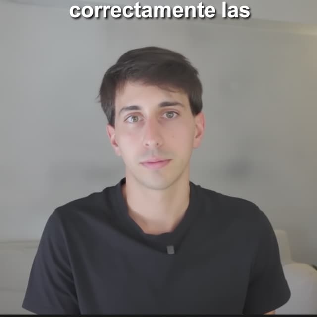
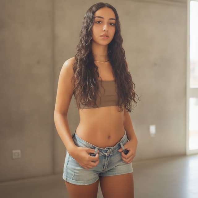
Enhance this image to be sharper and more high-resolution, improving clarity and fine detail without changing the lighting, colors, or composition. Adjust the person's facial expression to be more neutral and relaxed — soften any tension in the mouth and eyebrows, keep the eyes natural, and preserve their exact identity, facial structure, skin texture, and likeness. Keep everything else in the image unchanged.
nano-banana

Enhance this image to be sharper and more high-resolution, improving clarity and fine detail without changing the lighting, colors, or composition. Adjust the person's facial expression to be more neutral and relaxed — soften any tension in the mouth and eyebrows, keep the eyes natural, and preserve their exact identity, facial structure, skin texture, and likeness. Keep everything else in the image unchanged.

NA@Newlyn Allan
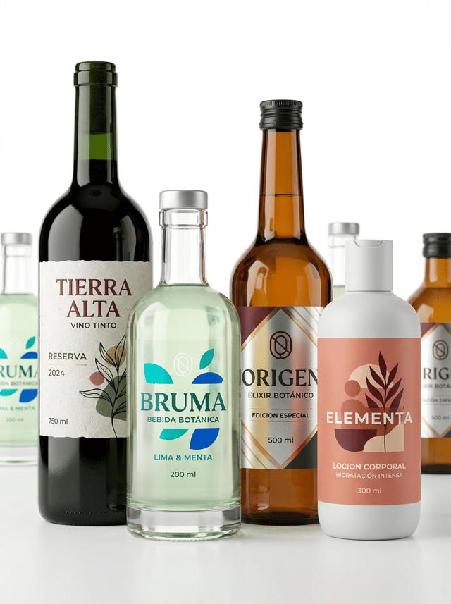
The label must look like a physical self-adhesive label applied onto the container, with visible edges and realistic material texture. It must NOT look like graphics printed directly onto the packaging.


Ultra-premium commercial packaging photography created for a premium self-adhesive label manufacturer, featuring a sophisticated collection of four premium bottles showcasing different professional self-adhesive label materials and printing finishes.

The purpose of the image is to demonstrate the wide range of materials, textures and premium finishes available for custom bottle labels.

THE SELF-ADHESIVE LABELS MUST BE THE ABSOLUTE VISUAL PROTAGONISTS OF THE IMAGE.

Create an elegant contemporary composition featuring FOUR clearly different premium bottles:

• dark green glass wine bottle with textured paper label
• thick transparent glass botanical beverage bottle with transparent no-label-look label
• amber glass gourmet bottle with metallic self-adhesive label
• contemporary matte white plastic bottle with premium matte label

The four main bottles are arranged at slightly different heights in the foreground, creating a sophisticated editorial composition.

Additional bottles may appear softly out of focus behind them to create depth, but the four foreground labels must remain the dominant visual elements.

Each bottle must clearly demonstrate a DIFFERENT SELF-ADHESIVE LABEL MATERIAL.


1. TEXTURED PAPER LABEL

Apply a premium white textured paper self-adhesive label to the dark green glass wine bottle.

The paper must show subtle natural fibers and tactile texture clearly visible under the studio lighting.

Contemporary premium wine branding.

Use warm ivory, deep burgundy, black and subtle muted green.

Elegant modern typography and a large abstract graphic illustration.

Visible text in Spanish:

TIERRA ALTA

VINO TINTO

RESERVA

2024

750 ml


2. TRANSPARENT NO-LABEL-LOOK FILM

Apply a crystal-clear self-adhesive film label to the transparent glass botanical beverage bottle.

Large areas of the label remain transparent, allowing the bottle and liquid to remain completely visible.

Selected typography and graphics use opaque white ink combined with vivid turquoise and cobalt blue.

The subtle physical edges of the transparent label must remain visible.

The viewer must understand that this is a REAL TRANSPARENT SELF-ADHESIVE LABEL and NOT direct printing onto the bottle.

Visible text in Spanish:

BRUMA

BEBIDA BOTÁNICA

LIMA & MENTA

200 ml


3. METALLIC SELF-ADHESIVE LABEL

Apply a premium metallic silver self-adhesive label to the amber glass gourmet bottle.

IMPORTANT:

The entire label must NOT appear metallic.

Large areas of the metallic substrate are covered with opaque deep burgundy, charcoal and warm ivory inks.

Carefully selected areas remain exposed to reveal the metallic material underneath.

Use exposed metallic areas strategically in:

• the logo
• selected typography
• geometric lines
• small graphic details

Some areas may use transparent amber ink over the metallic silver substrate to create a realistic warm metallic gold appearance.

The metallic effect must come from the LABEL MATERIAL itself.

NO fake digital metallic gradients.

Visible text in Spanish:

ORIGEN

ELIXIR BOTÁNICO

EDICIÓN ESPECIAL

500 ml


4. PREMIUM MATTE LABEL

Apply a sophisticated ultra-matte self-adhesive label to a contemporary matte white plastic bottle.

The label should have a visibly soft, tactile, non-reflective surface.

Use contemporary personal-care branding with soft coral, muted terracotta, deep burgundy and warm ivory.

Large modern illustration and bold contemporary typography.

Visible text in Spanish:

ELEMENTA

LOCION CORPORAL

HIDRATACIÓN INTENSA

300 ml


IMPORTANT FOR ALL FOUR BOTTLES:

Every label must look like a REAL PHYSICAL SELF-ADHESIVE LABEL applied onto the bottle.

Clearly visible physical label edges where appropriate.

Realistic differences between:

• textured paper
• transparent film
• metallic film
• ultra-matte material

The viewer must be able to visually distinguish the FOUR DIFFERENT LABEL MATERIALS.

The labels must NOT look like identical white stickers with different graphics.

Material texture and finishing must be clearly visible.

Perfect adhesion following the curved bottle surfaces.

No wrinkles.

No bubbles.

No lifting edges.

The graphics must NOT look printed directly onto the bottles.

The labels must occupy a significant visual area of each bottle.

Exceptional commercial printing quality.

Ultra-sharp typography.

Perfect registration.

Perfect die-cut edges.

Professional editorial product photography.

PURE WHITE seamless background (#FFFFFF).

The background must be genuinely pure white, not beige, cream or gray.

Clean white studio surface.

Front three-quarter view, almost frontal, allowing the different bottle shapes and label materials to be clearly appreciated.

Balanced composition with the four bottles occupying most of the horizontal frame.

Generous clean white space surrounding the collection.

Soft natural contact shadows only.

Controlled high-key studio lighting specifically designed to reveal the DIFFERENT PHYSICAL PROPERTIES OF EACH LABEL:

• directional light revealing the fibers and texture of the paper label
• subtle reflections revealing the transparent film edges
• controlled highlights revealing the metallic substrate
• soft diffuse lighting revealing the non-reflective matte finish

The foreground labels must be razor-sharp.

Hyper-realistic glass.

Hyper-realistic plastic.

Hyper-realistic self-adhesive materials.

Exceptional commercial printing.

Contemporary European packaging design.

Premium editorial photography.

8K ultra-high definition.

Designed by a Pentawards-winning packaging designer.

NO stamping effect replacing the metallic material.
NO fake gold gradients.
NO fully metallic bottle.
NO shrink sleeves.
NO direct printing onto bottles.
NO identical label material on every bottle.
NO generic packaging.
NO vintage design.
NO ornamental borders.
NO arabesque patterns.
NO decorative props.
NO glasses.
NO fruit.
NO flowers.
NO plants outside the labels.
NO wooden surfaces.
NO colored background.
NO beige background.
NO gray background.
NO clutter.
nano-banana-pro

The label must look like a physical self-adhesive label applied onto the container, with visible edges and realistic material texture. It must NOT look like graphics printed directly onto the packaging. Ultra-premium commercial packaging photography created for a premium self-adhesive label manufacturer, featuring a sophisticated collection of four premium bottles showcasing different professional self-adhesive label materials and printing finishes. The purpose of the image is to demonstrate the wide range of materials, textures and premium finishes available for custom bottle labels. THE SELF-ADHESIVE LABELS MUST BE THE ABSOLUTE VISUAL PROTAGONISTS OF THE IMAGE. Create an elegant contemporary composition featuring FOUR clearly different premium bottles: • dark green glass wine bottle with textured paper label • thick transparent glass botanical beverage bottle with transparent no-label-look label • amber glass gourmet bottle with metallic self-adhesive label • contemporary matte white plastic bottle with premium matte label The four main bottles are arranged at slightly different heights in the foreground, creating a sophisticated editorial composition. Additional bottles may appear softly out of focus behind them to create depth, but the four foreground labels must remain the dominant visual elements. Each bottle must clearly demonstrate a DIFFERENT SELF-ADHESIVE LABEL MATERIAL. 1. TEXTURED PAPER LABEL Apply a premium white textured paper self-adhesive label to the dark green glass wine bottle. The paper must show subtle natural fibers and tactile texture clearly visible under the studio lighting. Contemporary premium wine branding. Use warm ivory, deep burgundy, black and subtle muted green. Elegant modern typography and a large abstract graphic illustration. Visible text in Spanish: TIERRA ALTA VINO TINTO RESERVA 2024 750 ml 2. TRANSPARENT NO-LABEL-LOOK FILM Apply a crystal-clear self-adhesive film label to the transparent glass botanical beverage bottle. Large areas of the label remain transparent, allowing the bottle and liquid to remain completely visible. Selected typography and graphics use opaque white ink combined with vivid turquoise and cobalt blue. The subtle physical edges of the transparent label must remain visible. The viewer must understand that this is a REAL TRANSPARENT SELF-ADHESIVE LABEL and NOT direct printing onto the bottle. Visible text in Spanish: BRUMA BEBIDA BOTÁNICA LIMA & MENTA 200 ml 3. METALLIC SELF-ADHESIVE LABEL Apply a premium metallic silver self-adhesive label to the amber glass gourmet bottle. IMPORTANT: The entire label must NOT appear metallic. Large areas of the metallic substrate are covered with opaque deep burgundy, charcoal and warm ivory inks. Carefully selected areas remain exposed to reveal the metallic material underneath. Use exposed metallic areas strategically in: • the logo • selected typography • geometric lines • small graphic details Some areas may use transparent amber ink over the metallic silver substrate to create a realistic warm metallic gold appearance. The metallic effect must come from the LABEL MATERIAL itself. NO fake digital metallic gradients. Visible text in Spanish: ORIGEN ELIXIR BOTÁNICO EDICIÓN ESPECIAL 500 ml 4. PREMIUM MATTE LABEL Apply a sophisticated ultra-matte self-adhesive label to a contemporary matte white plastic bottle. The label should have a visibly soft, tactile, non-reflective surface. Use contemporary personal-care branding with soft coral, muted terracotta, deep burgundy and warm ivory. Large modern illustration and bold contemporary typography. Visible text in Spanish: ELEMENTA LOCION CORPORAL HIDRATACIÓN INTENSA 300 ml IMPORTANT FOR ALL FOUR BOTTLES: Every label must look like a REAL PHYSICAL SELF-ADHESIVE LABEL applied onto the bottle. Clearly visible physical label edges where appropriate. Realistic differences between: • textured paper • transparent film • metallic film • ultra-matte material The viewer must be able to visually distinguish the FOUR DIFFERENT LABEL MATERIALS. The labels must NOT look like identical white stickers with different graphics. Material texture and finishing must be clearly visible. Perfect adhesion following the curved bottle surfaces. No wrinkles. No bubbles. No lifting edges. The graphics must NOT look printed directly onto the bottles. The labels must occupy a significant visual area of each bottle. Exceptional commercial printing quality. Ultra-sharp typography. Perfect registration. Perfect die-cut edges. Professional editorial product photography. PURE WHITE seamless background (#FFFFFF). The background must be genuinely pure white, not beige, cream or gray. Clean white studio surface. Front three-quarter view, almost frontal, allowing the different bottle shapes and label materials to be clearly appreciated. Balanced composition with the four bottles occupying most of the horizontal frame. Generous clean white space surrounding the collection. Soft natural contact shadows only. Controlled high-key studio lighting specifically designed to reveal the DIFFERENT PHYSICAL PROPERTIES OF EACH LABEL: • directional light revealing the fibers and texture of the paper label • subtle reflections revealing the transparent film edges • controlled highlights revealing the metallic substrate • soft diffuse lighting revealing the non-reflective matte finish The foreground labels must be razor-sharp. Hyper-realistic glass. Hyper-realistic plastic. Hyper-realistic self-adhesive materials. Exceptional commercial printing. Contemporary European packaging design. Premium editorial photography. 8K ultra-high definition. Designed by a Pentawards-winning packaging designer. NO stamping effect replacing the metallic material. NO fake gold gradients. NO fully metallic bottle. NO shrink sleeves. NO direct printing onto bottles. NO identical label material on every bottle. NO generic packaging. NO vintage design. NO ornamental borders. NO arabesque patterns. NO decorative props. NO glasses. NO fruit. NO flowers. NO plants outside the labels. NO wooden surfaces. NO colored background. NO beige background. NO gray background. NO clutter.

ev@eli verges
The label must look like a physical self-adhesive label applied onto the container, with visible edges and realistic material texture. It must NOT look like graphics printed directly onto the packaging.


Ultra-premium commercial packaging photography created for a premium self-adhesive label manufacturer, featuring a contemporary collection of different bottles exposed to water, condensation and high-humidity conditions.

The purpose of the image is to visually demonstrate the exceptional resistance, durability and adhesion of professional self-adhesive labels applied to different bottle materials.

THE SELF-ADHESIVE LABELS MUST BE THE ABSOLUTE VISUAL PROTAGONISTS OF THE IMAGE.

Create a sophisticated composition featuring three clearly different bottles:

• one cold amber glass craft beer bottle
• one transparent PET sports hydration bottle
• one transparent personal-care bottle with pump dispenser

The three main bottles are positioned in the foreground at slightly different heights.

Behind them, three additional bottles from the same product families are positioned slightly out of focus, creating natural depth.

All bottles are covered with REALISTIC SMALL WATER DROPLETS AND LIGHT CONDENSATION.

IMPORTANT:

Water droplets must be clearly visible directly ON THE SURFACE OF THE SELF-ADHESIVE LABELS, not only on the bottles.

Despite exposure to water and humidity, every label remains:

• perfectly adhered
• completely flat
• razor-sharp
• fully readable
• structurally intact
• with perfectly sealed edges
• without wrinkles
• without bubbles
• without lifting corners
• without ink deterioration

The image must immediately communicate:

HIGH-PERFORMANCE SELF-ADHESIVE LABELS FOR WET AND HUMID ENVIRONMENTS.


COLD BEER BOTTLE:

Use an elegant amber glass craft beer bottle with visible cold condensation.

Apply a premium wet-strength self-adhesive label designed for bottles exposed to refrigeration and moisture.

Contemporary craft beer design using deep cobalt blue, vivid orange, warm white and black.

Bold modern typography and a large contemporary graphic illustration.

Visible text must be written in Spanish:

COSTA NORTE

CERVEZA ARTESANA

LAGER

330 ml

SERVIR FRÍA


SPORTS DRINK:

Use a contemporary transparent PET sports bottle with ergonomic curved shape.

The beverage inside has a subtle translucent turquoise tone.

Apply a premium synthetic self-adhesive film label resistant to water and condensation.

Bold contemporary design using turquoise, electric blue, coral and white.

Dynamic abstract graphics inspired by hydration and movement.

Visible text must be written in Spanish:

PULSO

BEBIDA ISOTÓNICA

HIDRATACIÓN

ELECTROLITOS

500 ml


PERSONAL-CARE BOTTLE:

Use an elegant transparent glass or PET pump bottle containing a very subtle translucent personal-care product.

Apply a premium matte synthetic self-adhesive film label designed for bathrooms and high-humidity environments.

Sophisticated contemporary design using eucalyptus green, soft aqua, warm ivory and deep charcoal.

Large modern botanical illustration integrated into the graphic design.

Visible text must be written in Spanish:

ELEMENTA

GEL DE DUCHA

HIDRATACIÓN DIARIA

PIEL SENSIBLE

300 ml


EVERY LABEL MUST LOOK LIKE A REAL PHYSICAL SELF-ADHESIVE LABEL APPLIED ONTO THE BOTTLE.

Clearly visible physical label edges.

Realistic synthetic film and wet-strength label material textures.

Perfect adhesion following the curved surfaces of the bottles.

The graphics must NOT look printed directly onto the packaging.

The labels must occupy a significant visual area of each bottle and remain completely visible from the camera angle.

The presence of water must emphasize the PERFORMANCE OF THE LABEL, not create a decorative splash effect.

Water droplets should naturally sit on both the bottle surface and the label surface.

The droplets must be small enough that the label design remains completely readable.

Professional editorial product photography.

PURE WHITE seamless background (#FFFFFF).

The background must be genuinely pure white, not blue, gray, beige or cream.

Clean white studio surface.

Front three-quarter view, almost frontal.

Balanced centered composition.

Generous clean white space surrounding the products.

Soft natural contact shadows.

Controlled high-key studio lighting specifically designed to reveal:

• realistic condensation
• individual water droplets
• water droplets sitting directly on the labels
• physical label edges
• perfect adhesion
• synthetic label texture
• glass and PET transparency
• exceptional printing definition

The three foreground labels must be razor-sharp.

Background bottles may have a subtle natural depth of field.

Hyper-realistic water droplets.

Hyper-realistic condensation.

Hyper-realistic glass and PET.

Hyper-realistic self-adhesive label materials.

Exceptional commercial printing quality.

Contemporary European packaging design.

Premium commercial product photography.

8K ultra-high definition.

Designed by a Pentawards-winning packaging designer.

NO dramatic water splashes.
NO bottles submerged in water.
NO ice cubes hiding the labels.
NO wet damaged paper.
NO peeling labels.
NO curled corners.
NO wrinkled labels.
NO bubbles under the labels.
NO ink bleeding.
NO dissolved printing.
NO graphics printed directly onto bottles.
NO shrink sleeves.
NO bathroom scenery.
NO bar scenery.
NO gym scenery.
NO decorative props.
NO colored background.
NO gray background.
NO beige background.
NO clutter.
nano-banana-pro

The label must look like a physical self-adhesive label applied onto the container, with visible edges and realistic material texture. It must NOT look like graphics printed directly onto the packaging. Ultra-premium commercial packaging photography created for a premium self-adhesive label manufacturer, featuring a contemporary collection of different bottles exposed to water, condensation and high-humidity conditions. The purpose of the image is to visually demonstrate the exceptional resistance, durability and adhesion of professional self-adhesive labels applied to different bottle materials. THE SELF-ADHESIVE LABELS MUST BE THE ABSOLUTE VISUAL PROTAGONISTS OF THE IMAGE. Create a sophisticated composition featuring three clearly different bottles: • one cold amber glass craft beer bottle • one transparent PET sports hydration bottle • one transparent personal-care bottle with pump dispenser The three main bottles are positioned in the foreground at slightly different heights. Behind them, three additional bottles from the same product families are positioned slightly out of focus, creating natural depth. All bottles are covered with REALISTIC SMALL WATER DROPLETS AND LIGHT CONDENSATION. IMPORTANT: Water droplets must be clearly visible directly ON THE SURFACE OF THE SELF-ADHESIVE LABELS, not only on the bottles. Despite exposure to water and humidity, every label remains: • perfectly adhered • completely flat • razor-sharp • fully readable • structurally intact • with perfectly sealed edges • without wrinkles • without bubbles • without lifting corners • without ink deterioration The image must immediately communicate: HIGH-PERFORMANCE SELF-ADHESIVE LABELS FOR WET AND HUMID ENVIRONMENTS. COLD BEER BOTTLE: Use an elegant amber glass craft beer bottle with visible cold condensation. Apply a premium wet-strength self-adhesive label designed for bottles exposed to refrigeration and moisture. Contemporary craft beer design using deep cobalt blue, vivid orange, warm white and black. Bold modern typography and a large contemporary graphic illustration. Visible text must be written in Spanish: COSTA NORTE CERVEZA ARTESANA LAGER 330 ml SERVIR FRÍA SPORTS DRINK: Use a contemporary transparent PET sports bottle with ergonomic curved shape. The beverage inside has a subtle translucent turquoise tone. Apply a premium synthetic self-adhesive film label resistant to water and condensation. Bold contemporary design using turquoise, electric blue, coral and white. Dynamic abstract graphics inspired by hydration and movement. Visible text must be written in Spanish: PULSO BEBIDA ISOTÓNICA HIDRATACIÓN ELECTROLITOS 500 ml PERSONAL-CARE BOTTLE: Use an elegant transparent glass or PET pump bottle containing a very subtle translucent personal-care product. Apply a premium matte synthetic self-adhesive film label designed for bathrooms and high-humidity environments. Sophisticated contemporary design using eucalyptus green, soft aqua, warm ivory and deep charcoal. Large modern botanical illustration integrated into the graphic design. Visible text must be written in Spanish: ELEMENTA GEL DE DUCHA HIDRATACIÓN DIARIA PIEL SENSIBLE 300 ml EVERY LABEL MUST LOOK LIKE A REAL PHYSICAL SELF-ADHESIVE LABEL APPLIED ONTO THE BOTTLE. Clearly visible physical label edges. Realistic synthetic film and wet-strength label material textures. Perfect adhesion following the curved surfaces of the bottles. The graphics must NOT look printed directly onto the packaging. The labels must occupy a significant visual area of each bottle and remain completely visible from the camera angle. The presence of water must emphasize the PERFORMANCE OF THE LABEL, not create a decorative splash effect. Water droplets should naturally sit on both the bottle surface and the label surface. The droplets must be small enough that the label design remains completely readable. Professional editorial product photography. PURE WHITE seamless background (#FFFFFF). The background must be genuinely pure white, not blue, gray, beige or cream. Clean white studio surface. Front three-quarter view, almost frontal. Balanced centered composition. Generous clean white space surrounding the products. Soft natural contact shadows. Controlled high-key studio lighting specifically designed to reveal: • realistic condensation • individual water droplets • water droplets sitting directly on the labels • physical label edges • perfect adhesion • synthetic label texture • glass and PET transparency • exceptional printing definition The three foreground labels must be razor-sharp. Background bottles may have a subtle natural depth of field. Hyper-realistic water droplets. Hyper-realistic condensation. Hyper-realistic glass and PET. Hyper-realistic self-adhesive label materials. Exceptional commercial printing quality. Contemporary European packaging design. Premium commercial product photography. 8K ultra-high definition. Designed by a Pentawards-winning packaging designer. NO dramatic water splashes. NO bottles submerged in water. NO ice cubes hiding the labels. NO wet damaged paper. NO peeling labels. NO curled corners. NO wrinkled labels. NO bubbles under the labels. NO ink bleeding. NO dissolved printing. NO graphics printed directly onto bottles. NO shrink sleeves. NO bathroom scenery. NO bar scenery. NO gym scenery. NO decorative props. NO colored background. NO gray background. NO beige background. NO clutter.

ev@eli verges
crea un conjunto de viñetas en la que la  mujer de la imagen que adjunto subida encima de un toro está realizando las siguientes actividades: ● (artes gráficas).


● (fabricación de elementos metálicos para construcción).


● (forja, estampación y embutición de metales).


● (fabricación de productos de alambre).


● (fabricación equipos electrónicos).


● (reparación de productos metálicos y maquinaria).


● (talleres coches).


● (talleres motos).


● (comercio al por mayor de materiales de construcción).


● (transporte terrestre de viajeros).


● (transporte terrestre de mercancías).


●(actividades anexas a los transportes terrestre, marítimo y aéreo).


● (actividades de fotografía).


● (lavado y limpieza de prendas textiles y de piel).
nano-banana

crea un conjunto de viñetas en la que la mujer de la imagen que adjunto subida encima de un toro está realizando las siguientes actividades: ● (artes gráficas). ● (fabricación de elementos metálicos para construcción). ● (forja, estampación y embutición de metales). ● (fabricación de productos de alambre). ● (fabricación equipos electrónicos). ● (reparación de productos metálicos y maquinaria). ● (talleres coches). ● (talleres motos). ● (comercio al por mayor de materiales de construcción). ● (transporte terrestre de viajeros). ● (transporte terrestre de mercancías). ●(actividades anexas a los transportes terrestre, marítimo y aéreo). ● (actividades de fotografía). ● (lavado y limpieza de prendas textiles y de piel).

m@marina
The label must look like a physical self-adhesive label applied onto the container, with visible edges and realistic material texture. It must NOT look like graphics printed directly onto the packaging.


Ultra-premium commercial packaging photography created for a premium self-adhesive label manufacturer, featuring a contemporary collection of plastic and PET bottles from different consumer sectors.

The purpose of the image is to showcase the versatility, exceptional printing quality and perfect adhesion of professional self-adhesive labels applied to different plastic bottle shapes and curved surfaces.

THE SELF-ADHESIVE LABELS MUST BE THE ABSOLUTE VISUAL PROTAGONISTS OF THE IMAGE.

Create an elegant contemporary composition featuring three clearly different types of plastic bottles:

• one transparent PET functional beverage bottle
• one premium white plastic cosmetic bottle
• one transparent PET household cleaning spray bottle

The three main bottles are positioned in the foreground at slightly different heights.

Behind them, three additional bottles from the same product families are positioned slightly out of focus, creating natural depth.

The bottles must have clearly different shapes, curves and proportions so the viewer immediately understands the adaptability of self-adhesive labels to different plastic packaging formats.

IMPORTANT:

The labels must adapt perfectly to the CURVED SURFACES of the plastic bottles.

No lifting edges.

No bubbles.

No wrinkles.

No deformation.

Perfect adhesion.


FUNCTIONAL BEVERAGE:

Use a modern transparent PET sports and functional beverage bottle with contemporary ergonomic curves.

The bottle contains a lightly colored translucent beverage.

Apply a premium white synthetic self-adhesive film label with a bold, energetic and contemporary design.

Use electric blue, vivid coral, turquoise and clean white.

Integrate a large dynamic abstract illustration inspired by movement, hydration and energy.

Strong oversized typography.

Modern geometric elements.

The design should feel youthful, athletic and premium without looking like an extreme energy drink.

Visible text must be written in Spanish:

IMPULSO

BEBIDA FUNCIONAL

HIDRATACIÓN ACTIVA

ELECTROLITOS

500 ml


COSMETIC BOTTLE:

Use an elegant matte white plastic bottle with modern curved shoulders and premium pump dispenser.

Apply a sophisticated self-adhesive label with contemporary personal-care branding.

Use soft lilac, coral, warm pink and deep burgundy combined with clean white areas.

Include a large modern abstract botanical illustration integrated into the label.

The design must feel contemporary, colorful and premium rather than generic minimalist cosmetics.

Visible text must be written in Spanish:

NATURA

LOCION CORPORAL

HIDRATACIÓN INTENSA

PIEL SENSIBLE

300 ml


HOUSEHOLD CLEANING BOTTLE:

Use a modern transparent PET spray bottle with an ergonomic trigger.

The liquid inside has a subtle aqua tone.

Apply a premium synthetic self-adhesive label suitable for household cleaning applications.

Create a fresh, powerful and contemporary design using turquoise, deep blue, vivid lime and white.

Integrate large abstract graphics inspired by freshness, cleanliness and movement.

Avoid traditional supermarket cleaning-product aesthetics.

Visible text must be written in Spanish:

BRILLA

LIMPIADOR MULTIUSOS

FRESCURA INTENSA

USO DIARIO

750 ml


ALL THREE LABELS:

Every label must look like a REAL PHYSICAL SELF-ADHESIVE LABEL applied onto the plastic container.

Clearly visible label edges.

Realistic synthetic film or premium paper texture depending on the application.

The graphics must NOT look printed directly onto the bottle.

The bottles must remain visible around the labels so the viewer can clearly distinguish the packaging material from the self-adhesive label.

The labels must occupy a significant visual area of each bottle.

The labels must remain completely visible from the camera angle.

Exceptional commercial printing quality.

Ultra-sharp typography.

Perfect color registration.

Perfect die-cut edges.

Perfect adhesion.

The image must clearly demonstrate that professional self-adhesive labels can adapt perfectly to different plastic materials, bottle shapes and curved surfaces.

Professional editorial product photography.

PURE WHITE seamless background (#FFFFFF).

The background must be genuinely pure white, not gray, beige or cream.

Front three-quarter view, almost frontal.

Centered balanced composition.

Generous clean white space surrounding the bottles.

Soft natural contact shadows only.

Controlled high-key studio lighting designed to reveal:

• the transparency of PET
• the matte surface of the white plastic bottle
• the different curved bottle geometries
• the physical edges of the labels
• perfect label adhesion
• exceptional print definition

The three foreground labels must be razor-sharp.

The bottles positioned behind may have a subtle natural depth of field.

Hyper-realistic PET.

Hyper-realistic HDPE plastic.

Hyper-realistic trigger and pump components.

Exceptional self-adhesive label printing.

Contemporary European packaging design.

Premium commercial photography.

8K ultra-high definition.

Designed by a Pentawards-winning packaging designer.

NO glass bottles.
NO cans.
NO shrink sleeves.
NO wraparound shrink film.
NO graphics printed directly onto the plastic.
NO labels floating away from bottles.
NO peeling labels.
NO wrinkles.
NO bubbles.
NO deformed labels.
NO generic supermarket packaging.
NO vintage design.
NO excessive text.
NO decorative props.
NO fruit outside the packaging.
NO plants.
NO gym equipment.
NO bathroom setting.
NO cleaning accessories.
NO colored background.
NO gray background.
NO beige background.
NO clutter.
nano-banana-pro

The label must look like a physical self-adhesive label applied onto the container, with visible edges and realistic material texture. It must NOT look like graphics printed directly onto the packaging. Ultra-premium commercial packaging photography created for a premium self-adhesive label manufacturer, featuring a contemporary collection of plastic and PET bottles from different consumer sectors. The purpose of the image is to showcase the versatility, exceptional printing quality and perfect adhesion of professional self-adhesive labels applied to different plastic bottle shapes and curved surfaces. THE SELF-ADHESIVE LABELS MUST BE THE ABSOLUTE VISUAL PROTAGONISTS OF THE IMAGE. Create an elegant contemporary composition featuring three clearly different types of plastic bottles: • one transparent PET functional beverage bottle • one premium white plastic cosmetic bottle • one transparent PET household cleaning spray bottle The three main bottles are positioned in the foreground at slightly different heights. Behind them, three additional bottles from the same product families are positioned slightly out of focus, creating natural depth. The bottles must have clearly different shapes, curves and proportions so the viewer immediately understands the adaptability of self-adhesive labels to different plastic packaging formats. IMPORTANT: The labels must adapt perfectly to the CURVED SURFACES of the plastic bottles. No lifting edges. No bubbles. No wrinkles. No deformation. Perfect adhesion. FUNCTIONAL BEVERAGE: Use a modern transparent PET sports and functional beverage bottle with contemporary ergonomic curves. The bottle contains a lightly colored translucent beverage. Apply a premium white synthetic self-adhesive film label with a bold, energetic and contemporary design. Use electric blue, vivid coral, turquoise and clean white. Integrate a large dynamic abstract illustration inspired by movement, hydration and energy. Strong oversized typography. Modern geometric elements. The design should feel youthful, athletic and premium without looking like an extreme energy drink. Visible text must be written in Spanish: IMPULSO BEBIDA FUNCIONAL HIDRATACIÓN ACTIVA ELECTROLITOS 500 ml COSMETIC BOTTLE: Use an elegant matte white plastic bottle with modern curved shoulders and premium pump dispenser. Apply a sophisticated self-adhesive label with contemporary personal-care branding. Use soft lilac, coral, warm pink and deep burgundy combined with clean white areas. Include a large modern abstract botanical illustration integrated into the label. The design must feel contemporary, colorful and premium rather than generic minimalist cosmetics. Visible text must be written in Spanish: NATURA LOCION CORPORAL HIDRATACIÓN INTENSA PIEL SENSIBLE 300 ml HOUSEHOLD CLEANING BOTTLE: Use a modern transparent PET spray bottle with an ergonomic trigger. The liquid inside has a subtle aqua tone. Apply a premium synthetic self-adhesive label suitable for household cleaning applications. Create a fresh, powerful and contemporary design using turquoise, deep blue, vivid lime and white. Integrate large abstract graphics inspired by freshness, cleanliness and movement. Avoid traditional supermarket cleaning-product aesthetics. Visible text must be written in Spanish: BRILLA LIMPIADOR MULTIUSOS FRESCURA INTENSA USO DIARIO 750 ml ALL THREE LABELS: Every label must look like a REAL PHYSICAL SELF-ADHESIVE LABEL applied onto the plastic container. Clearly visible label edges. Realistic synthetic film or premium paper texture depending on the application. The graphics must NOT look printed directly onto the bottle. The bottles must remain visible around the labels so the viewer can clearly distinguish the packaging material from the self-adhesive label. The labels must occupy a significant visual area of each bottle. The labels must remain completely visible from the camera angle. Exceptional commercial printing quality. Ultra-sharp typography. Perfect color registration. Perfect die-cut edges. Perfect adhesion. The image must clearly demonstrate that professional self-adhesive labels can adapt perfectly to different plastic materials, bottle shapes and curved surfaces. Professional editorial product photography. PURE WHITE seamless background (#FFFFFF). The background must be genuinely pure white, not gray, beige or cream. Front three-quarter view, almost frontal. Centered balanced composition. Generous clean white space surrounding the bottles. Soft natural contact shadows only. Controlled high-key studio lighting designed to reveal: • the transparency of PET • the matte surface of the white plastic bottle • the different curved bottle geometries • the physical edges of the labels • perfect label adhesion • exceptional print definition The three foreground labels must be razor-sharp. The bottles positioned behind may have a subtle natural depth of field. Hyper-realistic PET. Hyper-realistic HDPE plastic. Hyper-realistic trigger and pump components. Exceptional self-adhesive label printing. Contemporary European packaging design. Premium commercial photography. 8K ultra-high definition. Designed by a Pentawards-winning packaging designer. NO glass bottles. NO cans. NO shrink sleeves. NO wraparound shrink film. NO graphics printed directly onto the plastic. NO labels floating away from bottles. NO peeling labels. NO wrinkles. NO bubbles. NO deformed labels. NO generic supermarket packaging. NO vintage design. NO excessive text. NO decorative props. NO fruit outside the packaging. NO plants. NO gym equipment. NO bathroom setting. NO cleaning accessories. NO colored background. NO gray background. NO beige background. NO clutter.

ev@eli verges
The label must look like a physical self-adhesive label applied onto the container, with visible edges and realistic material texture. It must NOT look like graphics printed directly onto the packaging.


Ultra-premium commercial packaging photography created for a premium self-adhesive label manufacturer, featuring a sophisticated collection of glass bottles for wine, craft beer and premium spirits.

The purpose of the image is to showcase the versatility, design possibilities and exceptional printing quality of professional self-adhesive labels applied to different types of glass bottles.

THE SELF-ADHESIVE LABELS MUST BE THE ABSOLUTE VISUAL PROTAGONISTS OF THE IMAGE.

Create an elegant composition featuring:

• one premium wine bottle in dark green glass
• one contemporary craft beer bottle in amber glass
• one premium spirits bottle in thick transparent glass

The three main bottles are positioned in the foreground at slightly different heights, creating a sophisticated editorial composition.

Behind them, three additional bottles from the same product families are positioned slightly out of focus, creating depth and reinforcing the idea of a complete collection.

The bottles must have clearly different shapes so the viewer immediately understands the versatility of self-adhesive labels for different bottle formats.

Each bottle uses a DIFFERENT PROFESSIONAL SELF-ADHESIVE LABEL SOLUTION.

WINE BOTTLE:

Use a premium textured white paper self-adhesive label.

Contemporary Spanish wine branding with sophisticated editorial design.

Deep burgundy, warm ivory and subtle black details.

Large modern typography combined with an elegant contemporary illustration of a vineyard landscape reduced to abstract geometric shapes.

The paper texture must be clearly visible in the foreground.

The label must look refined, modern and premium, NOT traditional or rustic.

Visible text in Spanish:

FINCA NORTE

VINO TINTO

RESERVA

RIOJA

2024


CRAFT BEER BOTTLE:

Use a bold contemporary self-adhesive label with a modern colorful graphic identity.

Deep cobalt blue, vivid orange, turquoise and white.

Large expressive typography combined with a striking contemporary illustration.

The design should feel youthful, current and sophisticated, similar to premium independent European craft beer brands.

Visible text in Spanish:

NÓMADA

CERVEZA ARTESANA

IPA

EDICIÓN ESPECIAL

330 ml


PREMIUM SPIRITS BOTTLE:

Use a transparent premium self-adhesive film label creating an elegant NO-LABEL-LOOK effect.

Large areas of the label remain transparent, allowing the thick premium glass and the liquid inside to remain visible.

Selected typography and graphic elements are printed using opaque white ink combined with subtle metallic silver details.

The physical transparent label edges must remain subtly visible so the viewer understands that it is a REAL SELF-ADHESIVE LABEL and NOT direct printing onto the glass.

Contemporary luxury spirits branding.

Visible text in Spanish:

DESTILERÍA 27

LICOR BOTÁNICO

DESTILACIÓN ARTESANAL

40% VOL.

500 ml


IMPORTANT:

Every label must look like a REAL PHYSICAL SELF-ADHESIVE LABEL applied onto the bottle.

Clearly visible label edges where appropriate.

Realistic paper, film and adhesive material textures.

Perfect adhesion following the curved surfaces of the bottles.

The graphics must NOT look printed directly onto the glass.

The labels must occupy a significant visual area of each bottle and remain completely visible from the camera angle.

The labels must demonstrate exceptional commercial printing quality.

Ultra-sharp typography.

Perfect registration.

Premium materials.

Realistic finishing.

The viewer must immediately understand that the image is showcasing DIFFERENT LABEL SOLUTIONS FOR DIFFERENT TYPES OF GLASS BOTTLES.

Professional editorial product photography.

PURE WHITE seamless background (#FFFFFF).

The background must be genuinely pure white, not beige, cream or gray.

Clean studio surface.

Front three-quarter view, almost frontal, allowing the shape of each bottle to be appreciated while keeping every label clearly visible.

Generous clean white space surrounding the composition.

Soft natural contact shadows only.

Controlled high-key studio lighting carefully designed to reveal:

• the texture of the wine paper label
• the vivid printing of the beer label
• the transparency of the spirits label
• the different colors and thicknesses of the glass
• exceptional print definition

The foreground labels must be razor-sharp.

The background bottles may have a subtle natural depth of field but must remain recognizable.

Hyper-realistic dark green glass.

Hyper-realistic amber glass.

Hyper-realistic transparent premium glass.

Exceptional self-adhesive label printing.

Contemporary European packaging design.

Premium commercial photography.

8K ultra-high definition.

Designed by a Pentawards-winning packaging designer.

NO wine glasses.
NO beer glasses.
NO cocktail glasses.
NO grapes.
NO hops outside the label.
NO barrels.
NO wooden table.
NO bar.
NO winery scenery.
NO rustic aesthetic.
NO vintage overload.
NO traditional wine château illustration.
NO ornamental borders.
NO arabesque patterns.
NO decorative props.
NO direct printing onto the glass.
NO shrink sleeves.
NO label hidden by reflections.
NO gray background.
NO beige background.
NO clutter.
nano-banana-pro

The label must look like a physical self-adhesive label applied onto the container, with visible edges and realistic material texture. It must NOT look like graphics printed directly onto the packaging. Ultra-premium commercial packaging photography created for a premium self-adhesive label manufacturer, featuring a sophisticated collection of glass bottles for wine, craft beer and premium spirits. The purpose of the image is to showcase the versatility, design possibilities and exceptional printing quality of professional self-adhesive labels applied to different types of glass bottles. THE SELF-ADHESIVE LABELS MUST BE THE ABSOLUTE VISUAL PROTAGONISTS OF THE IMAGE. Create an elegant composition featuring: • one premium wine bottle in dark green glass • one contemporary craft beer bottle in amber glass • one premium spirits bottle in thick transparent glass The three main bottles are positioned in the foreground at slightly different heights, creating a sophisticated editorial composition. Behind them, three additional bottles from the same product families are positioned slightly out of focus, creating depth and reinforcing the idea of a complete collection. The bottles must have clearly different shapes so the viewer immediately understands the versatility of self-adhesive labels for different bottle formats. Each bottle uses a DIFFERENT PROFESSIONAL SELF-ADHESIVE LABEL SOLUTION. WINE BOTTLE: Use a premium textured white paper self-adhesive label. Contemporary Spanish wine branding with sophisticated editorial design. Deep burgundy, warm ivory and subtle black details. Large modern typography combined with an elegant contemporary illustration of a vineyard landscape reduced to abstract geometric shapes. The paper texture must be clearly visible in the foreground. The label must look refined, modern and premium, NOT traditional or rustic. Visible text in Spanish: FINCA NORTE VINO TINTO RESERVA RIOJA 2024 CRAFT BEER BOTTLE: Use a bold contemporary self-adhesive label with a modern colorful graphic identity. Deep cobalt blue, vivid orange, turquoise and white. Large expressive typography combined with a striking contemporary illustration. The design should feel youthful, current and sophisticated, similar to premium independent European craft beer brands. Visible text in Spanish: NÓMADA CERVEZA ARTESANA IPA EDICIÓN ESPECIAL 330 ml PREMIUM SPIRITS BOTTLE: Use a transparent premium self-adhesive film label creating an elegant NO-LABEL-LOOK effect. Large areas of the label remain transparent, allowing the thick premium glass and the liquid inside to remain visible. Selected typography and graphic elements are printed using opaque white ink combined with subtle metallic silver details. The physical transparent label edges must remain subtly visible so the viewer understands that it is a REAL SELF-ADHESIVE LABEL and NOT direct printing onto the glass. Contemporary luxury spirits branding. Visible text in Spanish: DESTILERÍA 27 LICOR BOTÁNICO DESTILACIÓN ARTESANAL 40% VOL. 500 ml IMPORTANT: Every label must look like a REAL PHYSICAL SELF-ADHESIVE LABEL applied onto the bottle. Clearly visible label edges where appropriate. Realistic paper, film and adhesive material textures. Perfect adhesion following the curved surfaces of the bottles. The graphics must NOT look printed directly onto the glass. The labels must occupy a significant visual area of each bottle and remain completely visible from the camera angle. The labels must demonstrate exceptional commercial printing quality. Ultra-sharp typography. Perfect registration. Premium materials. Realistic finishing. The viewer must immediately understand that the image is showcasing DIFFERENT LABEL SOLUTIONS FOR DIFFERENT TYPES OF GLASS BOTTLES. Professional editorial product photography. PURE WHITE seamless background (#FFFFFF). The background must be genuinely pure white, not beige, cream or gray. Clean studio surface. Front three-quarter view, almost frontal, allowing the shape of each bottle to be appreciated while keeping every label clearly visible. Generous clean white space surrounding the composition. Soft natural contact shadows only. Controlled high-key studio lighting carefully designed to reveal: • the texture of the wine paper label • the vivid printing of the beer label • the transparency of the spirits label • the different colors and thicknesses of the glass • exceptional print definition The foreground labels must be razor-sharp. The background bottles may have a subtle natural depth of field but must remain recognizable. Hyper-realistic dark green glass. Hyper-realistic amber glass. Hyper-realistic transparent premium glass. Exceptional self-adhesive label printing. Contemporary European packaging design. Premium commercial photography. 8K ultra-high definition. Designed by a Pentawards-winning packaging designer. NO wine glasses. NO beer glasses. NO cocktail glasses. NO grapes. NO hops outside the label. NO barrels. NO wooden table. NO bar. NO winery scenery. NO rustic aesthetic. NO vintage overload. NO traditional wine château illustration. NO ornamental borders. NO arabesque patterns. NO decorative props. NO direct printing onto the glass. NO shrink sleeves. NO label hidden by reflections. NO gray background. NO beige background. NO clutter.

ev@eli verges
änder mir den hintergrund beim ersten bild wie bei dem grauen VW
nano-banana

änder mir den hintergrund beim ersten bild wie bei dem grauen VW

D@Dennis
1…15…20
1…141516…20
Banana Pie

ウェブで最も直感的なAIツールで、クリエイターの可能性を広げます。愛とカリウムを込めて。

製品

モデルモデルラボ料金プランギャラリー

無料ツール

背景リムーバー画像圧縮画像サイズ変更画像形式変換画像切り抜きEXIF削除画像をPDFに変換QRコード作成PDFを画像に変換AI画像高画質化画像からテキストを抽出(OCR)深度マップ生成物体検出画像セグメンテーションすべての無料ツール →

会社情報

ブログお問い合わせ

法的情報

利用規約プライバシー返金ポリシー

© 2026 Banana Pie. All rights reserved.

すべてのシステムが正常に稼働中