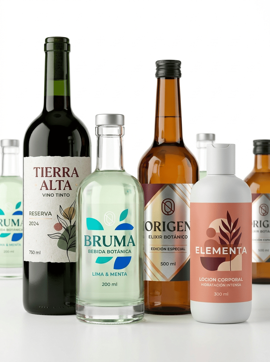
The label must look like a physical self-adhesive label applied onto the container, with visible edges and realistic material texture. It must NOT look like graphics printed directly onto the packaging. Ultra-premium commercial packaging photography created for a premium self-adhesive label manufacturer, featuring a sophisticated collection of four premium bottles showcasing different professional self-adhesive label materials and printing finishes. The purpose of the image is to demonstrate the wide range of materials, textures and premium finishes available for custom bottle labels. THE SELF-ADHESIVE LABELS MUST BE THE ABSOLUTE VISUAL PROTAGONISTS OF THE IMAGE. Create an elegant contemporary composition featuring FOUR clearly different premium bottles: • dark green glass wine bottle with textured paper label • thick transparent glass botanical beverage bottle with transparent no-label-look label • amber glass gourmet bottle with metallic self-adhesive label • contemporary matte white plastic bottle with premium matte label The four main bottles are arranged at slightly different heights in the foreground, creating a sophisticated editorial composition. Additional bottles may appear softly out of focus behind them to create depth, but the four foreground labels must remain the dominant visual elements. Each bottle must clearly demonstrate a DIFFERENT SELF-ADHESIVE LABEL MATERIAL. 1. TEXTURED PAPER LABEL Apply a premium white textured paper self-adhesive label to the dark green glass wine bottle. The paper must show subtle natural fibers and tactile texture clearly visible under the studio lighting. Contemporary premium wine branding. Use warm ivory, deep burgundy, black and subtle muted green. Elegant modern typography and a large abstract graphic illustration. Visible text in Spanish: TIERRA ALTA VINO TINTO RESERVA 2024 750 ml 2. TRANSPARENT NO-LABEL-LOOK FILM Apply a crystal-clear self-adhesive film label to the transparent glass botanical beverage bottle. Large areas of the label remain transparent, allowing the bottle and liquid to remain completely visible. Selected typography and graphics use opaque white ink combined with vivid turquoise and cobalt blue. The subtle physical edges of the transparent label must remain visible. The viewer must understand that this is a REAL TRANSPARENT SELF-ADHESIVE LABEL and NOT direct printing onto the bottle. Visible text in Spanish: BRUMA BEBIDA BOTÁNICA LIMA & MENTA 200 ml 3. METALLIC SELF-ADHESIVE LABEL Apply a premium metallic silver self-adhesive label to the amber glass gourmet bottle. IMPORTANT: The entire label must NOT appear metallic. Large areas of the metallic substrate are covered with opaque deep burgundy, charcoal and warm ivory inks. Carefully selected areas remain exposed to reveal the metallic material underneath. Use exposed metallic areas strategically in: • the logo • selected typography • geometric lines • small graphic details Some areas may use transparent amber ink over the metallic silver substrate to create a realistic warm metallic gold appearance. The metallic effect must come from the LABEL MATERIAL itself. NO fake digital metallic gradients. Visible text in Spanish: ORIGEN ELIXIR BOTÁNICO EDICIÓN ESPECIAL 500 ml 4. PREMIUM MATTE LABEL Apply a sophisticated ultra-matte self-adhesive label to a contemporary matte white plastic bottle. The label should have a visibly soft, tactile, non-reflective surface. Use contemporary personal-care branding with soft coral, muted terracotta, deep burgundy and warm ivory. Large modern illustration and bold contemporary typography. Visible text in Spanish: ELEMENTA LOCION CORPORAL HIDRATACIÓN INTENSA 300 ml IMPORTANT FOR ALL FOUR BOTTLES: Every label must look like a REAL PHYSICAL SELF-ADHESIVE LABEL applied onto the bottle. Clearly visible physical label edges where appropriate. Realistic differences between: • textured paper • transparent film • metallic film • ultra-matte material The viewer must be able to visually distinguish the FOUR DIFFERENT LABEL MATERIALS. The labels must NOT look like identical white stickers with different graphics. Material texture and finishing must be clearly visible. Perfect adhesion following the curved bottle surfaces. No wrinkles. No bubbles. No lifting edges. The graphics must NOT look printed directly onto the bottles. The labels must occupy a significant visual area of each bottle. Exceptional commercial printing quality. Ultra-sharp typography. Perfect registration. Perfect die-cut edges. Professional editorial product photography. PURE WHITE seamless background (#FFFFFF). The background must be genuinely pure white, not beige, cream or gray. Clean white studio surface. Front three-quarter view, almost frontal, allowing the different bottle shapes and label materials to be clearly appreciated. Balanced composition with the four bottles occupying most of the horizontal frame. Generous clean white space surrounding the collection. Soft natural contact shadows only. Controlled high-key studio lighting specifically designed to reveal the DIFFERENT PHYSICAL PROPERTIES OF EACH LABEL: • directional light revealing the fibers and texture of the paper label • subtle reflections revealing the transparent film edges • controlled highlights revealing the metallic substrate • soft diffuse lighting revealing the non-reflective matte finish The foreground labels must be razor-sharp. Hyper-realistic glass. Hyper-realistic plastic. Hyper-realistic self-adhesive materials. Exceptional commercial printing. Contemporary European packaging design. Premium editorial photography. 8K ultra-high definition. Designed by a Pentawards-winning packaging designer. NO stamping effect replacing the metallic material. NO fake gold gradients. NO fully metallic bottle. NO shrink sleeves. NO direct printing onto bottles. NO identical label material on every bottle. NO generic packaging. NO vintage design. NO ornamental borders. NO arabesque patterns. NO decorative props. NO glasses. NO fruit. NO flowers. NO plants outside the labels. NO wooden surfaces. NO colored background. NO beige background. NO gray background. NO clutter.

@eli verges
プロンプト
The label must look like a physical self-adhesive label applied onto the container, with visible edges and realistic material texture. It must NOT look like graphics printed directly onto the packaging. Ultra-premium commercial packaging photography created for a premium self-adhesive label manufacturer, featuring a sophisticated collection of four premium bottles showcasing different professional self-adhesive label materials and printing finishes. The purpose of the image is to demonstrate the wide range of materials, textures and premium finishes available for custom bottle labels. THE SELF-ADHESIVE LABELS MUST BE THE ABSOLUTE VISUAL PROTAGONISTS OF THE IMAGE. Create an elegant contemporary composition featuring FOUR clearly different premium bottles: • dark green glass wine bottle with textured paper label • thick transparent glass botanical beverage bottle with transparent no-label-look label • amber glass gourmet bottle with metallic self-adhesive label • contemporary matte white plastic bottle with premium matte label The four main bottles are arranged at slightly different heights in the foreground, creating a sophisticated editorial composition. Additional bottles may appear softly out of focus behind them to create depth, but the four foreground labels must remain the dominant visual elements. Each bottle must clearly demonstrate a DIFFERENT SELF-ADHESIVE LABEL MATERIAL. 1. TEXTURED PAPER LABEL Apply a premium white textured paper self-adhesive label to the dark green glass wine bottle. The paper must show subtle natural fibers and tactile texture clearly visible under the studio lighting. Contemporary premium wine branding. Use warm ivory, deep burgundy, black and subtle muted green. Elegant modern typography and a large abstract graphic illustration. Visible text in Spanish: TIERRA ALTA VINO TINTO RESERVA 2024 750 ml 2. TRANSPARENT NO-LABEL-LOOK FILM Apply a crystal-clear self-adhesive film label to the transparent glass botanical beverage bottle. Large areas of the label remain transparent, allowing the bottle and liquid to remain completely visible. Selected typography and graphics use opaque white ink combined with vivid turquoise and cobalt blue. The subtle physical edges of the transparent label must remain visible. The viewer must understand that this is a REAL TRANSPARENT SELF-ADHESIVE LABEL and NOT direct printing onto the bottle. Visible text in Spanish: BRUMA BEBIDA BOTÁNICA LIMA & MENTA 200 ml 3. METALLIC SELF-ADHESIVE LABEL Apply a premium metallic silver self-adhesive label to the amber glass gourmet bottle. IMPORTANT: The entire label must NOT appear metallic. Large areas of the metallic substrate are covered with opaque deep burgundy, charcoal and warm ivory inks. Carefully selected areas remain exposed to reveal the metallic material underneath. Use exposed metallic areas strategically in: • the logo • selected typography • geometric lines • small graphic details Some areas may use transparent amber ink over the metallic silver substrate to create a realistic warm metallic gold appearance. The metallic effect must come from the LABEL MATERIAL itself. NO fake digital metallic gradients. Visible text in Spanish: ORIGEN ELIXIR BOTÁNICO EDICIÓN ESPECIAL 500 ml 4. PREMIUM MATTE LABEL Apply a sophisticated ultra-matte self-adhesive label to a contemporary matte white plastic bottle. The label should have a visibly soft, tactile, non-reflective surface. Use contemporary personal-care branding with soft coral, muted terracotta, deep burgundy and warm ivory. Large modern illustration and bold contemporary typography. Visible text in Spanish: ELEMENTA LOCION CORPORAL HIDRATACIÓN INTENSA 300 ml IMPORTANT FOR ALL FOUR BOTTLES: Every label must look like a REAL PHYSICAL SELF-ADHESIVE LABEL applied onto the bottle. Clearly visible physical label edges where appropriate. Realistic differences between: • textured paper • transparent film • metallic film • ultra-matte material The viewer must be able to visually distinguish the FOUR DIFFERENT LABEL MATERIALS. The labels must NOT look like identical white stickers with different graphics. Material texture and finishing must be clearly visible. Perfect adhesion following the curved bottle surfaces. No wrinkles. No bubbles. No lifting edges. The graphics must NOT look printed directly onto the bottles. The labels must occupy a significant visual area of each bottle. Exceptional commercial printing quality. Ultra-sharp typography. Perfect registration. Perfect die-cut edges. Professional editorial product photography. PURE WHITE seamless background (#FFFFFF). The background must be genuinely pure white, not beige, cream or gray. Clean white studio surface. Front three-quarter view, almost frontal, allowing the different bottle shapes and label materials to be clearly appreciated. Balanced composition with the four bottles occupying most of the horizontal frame. Generous clean white space surrounding the collection. Soft natural contact shadows only. Controlled high-key studio lighting specifically designed to reveal the DIFFERENT PHYSICAL PROPERTIES OF EACH LABEL: • directional light revealing the fibers and texture of the paper label • subtle reflections revealing the transparent film edges • controlled highlights revealing the metallic substrate • soft diffuse lighting revealing the non-reflective matte finish The foreground labels must be razor-sharp. Hyper-realistic glass. Hyper-realistic plastic. Hyper-realistic self-adhesive materials. Exceptional commercial printing. Contemporary European packaging design. Premium editorial photography. 8K ultra-high definition. Designed by a Pentawards-winning packaging designer. NO stamping effect replacing the metallic material. NO fake gold gradients. NO fully metallic bottle. NO shrink sleeves. NO direct printing onto bottles. NO identical label material on every bottle. NO generic packaging. NO vintage design. NO ornamental borders. NO arabesque patterns. NO decorative props. NO glasses. NO fruit. NO flowers. NO plants outside the labels. NO wooden surfaces. NO colored background. NO beige background. NO gray background. NO clutter.
モデル
NANO-BANANA-PRO
種類
画像
いいね
0
アスペクト比
3/4